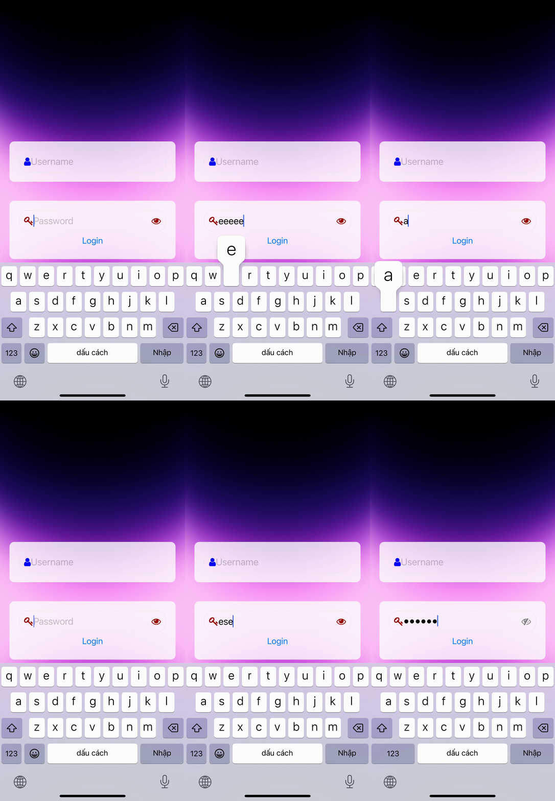
react-native-unsigned-input
- Normalizing the input string by removing Vietnamese diacritics and whitespaces:
-
This algorithm takes an input string and performs the following steps:
a. Decomposes the string into its canonical form using
decomposedStringWithCanonicalMapping. This breaks the string into its base characters and their combining marks (diacritics).b. Folds the diacritic marks using
stringByFoldingWithOptions:NSDiacriticInsensitiveSearch. This step replaces characters with diacritics with their base forms, effectively removing the diacritic marks.c. Trims the whitespaces at the beginning and the end of the string using
stringByTrimmingCharactersInSet:[NSCharacterSet whitespaceCharacterSet]. The result of this algorithm is a normalized string without diacritics and extra whitespaces.
- Replacing the input string in the text field with the normalized string:
- This algorithm updates the text field's content by replacing the characters in a specified range with the normalized string. This is done using the
stringByReplacingCharactersInRange:range withString:normalizedStringmethod. As a result, the text field will display the normalized version of the input string, without diacritics and extra whitespaces.
In summary, these two algorithms work together to process a text input by removing Vietnamese diacritics and extra whitespaces, then updating the text field with the normalized string.
Demo
Installation
Make sure to install the @tdduydev/react-native-unsigned-input package and link it with your project.
npm install react-native-unsigned-input --saveUsage
import InputBlurUnsigned from '@tdduydev/react-native-unsigned-input';

// In your JSX
<InputBlurUnsigned
  placeholder="Enter text"
  leftIcon={<YourLeftIcon />}
  rightIcon={<YourRightIcon />}
  onChangeText={(text) => console.log(text)}
/>;
Props
| Prop | Type | Description |
|---|---|---|
| secureTextEntry | Boolean | If set to true, the text entered will be obscured, typically used for password fields. |
| style | Object | Additional styles to be applied to the TextInput component. |
| multiline | Boolean | If set to true, the TextInput will allow multiple lines of text. |
| rightIcon | ReactElement | A React element to be displayed as the right icon within the TextInput field. |
| leftIcon | ReactElement | A React element to be displayed as the left icon within the TextInput field. |
| rightIconContainerStyle | Object | Additional styles to be applied to the right icon container. |
| leftIconContainerStyle | Object | Additional styles to be applied to the left icon container. |
| value | String | The value of the TextInput field. |
| defaultValue | String | The initial value of the TextInput field. |
| onChangeText | Function | A function to be called when the text changes in the TextInput field. |
| placeholder | String | A placeholder string to be displayed when the TextInput field is empty. |
| placeholderTextColor | String | The color of the placeholder text. |
| onGetValue | Function | A function to be called when the value of the TextInput field is retrieved. |
| onFocus | Function | A function to be called when the TextInput field receives focus. |
| onBlur | Function | A function to be called when the TextInput field loses focus. |
| ...rest | Any | Additional props to be passed down to the TextInput component. |
| backgroundInput | ReactElement | A React Element used as a background input for iOS platform |
Styling
The component has built-in styling for the TextInput and its container. To customize the styling, use the style, rightIconContainerStyle, and leftIconContainerStyle props as needed.
The backgroundInput prop is used to provide a custom background input for the iOS platform. This prop should be a React Element, and it is optional. If provided, the background input element will be rendered behind the main TextInput component on iOS devices. This can be useful for adding a custom appearance or styling to the input field on iOS.
Methods
focus: This method can be called to focus the TextInput field programmatically. To use it, create a ref for the component and call the focus method on the ref:
const inputRef = useRef();

// Somewhere in your code
inputRef.current.focus();

// In your JSX
<InputBlurUnsigned ref={inputRef} ... />
Supported Languages 🌐
| Language | Flag |
|---|---|
| Vietnamese | |
| French | |
| Spanish | |
| Portuguese | |
| German | |
| Swedish | |
| Norwegian | |
| Danish | |
| Dutch | |
| Polish | |
| Hungarian | |
| Czech | |
| Slovak | |
| Slovenian | |
| Croatian | |
| Romanian | |
| Icelandic | |
| Finnish | |
| Lithuanian | |
| Latvian | |
| Estonian | |
| Turkish | |
| Filipino |
Regenerate response
See the contributing guide to learn how to contribute to the repository and the development workflow.
License
MIT
Donate
A cup of coffee helps me have more motivation to develop more useful plugins, Thank you


