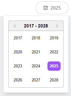
A customizable year picker component built with React and Tailwind CSS.
You can install the package using npm or yarn:
npm install @trackpilots/year-picker
# or
yarn add @trackpilots/year-picker
Make sure Tailwind CSS is installed in your project.
Use in Your Component
import React, { useState } from "react";
import YearPicker from "@trackpilots/year-picker";

const App = () => {
  const [selectedYear, setSelectedYear] = useState(null);

  const handleChange = (year) => {
    setSelectedYear(year);
    console.log("Selected Year:", year);
  };


  return (
    <div className="p-4">
      <h2 className="text-lg font-bold">Date Picker</h2>
      <YearPicker
        onChange={handleChange}
      />
      <p>Selected Year: {selectedYear ? selectedYear.year : "None"}</p>
    </div>
  );
};

export default App;A React Select component that allows users to choose a Year
| Prop Name | Type | Default | Description |
|---|---|---|---|
onChange |
function |
() => {} |
Triggered when a Year is selected. |
<YearPicker
  onChange={(Year) => console.log("Selected Year:", year)}
/>- React
- Tailwind CSS
-
react-icons (for
IoCalendarOutlineicon)
These packages are maintained by Quick App Studio Developers.
This project is licensed under the MIT License.


