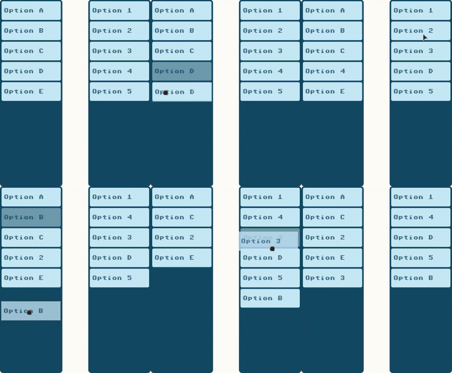
Drag and Drop
This is a small library to enable drag and drop functionality in lists of HTML elements.
This library use the polyfill DragDropTouch by Bernardo-Castilho to support touch.
Installation
To install Drag and Drop you can use npm:
npm install @wudev/drag-drop
Or you can copy the code of the files:
-
drag-drop.min.jsThis file includes the polyfill DragDropTouch by Bernardo-Castilho -
drag-drop-no-polyfill.min.jsThis file doesn't include the polyfill so you have to add support touch.
Usage
The library consists of the following files:
-
DragDrop.tsMain class to enable drag and drop on a container element. -
DragDropItem.tsHelper class to enable drag and drop on a single item. -
types.tsSome types used in the classes.
DragDrop class
This class enables drag and drop on a list of elements inside a container.
import DragDrop from '@wudev/drag-drop';

const container = document.getElementById('list');
const dragDrop = new DragDrop(container, 'li');
The DragDrop class handles:
- Adding
draggableattributes and listeners to items - Swapping positions of elements when dropping
- CSS classes for drag and drop states
Parameters
- container: The container element
- itemClassName: CSS class name for the draggable items
- attributeKey: Custom attribute to store position. Default: 'data-position'
- parentClassName: CSS class name for parent elements. If null, uses container element.
Methods
- destroy(): Removes listeners
- exchangePosition(): Swaps position of two elements
DragDropItem helper
The DragDropItem class handles drag and drop functionality for a single item. This is used internally by DragDrop.
import {DragDropItem} from '@wudev/drag-drop';

const item = document.getElementById('item');
const dragDropItem = new DragDropItem(item, container, (origin, destiny) => {
	//code to exchange elements...
});
Parameters
- item: The element to apply drag drop.
- parent: Name of the CSS class of the parent or parent element of the item.
- exchangePosition: Function to swap position of two elements.
- positionAttribute: Custom attribute to store position. Default: 'data-position'
Methods
- destroy(): Removes listeners
CSS
The DragDropItem class add to the item the next css classes:
- drag-start: To indicate that an element started its drag.
- drag-over: To indicate that an item is over another item.
Example
/* Generates an opacity on the element that is being dragged */
.drag-start {
	opacity: 0.5;
}

/* Displays a dotted border on the element below the element being dragged */
.drag-over {
	border-color: 1px dotted #5fa8d3;
}


