UI widgets for A-Frame.
Give it a whirl!
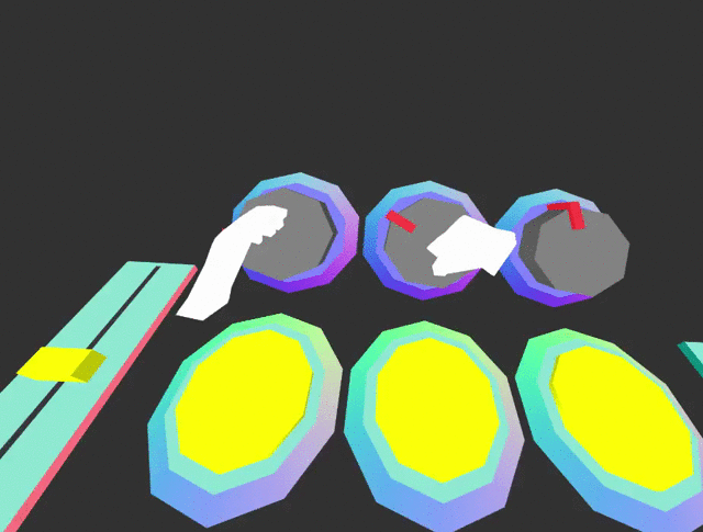
Works with HTC VIVE and Oculus touch in a WebVR enabled browser.
Basic usage
My A-Frame Scene <!-- Include component script into your project along with A-Frame. --> <!-- Adds hand controls --> <!-- Can also be controlled used with cursor --> <!-- Adds UI button widget --> Skinnable with custom styles
Using mixins, you can define a UI component styles.
UI Components
Button
Properties
| Property | Description | Default Value |
|---|---|---|
| base | mixins to use for button base. | |
| top | mixins to use for button top. | |
| pressed | mixins to use for when button is pressed (added to top). | |
| color | default button color | #960960 |
| pressedColor | default button-pressed color | #FC2907 |
| baseColor | default button-base color | #618EFF |
| topY | default button top height | 0.02 |
| pressedY | default button pressed height | 0.012 |
Events
| Event | Description |
|---|---|
| buttondown | Emitted when button is pushed down. |
| buttonup | Emitted when button is released. |
| pressed | Emitted when button has been has been pushed down and released. |
Toggle switch
Properties
| Property | Description | Default Value |
|---|---|---|
| value | sets toggle position. | 0 |
Events
| Event | Description |
|---|---|
| change | Emitted when switch has been toggled. |
Slider
Properties
| Property | Description |
|---|---|
| min | sets minimum value |
| max | sets maximum value |
| value | sets value |
Change
| Event | Description |
|---|---|
| change | Emitted when slider has been moved. |
Rotary Knob
Events
| Event | Description |
|---|---|
| change | Emitted when rotary has been turned. |
npm
Install via npm:
npm install aframe-ui-widgetsThen require and use.
;;