vue-datepicker-mobile
v2

Props
| param | description | type | default |
|---|---|---|---|
| custom | custom data.* | [object, array] | - |
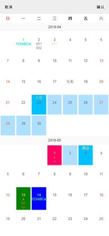
| endText | text of end for selected | string | '离店' |
| initDate | Init position for visible month.Allow a string of date,default is this month. | string | today |
| initLength | Init render length from init-date. | number | 6 |
| loadLength | scroll load render length every time. | number | 6 |
| mondayFirst | Whether Monday is the first-day as a week, default for Sunday. | boolean | true |
| selectArea | area for allow user choose date. e.g.['2019-05-01', '2019-08-02'] |
array | - |
| selected | select some area. Ibid. | array | - |
| single | select single date.default select a range. | boolean | false |
| startText | text of beginning for selected | string | '入住' |
| cancelText | text for cancel button | string | '取消' |
| confirmText | text for confirm button | string | '确认' |
| visible | display state, show or hide datepicker window. | boolean | false |
| weekTexts | texts array of week name | array | ['一', '二', '三', '四', '五', '六', '日'] |
* 注
// 当key为月份如:'2019-05'时,value则为从当月1日开始的数据序列。可接受多个月份(多个key) '2019-04': custom1custom2custom29custom30 '2019-05': custom1custom2custom30custom31// 当key为具体日期如:'2019-05-20'时,value为从该日起的数据序列,自动往下一个月添加超出的数据 '2019-04-09': custom1custom2custom29custom30custom99custom100custom2xxcustom3xx// 直接传入一个数组,相当于上面的key为当日custom1custom2custom29custom30custom99custom100custom2xxcustom3xxcustom
| param | description | type |
|---|---|---|
| bgc | background color | string |
| disabled | disabled status | boolean |
| color | color of text | string |
| info | display texts | [string, object, array] |
info
| param | description | type |
|---|---|---|
| text | display text | string |
| color | color of text | string |
this color priority great than custom.color
full e.g.
bgc: '#abc' disabled: true color: 'red' info: 'full' bgc: 'rgb(255,0,100)' info: '001' '002' bgc: 'hsl(100,100%,50%)' color: 'rgba(99, 99, 99, .9)' info: text: '007' color: 'hsla(60, 50%, 70%, .6)' Event
select({ start, end, range })
Called after select date range.start: object, end: object, range:[object]. range is a selected array does't include start and end.If don't have space between start and end,range is a array of null.
Object Of Date
start: date: // current day data: disabled: false custom: {} // custom object cancel()
Called when click cancel button.
confirm({ start, end, range })
Called when click confirm button.
disable(date)
Called after selected a date has custom.disabled.date is a Object Of Date.
viewport(month)
Called when somemonth in viewport with window, return current month.
month: date: // this month days: date1 date2 date29 date30 // all days for this monthInstructions
simple
Description
This project used Intersection Observer API