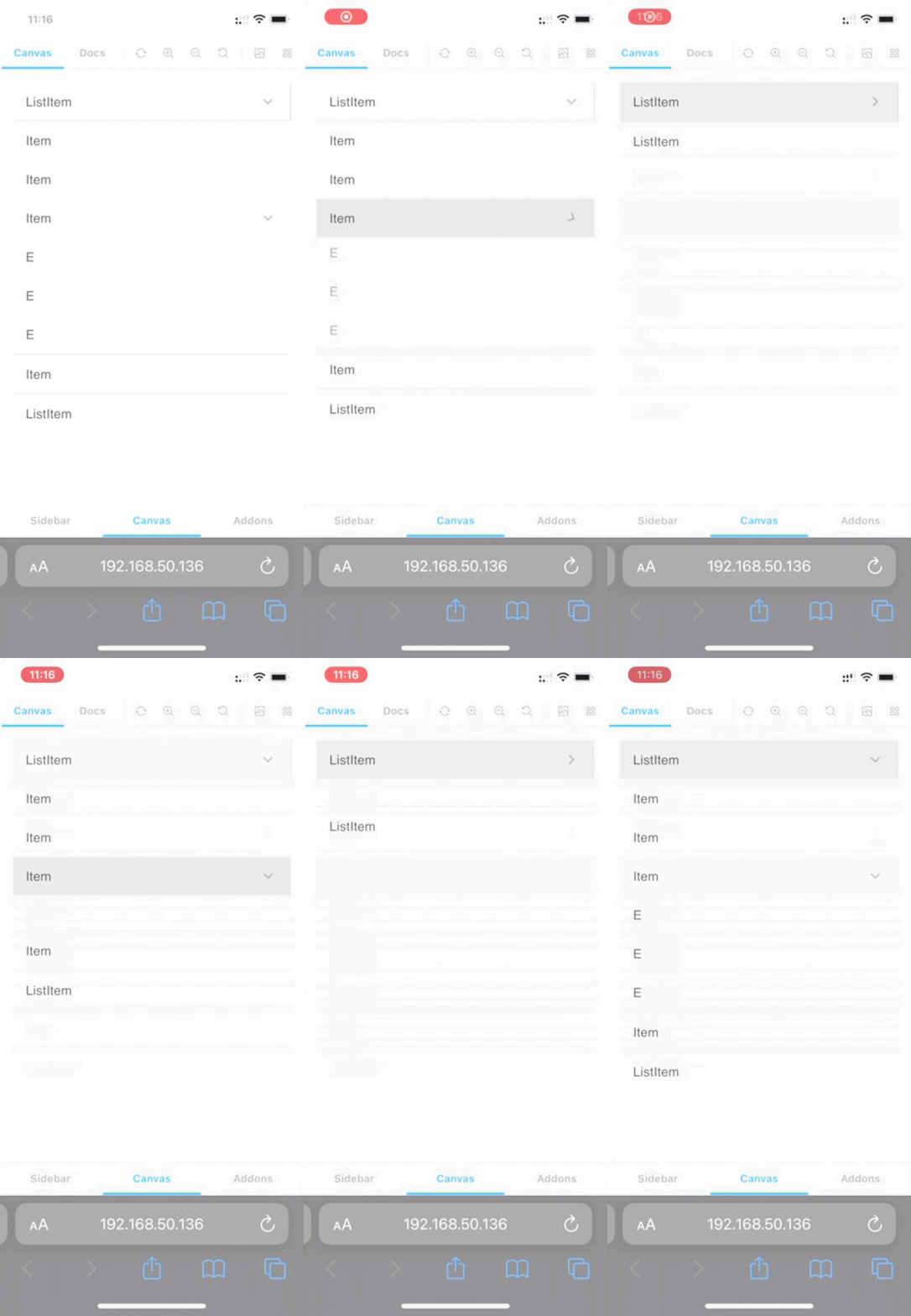
AnimatedSize
Introduce
This component provide flexible size-change animation for html element under react-dom framework.
Feature
- AnimatedSize provide the features that let element's width/height animate between
autoand any size. - Animation is provided by
css transitionso the component take less js-runtime compared with pure js implement. - And AnimatedSize support perfect animation that you can stop animation or change animation dest or change animation duration
at any timeeven AnimatedSize is animating or nested element's size is changing.
- nested
AnimatedSizeis also fine.
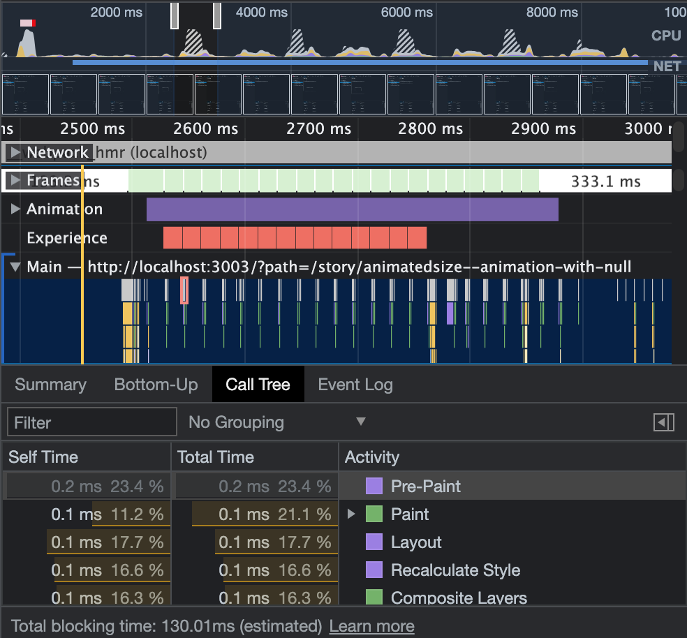
- most of the job is html renderer paint, more animation with less js-runtime.
Install
npm i animated-sizeImport
import { AnimatedSize } from "animated-size";Use
const [open, setOpen] = React.useState(true);
...
<AnimatedSize widthFactor={open ? { size: "auto" } : { size: 0 }}>
  {/* your element*/}
</AnimatedSize>;
Size Factor
export type Factor = {
  size?: SizeFactor /* default: undefined */;
  duration?: number /* unit: ms, default: 350 */;
  delay?: number /* unit: ms, default: 0 */;
  curve?: DataType.EasingFunction /* default: ease */;
};

export type SizeFactor = number | string | "auto" | undefined;| SizeFactor | Requirement |
|---|---|
| number | float or int that equal to or bigger than 0 |
| string | the string is valid for css width property |
| auto | / |
| undefined | / |
For example: element's width is 150px.
<AnimatedSize widthFactor={/* set your factor */}>
  {/* if the entirely width (wrapper by span) is 150px */}
  <Element0 />
  <Element1 />
</AnimatedSize>
This width property of inline style sheet:
| Type | Property | Code |
|---|---|---|
| number[2] | 300px (150 * 2 px) | widthFactor={{ size: 2 }} |
| string['50px'] | 50px | widthFactor={{ size: '50px' }} |
| auto | auto | widthFactor={{ size: 'auto' }} |
| undefined | undefined |
widthFactor={{ size: undefined }} or widthFactor={{ }} or widthFactor={undefined}
|
Factor change behaviors:
| From | To | Description |
|---|---|---|
| number[2] | auto | animate from 300px to 150px, then set the width property as 'auto' |
| number[2] | undefined | animate from 300px to 150px, then set the width property as undefined (remove width property from inline style sheet) |
| string['50px'] | auto | animate from 50px to 150px, then set the width property as 'auto' |
| string['50px'] | undefined | animate from 50px to 150px, then set the width property as undefined (remove width property from inline style sheet) |
| auto | number[2] | set the width property as 150px, then animate from 150px to 300px |
| undefined | number[2] | set the width property as 150px, then animate from 150px to 300px |
| auto | string['50px'] | set the width property as 150px, then animate from 150px to 50px |
| undefined | string['50px'] | set the width property as 150px, then animate from 150px to 50px |
| number[2] | string['50px'] | animate from 300px to 50px |
| string['50px'] | number[2] | animate from 50px to 300px |
| auto | undefined | set the width property as undefined (remove width property from inline style sheet) |
| undefined | auto | set the width property as auto |
- use
autoorundefinedfor better performance when nested element may change its size.
Custom animation curve
AnimatedSize implement the animation that underlay is css transition.
Setup factor other properties to custom your animation curve as well as duration and delay just like css transition.
<AnimatedSize
  widthFactor={{
    size: "auto",
    curve: "ease-in",
    duration: 200 /* unit: ms */,
    delay: 200 /* unit: ms */,
  }}
>
  {/* your element*/}
</AnimatedSize>
Custom wrapper
<AnimatedSizeBuilder
  widthFactor={/* set your factor */}
  heightFactor={/* set your factor */}
  builder={(ref) => (
    <div ref={ref}>{/* pass ref to dom element that let AnimatedSize access the element object */}
    {/* set your element that wrapper by div */}
    </div>
  )}
/>- AnimatedSize require wrapper dom element reference for calculation of this nested elements' total size
Inner element position
By default, AnimatedSize use inline-flex layout (and center inner element) and the inner element follow the flex layout.
Change the parament axisDirection, mainAxisPosition and crossAxisPosition to custom your element position. Or directly set inline style sheet -- style parament.
Because default layout is inline-flex that may cause some layout problem. You can change display to flex to fix some layout problem. Detail in project storybook.
By the way, by default AnimatedSize set overflow as hidden. Set style to override it if necessary.
<AnimatedSize
  widthFactor={/* set your factor */}
  heightFactor={/* set your factor */}
  axisDirection="column"
  mainAxisPosition="start"
  crossAxisPosition="end">
  {/* your element */}
</AnimatedSize>-
axisDirection- CSSProperties.flexDirection -
mainAxisPosition- CSSProperties.justifyContent -
crossAxisPosition- CSSProperties.alignItems
<AnimatedSize
  widthFactor={/* set your factor */}
  heightFactor={/* set your factor */}
  style={{
    overflow: 'visible',
    display:'flex', /* use flex as possible as you can, block usually do not work well */
    position:'relative',
    /* Don't override width or height or transition if you want animation to work properly */
    }}>
  {/* your element */}
</AnimatedSize>
style
Interactive Demo
git clone https://github.com/JohnGu9/AnimatedSize.git
cd AnimatedSize
npm i
npm run storybook
Browser requirement
ResizeObserver support
| Browser | Version (or newer) |
|---|---|
| Chrome | 64 |
| Edge | 79 |
| Firefox | 69 |
| Safari | 13.1 |
| Safari on iOS | 13.4 |
Component dependencies
- react-dom
- react-ref-composer
Issue report
https://github.com/JohnGu9/AnimatedSize/issues


