aurelia-table
News
Latest:
- Unhooked column width(the style component) from the column object(you still set width with column.size).
- This allows the same set of columns to be shared with multiple tables, previously they would get get column width issues since they would both attempt to recalculate their width to correct the other.
- Note changing sort, header, hidden, etc will affect all tables with that column set.
- Added slightly easier access to common events, see event delegations below.
- Ability to override scrollbar width used in column width calculations, see bindables below.
- Ability to set auto scroll page down ratio, usually 0 to 1 indicating when the auto scroll page down will occur default is 90% (0.9) of the way down the scroll, see bindables below.
Last Time:
- Various column width/resize fixes
- Note: Still doesn't properly handle fixed widths that go beyond the body width, need a means of dealing with that yet.
- Row View Value converter was discontinued and the row filtering just runs off of the two computed properties for now.
filteredAll rows filtered down.viewableFiltered rows plus page limitations.
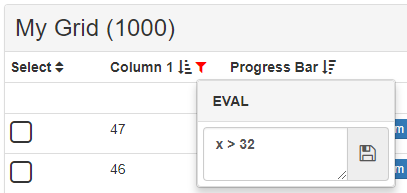
- Beginnings of column specific filtering has been built in, only simple text evaluate is included for now with plans for:
- Date (Equals/Greater Than/Less Than/Between) - I'd have to put together a decent datepicker for this using Moment.js probably
- Number (Equals/Greater Than/Less Than/Between)
- Checklist (Strings/Numbers/Dates)
- Column filter mode for Evaluate has access to:
x/valuecurrent row value.i/rowidxcurrent row index.rowcurrent row.columncurrent column.
About
Semi-Bare bones bootstrap table/panel setup created as an aurelia element with fixed header/summary options, sortable columns/multisort with shift, resizable columns, title as the panel-heading and replaceable parts for header/row renders and more.
NOTE: check-box, search-box, progress-bar, scale-bar, range elements, etc are not included. Reserved names are a custom element 'aurelia-table', 'aurelia-table-filter', 'aurelia-table-eval'
Gif including the in dev column-menu and other glitchy things like the progress bars.
(Live example pending IRL complications)

Full suite of controls/components is in the works for semantic-ui including a semantic-ui specific variation of the table.
Installation
Install package with NPM and add it to your development dependencies:
npm install --save aurelia-table
{ aureliause ; await aureliastart; await aurelia;}Webpack
If you have webpack then currently you'll probably have to add the ModuleDependenciesPlugin to your webpack.config.js
const AureliaPlugin ModuleDependenciesPlugin = ; ... plugins: ... "aurelia-table": './aurelia-table-filter' './aurelia-table' ...Dependencies
- Bootstrap (css)
- Font-Awesome Icons 4.6.3 (sort icons)
- iterate-js a (~25kb) library of my own making that assists with the column resizing/row templating/sorting and will help with searching/filtering and more in the future.
Usage
Minimum Setup View
Minimum Setup View Model
{ thisheader = 'Basic Grid'; thiscolumns = field: 'value' header: 'Value' ; // generate 1000 rows // NOTE that infinite scroll is turned on by default and loads in blocks of 50 rows at a time thisrows = __; } Bindables
@ header = '';@ height = 300;@ loading = false;@ tableClasses = 'table-hover table-condensed';@ showSummary = true;@ showColHeaders = true;@ showFixedHeaders = true;@ showRows = true;@ autoScrollRatio = 09; // New@ scrollWidth = null; // New@ colfilters = null;@ filter = null;@ sort = null;@ map = null;@ startPage = 0;@ endPage = 1;@ pageSize = 50;@ pageMode = 'scroll'; // paginate, set to null to disable infinite scroll/pagination@ summary = ;@ headers = ;@ rows = ;@ columns = ;Event Delegations
@ { };@ { };@ { };@ { };@ { };@ { };@ { };@ { };@ { };@ { };@ { };How to Use
{ // if you don't want to cancel ifafter console; } { // full functionality var row = eventdatarow; //event.isCancelled = true; // to prevent most default event executions ifeventbefore // before default execution ifeventafter // after default execution }Row View
Rows are rendered via computed properties.
@ { var temp = thisrows; ifthispageMode temp = __; if__is var flag; temp = __; if__is temp = __; if__is temp = __; if__is temp = __; return temp;} @ { var array = thisfiltered; if__is && thispageMode && __is && __is && __is return array; return array;}Current viewable/filtered rows
You can bind to your grids current viewable rows which includes pagination/scroll limits and filter/sort/map or you can bind to filtered rows which only use the filter/sort/map functions.
Colfilters/Filter/Sort/Map
These four bindables can shape your rows how you like.
colfiltersis primarily handled by the column definitionsfilterstring that sets the type of filter for the column only option at the moment is'eval'conditionfunction set by the internal filter component and must return true/false(value, row, column, rowidx) => true
filterexpects a function passed (value, key) of the row item, key being the array index and must return true if it is to be included, null means the filter is ignored.sortis primarily handled by the column definitions, all are optional{...sortable: true, dir: 'desc', defaultDir: 'asc', key: x => x.value, sortOrder: 2 }sortableEnables sorting for that columndirCurrent direction of the sort on the column, defaults toascif not set, responds to being changed and will update the griddefaultDirDefault direction the column will be sorted on when first clicked with no current sort, defaults toascif not setkeyPath to the row value sorted upon, defaults torow => row[column.field], allows you to modify what you are sorting upon for example if you wanted to do numeric sort on a string valuex => parseFloat(x.value)sortOrderNumeric order of sorting used with multi sort lower the number the higher the priority, usually starts with 1, so two columns with two sortOrder props defined will sort in that order
mapallows you to transform the array before use for examplerow => ({ id: x.someId, label: x.name })
Row Property Keywords
All are optional
.class[string]Set classes on each of the body rows..style[string]Set styles on each of the body rows..active[bool]Adds active styling over the row, bootstrap sets the styles..hidden[bool]Sets hide/show for the row undefined or false results in being shown.
Column Property Keywords
I highly recommend setting field though it isn't required
.field[string]For your own use to help you locate the property for that column..header[string]For your own use to help display the column header for that column..size[string]Sets the column width, must bepxor%. Default is set to100%..class[string]Set classes on each of the columns..style[string]Set styles on each of the columns, avoid setting width here set incolumn.sizeinstead..hidden[bool]Sets hide/show for the column undefined or false results in being shown..render[string]For your own use to help display the column renders if you have differing ones, default value is null..fitler[string]Sets the filter type for the column default is null..condition[function]Filter evaluation for the column(value, row, column, rowidx) => truedefaults to null..sortable[bool]Enables sorting interaction on column..resizable[bool]Enables the manual resizing of the column..configurable[bool]Enables the column-menu element configuration of an column..key[function]Path to sortable variable for that column default isrow => row[column.field]..dir[string]Sort direction for column. Null turns off sort on the column..defaultDir[string]Default sort direction set when the user first clicks on a column..sortOrder[number]Numeric order used for multi sort, sorts in ascending numeric order so 1, 2, 3
Replaceable Parts Include
- Header Areas
headerright-controlsRight Aligned controls placed on the top panel heading.left-controlsLeft Aligned controls placed on the top panel heading following the header.
${header} -
Render Blocks (replace entire render blocks)
column-renderColumn headers, comes with sort icon look at the template before you replace this piecerow-renderRow body, look at the template before you replace this piece
-
Simple Replaceables
column-headerBasic area for the column header display
${column.header} static-headerBasic area for static header renders
cellBasic body area renders
${row[column.field]}static-summaryBasic summary area renders
Helpful ViewModel Functions
table.columnRefresh()Debounced method to signal force columns to update.table.rowRefresh()Debounced method to signal force rows to update.table.sortRows()Debounced method to force a row sort based on current column state.table.resizeColumns()Debounced method to force a recalculation of column widths.table.pageDown()Decrements the end page. In'paginate'mode it decreases the start page too.table.pageUp()Increments the end page, used by auto scroll when you hit the bottom. In'paginate'mode it increases the start page too.table.pageReset()Resets the start page to 0 and the end page to 1 and scrolls the body of the table to the top of the page.
Future Plans
- column specific filtering - more types
- table menu element for full user customization?
- trim down css needed from bootstrap, icons needed from font-awesome icons and minimize iterate-js to a small lib of the required functions
- included elements (maybe) (search-box, progress-bar, scale-bar, range, date-time, check-box)
- ui virtualization (if it ever works with stacked repeat.for attributes)
Advanced Setup (what the top picture uses)
Setup View
${header} (${rows.length}) ${column.header} Static Header Rows ${row[column.field] | numeral:column.format} ${row[column.field]} Static Summary Rows Total: ${filtered | total:'value1' & signal:'row-totals'} Setup View Model
;; ; @ { var self = this; selfsignaler = signaler; selfsearchtext = ''; // Debounced to prevent input spam selfrefresh = __; self { selfsearchtext = eventvalue; self; }; } { var self = this { selfsignaler; }; // Generate 1000 rows var rows = __; // Table setup all of these can be bound in the html selfmyTable; // Size responds to change //setTimeout(() => { self.myTable.columns[2].size = '300px'; }, 1000); }