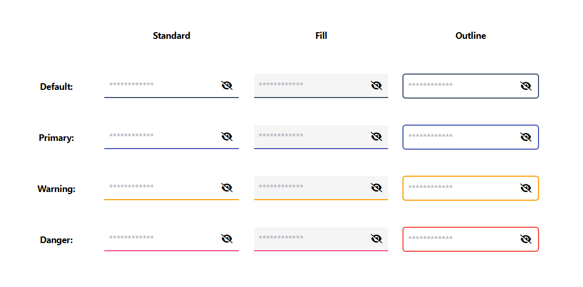
Password visibility can be changed with the icon toggle. You can add as a custom web component by following the documentation of the framework that you are using.
value: input value
placeholder: input placeholder
appearence: standard || fill || outline
color: default || primary || warning || danger
valuechange: Emits the value whenever it changes.
<password-input @valuechange="onValueChange" :value="passwordVal" appearence="outline" color="primary" placeholder="password field"></password-input>


