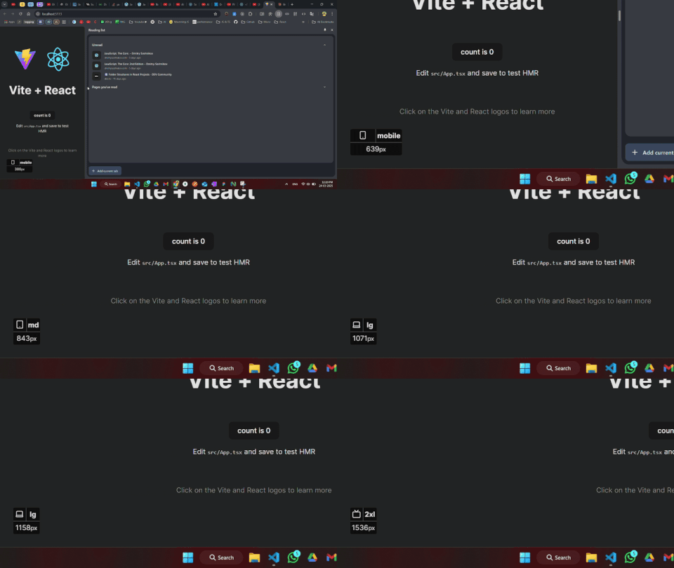
A lightweight React library for real-time breakpoint detection with support for custom and default Tailwind breakpoints.
npm install breakpointer| Export | Description |
|---|---|
BreakpointerProvider |
A context provider to wrap your application |
useBreakpointer |
A hook to access the current breakpoint |
Wrap your application with BreakpointerProvider:
import React, { StrictMode } from 'react';
import { createRoot } from 'react-dom/client';
import App from './App';
import { BreakpointerProvider } from 'breakpointer';

/*
    if mode !== "development", the BreakpointerIndicator will skip rendering
*/
const MODE = import.meta.env.MODE; // based on your chosen build tool

createRoot(document.getElementById('root')!).render(
    <StrictMode>
        <BreakpointerProvider mode={MODE}>
            <App />
        </BreakpointerProvider>
    </StrictMode>,
)Use the useBreakpointer hook to detect breakpoints in your components:
import React from 'react';
import { useBreakpointer } from 'breakpointer';

const MyComponent = () => {
    const {
        screen,      // ex: "md" if currentWidth is in the range from 768 - 1023
        currentWidth // innerWidth/viewPort width
    } = useBreakpointer();

    return (
        <div>
            {screen === 'sm' && <p>Small screen (640px - 767px)</p>}
            {screen === 'md' && <p>Medium screen (768px - 1023px)</p>}
            {screen === 'lg' && <p>Large screen (1024px - 1279px)</p>}
            <p>Current width: {currentWidth}px</p>
        </div>
    );
};

export default MyComponent;Breakpointer comes with the following default breakpoints, which align with Tailwind CSS's default breakpoint system:
| Breakpoint | Min Width (px) | Description |
|---|---|---|
sm |
640 | Large phones & small tablets |
md |
768 | Tablets |
lg |
1024 | Laptops & large tablets |
xl |
1280 | Desktop & large laptops |
2xl |
1536 | Wide screen & large desktops |
Note: resolveConfig is only applicable for Tailwind CSS version 3.x.x.
To use custom Tailwind breakpoints, pass a breakpointsObj prop to BreakpointerProvider:
import React from 'react';
import { createRoot } from 'react-dom/client';
import App from './App';
import { BreakpointerProvider } from 'breakpointer';

import resolveConfig from "tailwindcss/resolveConfig"; // resolver Function
import tailwindConfig from "../tailwind.config"; // js/ts tailwind config

const resolvedConfig = resolveConfig(tailwindConfig);

createRoot(document.getElementById('root')!).render(
    <BreakpointerProvider breakpointsObj={resolvedConfig.theme.screens}>
        <App />
    </BreakpointerProvider>,
    document.getElementById('root')
);The BreakpointerIndicator component has been integrated into the BreakpointerProvider, so there is no need for manual invocation. You can now customize its appearance by passing a classNames object as a prop to the BreakpointerProvider.
The classNames object allows you to style the internal elements of the BreakpointerIndicator. Below is a table describing the available properties:
| Property | Description |
|---|---|
wrapper |
Styles the outer wrapper of the indicator. |
iconWrapper |
Styles the container for the breakpoint icon. |
screen |
Styles the text displaying the current breakpoint (e.g., sm, md). |
currentWidth |
Styles the text displaying the current viewport width in pixels. |
import { BreakpointerProvider } from 'breakpointer';

const App = () => {
    return (
        <BreakpointerProvider
            mode="development"
            classNames={{
                wrapper: ["bg-gray-300", "text-red-800", "p-4", "rounded-lg"],
                iconWrapper: ["content-start"],
                screen: ["font-bold", "text-lg", "text-blue-500"],
                currentWidth: ["text-sm", "text-gray-400"],
            }}
        >
            <App />
        </BreakpointerProvider>
    );
};
This configuration will style the BreakpointerIndicator according to the provided class names.

