can-search-select

CanJS component for a dropdown select with a search
To try out the demo open demo.html file in browser.
Example
Your page template can look like this:
Your view model can look like this:
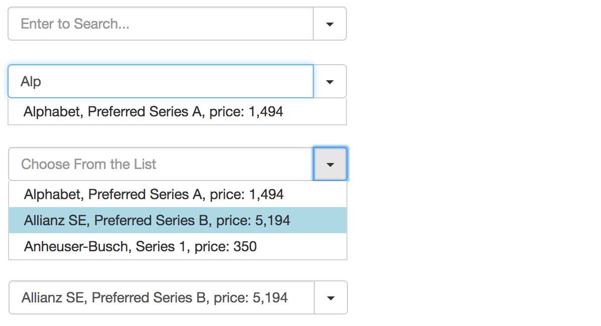
const vm = selectedItem: null items: companyName: 'Alphabet' issuanceName: 'Preferred Series A' price: '1,494' { return itemcompanyName + ', ' + itemissuanceName + ', price: ' + itemprice; } { return itemcompanyName; }There is also a simple dropdown select without a search:
<can-<can-select items="items" display-prop-name="companyName" ^selected-item="selectedItem" />API
can-search-select
Main props:
items, a list of source items;selected-item, the selected item, can also be used for preselection;filter-prop-name, string, a property name to search against;format, a function that receives the selected item and returns a value for rendering in the input, default will usefilterPropNameor the item itself;format-input, a function to format the input field value.
Customization options:
placeholder-search, defaultEnter to Search...;placeholder-select, defaultChoose From the List;btnClass, defaultcaret(for TwBootstrap caret).
can-select
Simple dropdown select:
items, a list of source items;selected-item, the selected item, can also be used for preselection;filter-prop-name, string, a property name to use for displaying.
Usage
ES6 use
With StealJS, you can import this module directly in a template that is autorendered:
;CommonJS use
Use require to load can-search-select and everything else
needed to create a template that uses can-search-select:
;Standalone use
Load the global version of the plugin:
Release Notes
0.3.0:- added a simple dropdown select (w/o search)
can-selectcomponent.
- added a simple dropdown select (w/o search)
0.2.2:- added
format-inputparam.
- added
0.2.1:- styled dropdown list;
- use
selectedItemfor preselection.
0.2.0:- finalized main params and customization options.