
The Chronocraft DatePicker is a flexible datepicker component created for Vue3
- Vuejs 3.0 Based Datepicker
- Single Date Selection
- Date Range Selection
import { ChronoCraftDatePicker } from 'chronocraft-datepicker-vue';
    ...
app.use(ChronoCraftDatePicker)When you want to import a specific component from the library into a dedicated place inside your code
import { DatePicker } from 'chronocraft-datepicker-vue';
...
components:{
DatePicker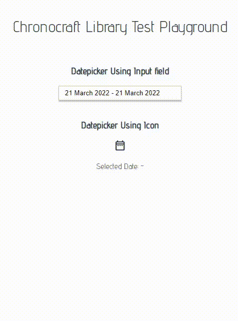
}<DatePicker :rangepicker="false" :showselecteddate="true" style="margin: 0px auto;">
</DatePicker><DatePicker :rangepicker="true" :showselecteddate="true" style="margin: 0px auto;" @on-date-selected="OnDateSelected">
<template v-slot:inputfield="slotProps">
<span class="material-icons-outlined" style="cursor: pointer;">date_range</span>
</template>
</DatePicker>| Name | Type | Description |
|---|---|---|
| showselecteddate | Boolean | Show or Hides the Selected Day or Days inside the Picker |
| dateformat | String | Defines the output string format writen inside the input component |
| rangepicker | Boolean | Enables selection of a date range (from A date to B date) |
| autohide | Boolean | Turns on or off the auto hidding in the datepicker popup |
| @on-date-selected | Event Function | Event fired when the user selects a date or rnage of dates |
| Name | hasprops | Description |
|---|---|---|
| inputfield | no | Overrides the datepicker's input field and custom elements can be entered like a button or icon |