Table of Contents
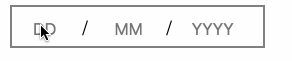
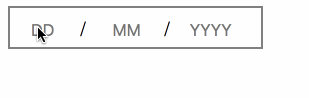
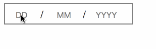
date-input
a react component for date input, totally manual input field
available props
| Props | description | optional? | comment |
| shouldValidate | toggle whether validate the date | yes | default false, set it true when you need validate your date |
| value | the initial date Value | yes | format "YYYY-MM-DD" |
| onChange | callback function | yes | call when you type in any field |
| onBlur | callback function | yes | call when you blur the whole DateInput |
| minDate | the min date | yes | if the date you fill in is before minDate will get error, format "YYYY-MM-DD" |
| minDateError | customized errorMessage | yes | default errorMessage is "The date is too early" |
| maxDate | the max date | yes | if the date you fill in is after maxDate will get error, format "YYYY-MM-DD" |
| maxDateError | customized errorMessage | yes | default errorMessage is "The date is too late" |
| invalidError | customized errorMessage | yes | default errorMessage is "please input a valid date" |
| rules | customized validate rules | yes | the format should follow [{checker: value => fun(val), errorMessage: 'a string'}] |
currently, we have default validate rules
let defaultRules = errorMessage: thispropsinvalidError || 'please input a valid date' //only when you pass minDate errorMessage: thispropsminDateError || 'The date is too early' //only validate when you pass maxDate errorMessage: thispropsmaxDateError || 'The date is too late' ;Also, you are allowed to pass customized rules, just following the format above.
Examples
customize invalidError
add minDate validate and customized its errorMessage
add maxDate validate and customized its errorMessage
customize the whole validate rules, p.s. the default rules will lost
moment().isBefore(value), errorMessage: 'the date should be the future date'}]} />demo gif
type your date
valdate when you blur it
validate when you type the full date
Have a try ?
yarn installyarn storybookthen feel free to have a try
Import in your project
yarn add date-inputthen date-input will appear in your package.json,
;import this component in your source code
Roadmap
- add props minDate and maxDate which can be exactly date or relative date.
- add more validate Rules for user to choose, like [isFutureDate, isPastDate]
- allow user to pass into customized validate rules, error messages
- [] support date format like MM/YYYY, which is useful like expire date of credit card
- [] support customized style