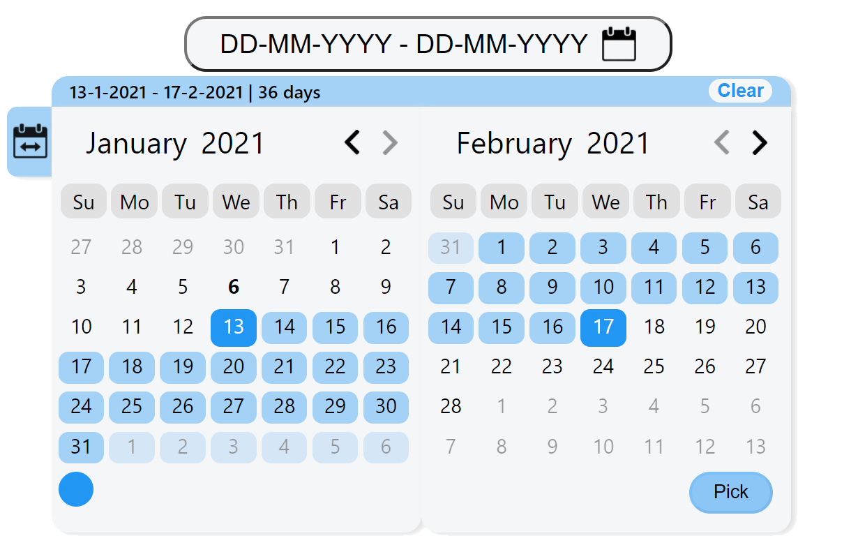
Demo
Demo page at https://almogtavor.github.io/date-range-picker/
Read More
Main Features
- Pick method - an option of configuring the component to be date picker, range picker, or ranges picker.
- Days amount tab - an option of selecting a number of days backward from the current date immediately by choosing a number.
- Colors palette - an option of determining the component's color (can be disabled removed).
- Language - English and Hebrew support.
- Select all button - an option of selecting all of the current board's dates. Whether viewing dates, months, or years.
- Boards number - an option of configuring components to be in one board or two boards.
Installation
$ npm i dates-pickerUsage
function callbackFunction(dates) {
    console.log(`The range of dates that got picked is: ${dates.text}`);
    console.log(`The min date that got picked is: ${dates.minDate}`);
    console.log(`The max date that got picked is: ${dates.maxDate}`);
    console.log(`The number of days that got picked is: ${dates.numberOfDaysPicked}`);
    console.log(`All dates: ${dates.allDates}`);
}

function MyComponent() {
    return (
      <DateRangePicker
        callback={callbackFunction}
      />
    )
  }
}
Options
| Property | Type | Allowed Values | Default Value | Description |
|---|---|---|---|---|
| language | String |
English, Hebrew
|
English |
component's language. currently support English and Hebrew. Notice Languages such Hebrew changes the whole component from left to right to right to left. |
| colorsPalette | String |
enabled, disabled
|
enabled |
by enabling colors palette you can choose the component's color. |
| format | String | any combination of 2 Ds, 2 Ms and 2\4 Ys with other | DD-MM-YYYY |
the format of the dates. |
| selectAllButton | String |
enabled, disabled
|
enabled |
depends on current board's view (dates, months, or years), select all enabled items. |
| startDate | date | date object | new Date(1900, 0, 0) |
calendar's start date. |
| endDate | date | date object | new Date(2025, 0, 0) |
calendar's end date. |
| firstDayOfWeekIndex | int | 0 - 6 | 0 (sunday) | first day of the week (etc monday, sunday). |
| pickMethod | String |
date, range, ranges
|
range |
date means picking one day (on one board). range is to peak dates two dates. ranges is to pick an array of ranges (with view option on hover). |
| defaultColor | String | any color format item | #2196f3 |
default component's color. becomes the first option on colors palette. |
| daysAmountTab | String |
enabled, disabled
|
disabled |
by enabling, there will be a button on the left that you can open and choose prepared range, or days amount up to today. |
| boardsNum | int | 1, 2 | 2 | by specifing you can choose the component's boards number. |
Future Plans
- Add simple and intuitive time picker option (by list\ or visual clock\ both).
- Tooltips for buttons explanation (for example on select all button).
- On non-component-screen click, close component.
- Go back button on non-dates mode (or on all modes for previous). When the user is in month's or year's mode, add an option to return to dates mode without choosing any value.
- Component & button sizes parameters
- Border radius parameter
- An option to cancel picked range from the input label


