
Imagine a world where selecting dates isn't a chore, but a delightful dance of digits. Welcome to Dinaank, the featherweight champion of date pickers! Weighing in at a mere 4.9kb gzipped, this nimble library pirouettes through your code with zero dependencies.
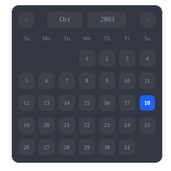
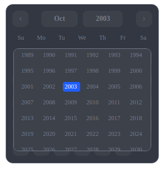
Dinaank doesn't just appear; it performs. With a flourish, a calendar materializes before your eyes, complete with time selection capabilities. You, the director, simply point to a date and time, and the show concludes. Bravo! 👏
Summon Dinaank with a mere whisper in your HTML's head:
<link rel="stylesheet" href="https://unpkg.com/dinaank/dist/dinaank.css" />
<script src="https://unpkg.com/dinaank"></script>npm install dinaank # The npm spell
yarn add dinaank # The yarn enchantmentDinaank is your canvas, and dates are your palette. Let's create a masterpiece:
// Basic Date Selector
const simplePicker = new Dinaank({
el: '#date-selector',
onChange: (selectedDate) => {
console.log(`A moment in time was captured: ${selectedDate}`);
},
theme: 'dark', // For those who paint with starlight
colors: {
hover: 'rgb(0, 0, 0)',
active: '#000',
range: 'rgba(91,91,91,0.13)',
rangeColor: '#000',
}
});
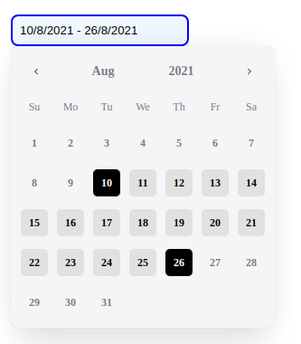
// Date Range Selector
const rangePicker = new Dinaank({
el: '#date-range-selector',
canSelectRange: true,
onChange: (selectedDate, rangeSelected) => {
console.log(`Range selected: ${rangeSelected.start} to ${rangeSelected.end}`);
}
});
// Date & Time Selector
const dateTimePicker = new Dinaank({
el: '#date-time-selector',
enableTimeSelection: true,
timeFormat: '12h', // or '24h'
defaultTime: {
hours: 12,
minutes: 30,
seconds: 0
},
onChange: (selectedDate, rangeSelected, selectedTime) => {
console.log('Selected DateTime:', selectedDate);
console.log('Selected Time:', selectedTime);
}
});Dinaank isn't just a date picker; it's a time traveler's toolkit:
- 🎨 Themes: Light for sun-chasers, dark for night owls
- 📅 Custom Ranges: Set the boundaries of your temporal playground
- 🕒 Time Selection: Choose your moment down to the second
- 🔒 Min/Max Dates: Create a safe haven in the timestream
-
↔️ Date Ranges: For those who think in spans, not points - ⏰ Time Formats: 12-hour or 24-hour, you decide
- 🎯 Default Values: Start with your preferred time of day
interface DateSelectorOptions {
  el: string;                    // Target element selector (required) (eg. "#date-selector", ".canvas_of_time", etc.)
  canSelectRange?: boolean;      // Enable range selection
  closeOnSelect?: boolean;       // Close picker after selection
  theme?: 'light' | 'dark';      // Color theme
  colors?: {                     // Custom colors
    hover?: string;
    active?: string;
    range?: string;
    rangeColor?: string;
    background?: string;
  }; // eg. { hover: 'rgb(0, 0, 0)', active: '#000', range: 'rgba(91,91,91,0.13)', rangeColor: '#000', background: 'rgb(255, 255, 255)' }
  enableTimeSelection?: boolean; // Enable time picker (eg. true)
  timeFormat?: '12h' | '24h';   // Time format (eg. '12h' or '24h')
  defaultTime?: {               // Default time values
    hours?: number; // eg. 12
    minutes?: number; // eg. 30
    seconds?: number; // eg. 0
  };
  minDate?: Date;               // Minimum selectable date (eg. new Date())
  maxDate?: Date;               // Maximum selectable date (eg. new Date())
  currentDate?: Date;           // Initial selected date (eg. new Date())
  onChange?: (                  // Selection callback
    selectedDate: Date,
    rangeSelected: { start: Date | undefined, end: Date | undefined },
    selectedTime?: { hours: number, minutes: number, seconds: number }
  ) => void; // eg. (selectedDate: Date, rangeSelected: { start: Date | undefined, end: Date | undefined }, selectedTime: { hours: number, minutes: number, seconds: number }) => void,
  weekdays?: string[]; // eg. ["Su", "Mo", "Tu", "We", "Th", "Fr", "Sa"]
  months?: string[]; // eg. ["January", "February", "March", "April", "May", "June", "July", "August", "September", "October", "November", "December"]
}Dinaank provides several public methods to control and interact with the date picker programmatically:
// Set minimum and maximum selectable dates
datePicker.setMinMaxDate(minDate: Date, maxDate: Date): void;

// Set time values manually
datePicker.setTime(hours: number, minutes: number, seconds: number = 0): void;

// Get the complete selected date and time
datePicker.getDateTime(): Date;

// Change the theme dynamically
datePicker.setTheme(theme: "dark" | "light"): void;

// Clean up resources when no longer needed
datePicker.destroy(): void;Sets the minimum and maximum selectable dates in the calendar.
// Example: Limit selection to the current month
const now = new Date();
const firstDay = new Date(now.getFullYear(), now.getMonth(), 1);
const lastDay = new Date(now.getFullYear(), now.getMonth() + 1, 0);
datePicker.setMinMaxDate(firstDay, lastDay);Programmatically set the time portion of the selected date.
// Example: Set time to 2:30 PM
datePicker.setTime(14, 30, 0);Returns the complete Date object with both date and time components.
// Example: Get the full selected date and time
const selectedDateTime = datePicker.getDateTime();
console.log(selectedDateTime.toLocaleString());Dynamically switch between dark and light themes.
// Example: Switch to dark theme
datePicker.setTheme("dark");Clean up the date picker and remove event listeners.
// Example: Remove the date picker when no longer needed
datePicker.destroy();Dinaank is more than code; it's poetry in motion, a ballet of bytes. It turns the mundane act of choosing a date and time into a celebration of possibility.
So go forth, temporal artist! Paint your web pages with the brushstrokes of time itself. Let Dinaank be your muse, your stage, and your standing ovation.
Dinaank is licensed under the MIT License. See the LICENSE file for details.
Crafted with ❤️ and a sprinkle of stardust by Harsh Vardhan Goswami. Under the benevolent gaze of the MIT License.