This is a cross-platform picker with search bar for react native support both platform IOs and android

- Easy to use
- Cross platform compatibility android and ios both
- According to use hide and show search bar and title
- Dynamically change dropdown image
- Customize font size, font color and style
- Change animation(Slide, fade, none)
npm i rn-modal-picker
react-native link rn-modal-picker
import React from 'react';
import {StyleSheet, Text, View} from 'react-native';
// import RNPickerDialog from './picker/new';
import RNPickerDialog from 'rn-modal-picker';
export default class HomeScreen extends React.Component {
constructor(props) {
super(props);
this.state = {
data: [
{
id: 1,
name: 'Afghanistan',
},
{
id: 2,
name: 'Bahrain',
},
{
id: 3,
name: 'Canada',
},
{
id: 4,
name: 'Denmark',
},
{
id: 5,
name: 'Egypt',
},
{
id: 6,
name: 'France',
},
{
id: 7,
name: 'Greece',
},
{
id: 8,
name: 'Hong Kong',
},
{
id: 9,
name: 'India',
},
{
id: 10,
name: 'Japan',
},
{
id: 11,
name: 'Kenya',
},
{
id: 12,
name: 'Liberia',
},
{
id: 13,
name: 'Malaysia',
},
{
id: 14,
name: 'Nepal',
},
{
id: 15,
name: 'Oman',
},
{
id: 16,
name: 'Poland',
},
],
placeHolderText: 'Please Select Country',
selectedText: '',
defaultValue: true,
select: '',
value: '',
};
}
selectedValue(index, item) {
this.setState({selectedText: item.name});
}
render() {
return (
<View style={Styles.container}>
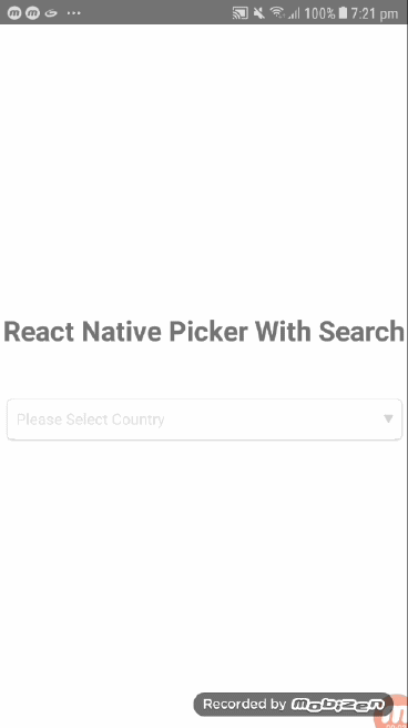
<Text style={{marginBottom: 50, fontSize: 25, fontWeight: 'bold'}}>
{'React Native Picker With Search'}
</Text>
<RNPickerDialog
data={this.state.data}
pickerTitle={'Sort by'}
// labelText={'testss'}
showSearchBar={true}
showPickerTitle={true}
listTextStyle={Styles.listTextStyle}
pickerStyle={Styles.pickerStyle}
selectedText={this.state.selectedText}
placeHolderText={this.state.placeHolderText}
searchBarPlaceHolder={'Search.....'}
searchBarPlaceHolderColor={'#9d9d9d'}
selectedTextStyle={Styles.selectedTextStyle}
placeHolderTextColor={'gray'}
dropDownIconStyle={Styles.dropDownIconStyle}
searchBarStyle={Styles.searchBarStyle}
//dropDownIcon={require('../assets/pin.png')}
selectedValue={(index, item) => this.selectedValue(index, item)}
/>
<RNPickerDialog
data={this.state.data}
pickerTitle={'Sort by'}
labelText={'Country'}
showSearchBar={true}
showPickerTitle={true}
listTextStyle={Styles.listTextStyle}
pickerStyle={Styles.pickerStyle1}
selectedText={this.state.selectedText}
// placeHolderText={this.state.placeHolderText}
searchBarPlaceHolder={'Search.....'}
searchBarPlaceHolderColor={'#9d9d9d'}
selectedTextStyle={Styles.selectedTextStyle1}
placeHolderTextColor={'black'}
dropDownIconStyle={Styles.dropDownIconStyle1}
searchBarStyle={Styles.searchBarStyle}
//dropDownIcon={require('../assets/pin.png')}
selectedValue={(index, item) => this.selectedValue(index, item)}
/>
</View>
);
}
}
const Styles = StyleSheet.create({
container: {
flex: 1,
alignItems: 'center',
justifyContent: 'center',
},
selectedTextStyle: {
height: 50,
borderColor: 'gray',
backgroundColor: 'transparent',
justifyContent: 'center',
width: '100%',
color: 'black',
fontSize: 20,
paddingLeft: 10,
marginTop: -2,
},
selectedTextStyle1: {
height: 50,
borderColor: 'gray',
backgroundColor: 'transparent',
justifyContent: 'center',
width: '100%',
color: 'black',
fontSize: 20,
paddingLeft: 10,
marginTop: 15,
},
listTextStyle: {
color: '#000',
marginVertical: 10,
flex: 0.9,
marginLeft: 20,
marginHorizontal: 10,
textAlign: 'left',
},
searchBarStyle: {
marginBottom: 10,
flexDirection: 'row',
height: 40,
shadowRadius: 1,
shadowOpacity: 1.0,
borderWidth: 1,
shadowOffset: {
width: 1,
height: 1,
},
borderColor: '#303030',
shadowColor: '#303030',
borderRadius: 5,
elevation: 1,
marginHorizontal: 10,
},
placeHolderTextStyle: {
color: 'red',
padding: 10,
textAlign: 'left',
width: '99%',
flexDirection: 'row',
},
dropDownIconStyle: {
width: 10,
height: 10,
left: -40,
// marginTop: 20,
},
dropDownIconStyle1: {
width: 10,
height: 10,
left: -40,
marginTop: 15,
},
pickerStyle: {
shadowRadius: 0.5,
shadowOpacity: 0.5,
borderWidth: 0.5,
shadowOffset: {
width: 0.5,
height: 0.5,
},
height: 60,
borderColor: '#303030',
shadowColor: '#303030',
borderRadius: 2,
elevation: 0.5,
},
pickerStyle1: {
height: 60,
borderBottomColor: 'dodgerblue',
borderBottomWidth: 2,
},
});| Prop | Default | Type | Description | Required/Optional |
|---|---|---|---|---|
| data | [] | array | Array of objects with a unique id and name | Required |
| labelText | - | string | Show label in material input box | Required |
| pickerTitle | - | string | Use to show title on picker | Optional |
| showSearchBar | false | bool | Show and hide search bar | Optional |
| showPickerTitle | false | bool | Show and hide picker title | Optional |
| selectedText | - | string | Set selected value otherwise its blank $ use for default value | Optional |
| placeHolderText | - | string | Use to Show place holder hint text | Required |
| pickerStyle | - | object | Customize picker style | Required |
| listTextStyle | - | object | Customize list item text style | Optional |
| placeHolderTextColor | - | object | Customize placeholder text color | Optional |
| itemSeparatorStyle | - | object | Style for Horizontal Line between item | Optional |
| selectedTextStyle | - | object | Customize selected text style | Optional |
| searchBarStyle | - | object | Customize Search bar Container style | Optional |
| dropDownIconStyle | - | object | Customize drop down style | Optional |
| dropDownIcon | - | png/jpg | Add custom drop down image | Optional |
| selectedValue | - | function | callback function received value from list selection | Required |
| changeAnimation | - | string [slide,none,fade] | Change Modal Animation | Optional |
| disablePicker | - | bool | Disable picker if you show default value and no need to change | Optional |
| searchBarPlaceHolder | - | string | Search bar place holder text | Optional |
| searchBarPlaceHolderColor | - | color code | Add color code | Optional |