React Tree Select Component
The React Tree Select component is a flexible and customizable tree select component built with React. It allows you to create a hierarchical select input with checkboxes.
To use the React Tree Select component in your project, you need to import it from its location in your project:
import { ReactTreeSelect } from './react-tree-select.tsx';
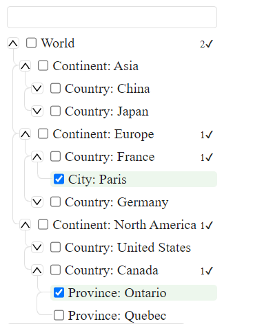
Base view:
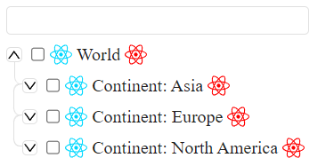
With custom icons:
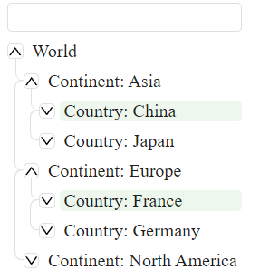
Hide checkbox and selected child count:
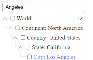
Search mode:
Props
The React Tree Select component accepts the following props:
- tree: An array of objects that represent the hierarchical data that you want to display. Each object should have the following properties:
-
id: A unique identifier for the item. -
label: The display text for the item. -
children: An array of objects that represent the child items of the current item. -
expanded: A boolean that determines whether the child items of the current item are visible or not.
- onChange: A function that is called when the selected items change. It receives the selected items as its argument.
- selectedIds: (optional) An array of the id values of the items that should be selected by default.
- renderIconBefore: (optional) A React element that will be rendered before the item label.
- renderIconAfter: (optional) A React element that will be rendered after the item label.
- targetNodeId: (optional) The id of the DOM element where the component will be rendered.
- hideCheckbox: (optional) A boolean that determines whether the checkboxes should be hidden or not.
- hideSelectedChildCount: (optional) A boolean that determines whether the count of selected child items should be hidden or not.
- loading: (optional) boolean - loading tree state
- asyncSearchCallback: (optional) is a function that is used for asynchronous search operations in the ReactTreeSelect component. This function is expected to return a Promise that resolves to an array of TreeSelectItems:
    const mockApiCall = async (): Promise<TreeSelectItems[]> => await new Promise((resolve) => {
    setTimeout(() => {
        resolve(mockTree);
    }, 1500);
});

const asyncSearchCallback = async (e: string) => await mockApiCall()- asyncLoading: is an optional property. It is of type AsyncLoadingCallback, which is a function that takes a parentNode of type TreeSelectItems as an argument and returns a Promise that resolves with an array of TreeSelectItems.
This property is used for asynchronously loading child elements of a tree. When a node in the tree is expanded, if this property is provided, it will be called with the node as an argument. The function should return a Promise that resolves with the child elements to be added to the tree. This allows for dynamic loading of tree nodes, which can be useful in scenarios where the full tree data is not available upfront or is too large to load all at once. Example:
const asyncLoadingCallback = async (node: TreeSelectItems): Promise<TreeSelectItems[]> => {
    // do something with node
    console.log(node);

    return await new Promise((resolve) => {
        setTimeout(() => {
            resolve([
                {
                    id: 'async1',
                    label: 'Province: Ontario',
                    children: null
                },
            ]);
        }, 1500);
    });
}
Usage
Here is an example of how to use the React Tree Select component:
import React from 'react'
import ReactDOM from 'react-dom'
import {ReactTreeSelect} from './react-tree-select.tsx';
import {TreeSelectItems, TreeSelectProps} from './types';

const mockTree: TreeSelectItems[] = [{
    id: 'world',
    label: 'World',
    children: [
        {
            id: 'continent-1',
            label: 'Continent: Asia',
            expanded: true,
            children: null
        }]
}]
const mockProps = {
    tree: mockTree,
    onChange: (el) => {
        console.log(el);
    },
    selectedIds: [],
    renderIconBefore: <div>Icon Before</div>,
    renderIconAfter: <div>Icon After</div>
}

ReactDOM.render(
    <React.StrictMode>
        // dom element where component will be rendered
        <div id={'TreeSelect'}></div>
        < ReactTreeSelect {...mockProps}
                          targetNodeId={'TreeSelect'}
                          selectedIds={['city-2-1-1']}
        />
    < /React.StrictMode>,
    document.getElementById('root')
)
;
I'm not designer sorry :) but you can reassign colors using CSS variables like these:
--tree-label-hover-color: rgba(0, 0, 0, 0.1);
--tree-label-blue-color: #747bff;
--tree-borders-color: #E0E0E0;
--tree-input-hover: #9FA8DA;
--tree-active-label-color: rgba(76, 175, 80, 0.1);
--tree-default-label-color: #212121;
--tree-empty-background: rgba(63, 61, 61, 0.6);
In this example, mockTree is the hierarchical data that you want to display, and mockProps are the props that you pass to the React Tree Select component. The onChange prop is a function that logs the selected items when they change. The renderIconBefore and renderIconAfter props are React elements that are rendered before and after the item label, respectively. Please adjust the documentation according to your needs.


