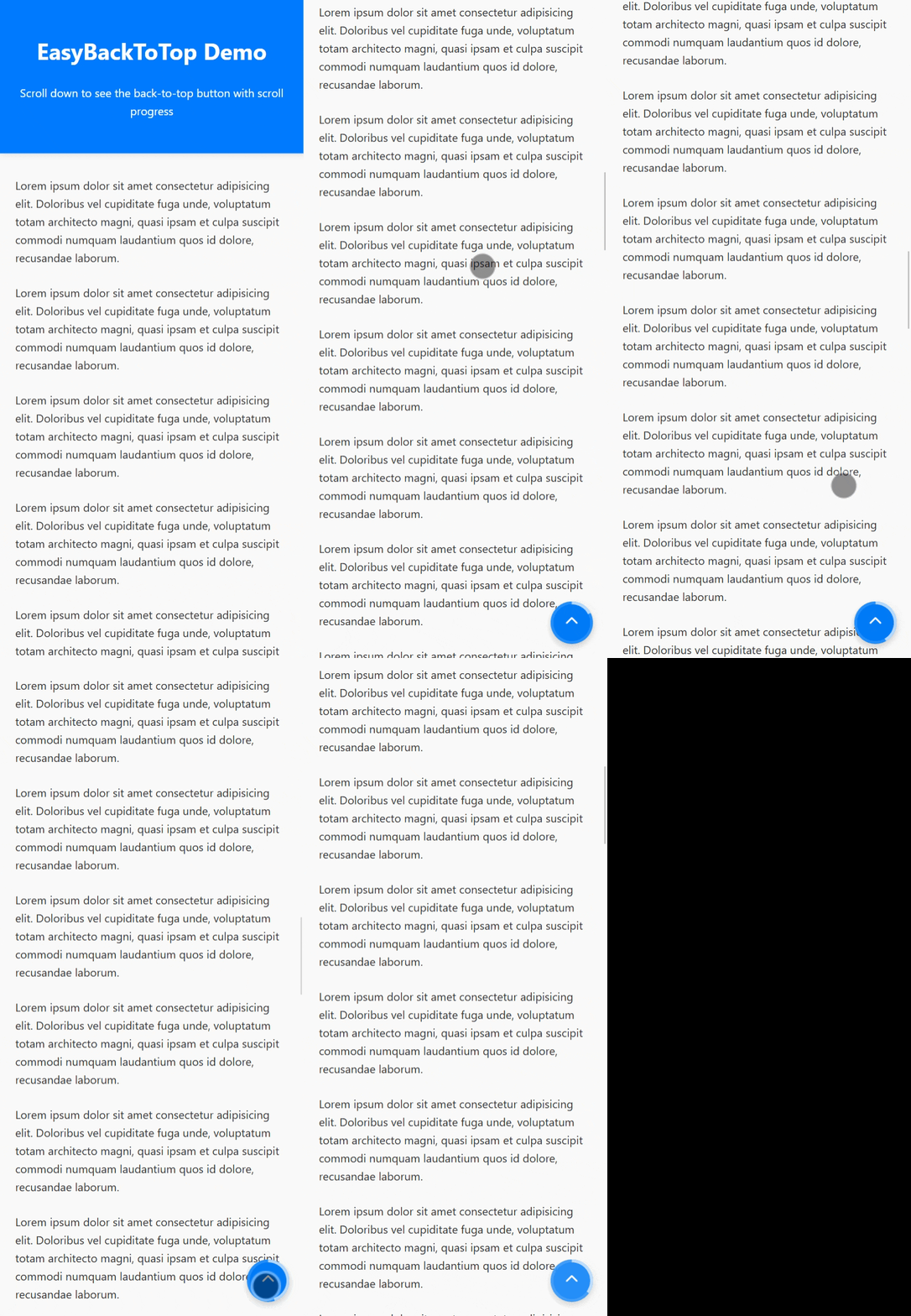
A lightweight, zero-dependency JavaScript utility that adds a smooth "Back to Top" button with optional scroll progress — easily customizable, framework-free, and CDN-ready.
- 📍 Custom button position (
bottom-right,bottom-left) - 🎨 Configurable size, color, and icon
- 📈 Optional circular scroll progress
- ⚡ Zero dependencies
- 🧩 Works with plain JavaScript — no frameworks required
Add this snippet right before the closing </body> tag:
<script src="https://cdn.jsdelivr.net/npm/easy-back-to-top@1.0.0/dist/index.min.js"></script>
<script>
  new EasyBackToTop({
    position: "bottom-right",
    backgroundColor: "#007bff",
    iconColor: "#ffffff",
    size: 60,
    iconSize: 28,
    offset: 150,
    showProgress: true,
    progressColor: "#ffffffaa",
    progressWidth: 4,
  });
</script>| Option | Type | Default | Description |
|---|---|---|---|
position |
string |
"bottom-right" |
Position of the button. Use "bottom-right" or "bottom-left". |
offset |
number |
100 |
Scroll distance (in px) after which the button appears. |
size |
number |
50 |
Size of the button (in pixels). |
backgroundColor |
string |
"#007bff" |
Background color of the button. |
iconColor |
string |
"#fff" |
Color of the arrow icon inside the button. |
iconSize |
number |
24 |
Size of the arrow icon (in pixels). |
zIndex |
number |
9999 |
z-index of the button. Higher means on top of other elements. |
showOnScroll |
boolean |
true |
Whether the button only shows after scrolling past offset. |
showProgress |
boolean |
false |
Show a circular scroll progress ring around the button. |
progressColor |
string |
"#ffffff88" |
Color of the scroll progress ring. |
progressWidth |
number |
3 |
Width (thickness) of the progress ring in pixels. |
