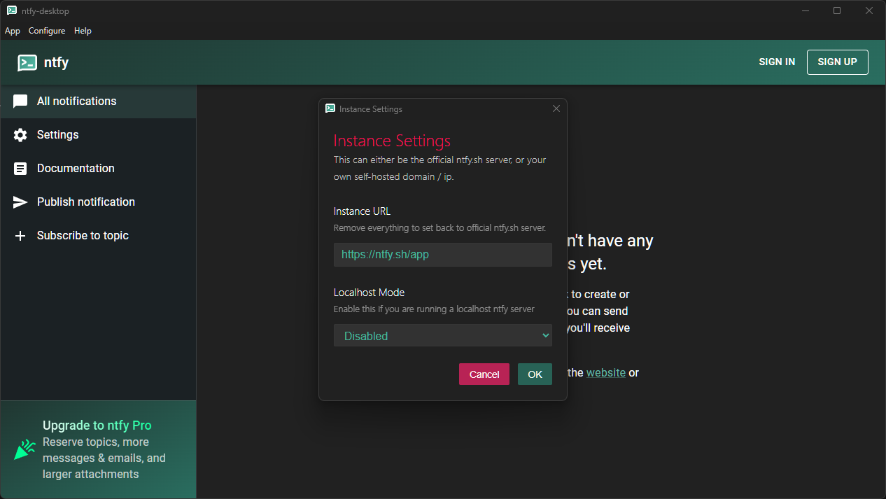
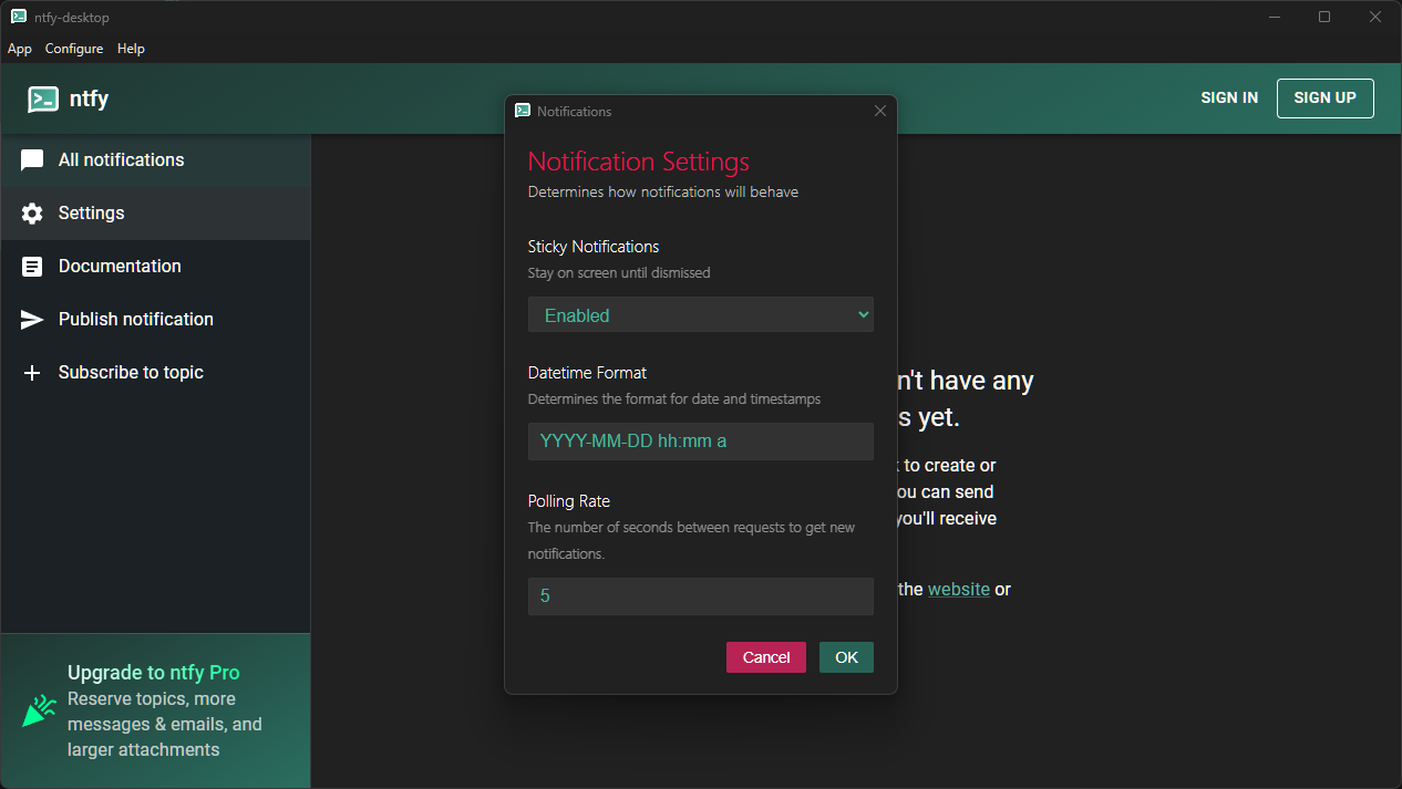
Electron Dialogs is a forked version of custom-electron-prompt, which has been modified to add new functionality, fix bugs, and maintain dependency updates.
This node package was originally developed for Ntfy Desktop
- About
- Example of a Simple Prompt from Input Type
- Usage
- Special Prompt Types
- Options object (optional)
- Contributors ✨
The Electron Dialogs node package allows you to generate dialog boxes / prompts for your electron powered projects.
There are currently 5 types available:
- Input
- Keybind
- Counter
- Select
- MultiInput
There is also an option for a button with user-defined onclick function.
Disclaimer: This node package has had two previous owners:
- 1: Install the npm package to your project directory with
or
npm install electron-plugin-prompts
oryarn add electron-plugin-prompts
bun add electron-plugin-prompts
-
2: Import prompt
const prompt = require('electron-plugin-prompts')
-
3: Create a prompt
prompt([options, parentBrowserWindow])
calling the prompt function returns a Promise
Promise resolve returns the input or returns null if prompt was canceled
On error, Prompise reject returns custom error message
const prompt = require('./prompt');

prompt({
    title: 'Prompt example',
    label: 'URL:',
    value: 'http://example.org',
    inputAttrs: {
        type: 'url'
    },
    type: 'input'
})
.then((r) => {
    if(r === null) {
        console.log('user cancelled');
    } else {
        console.log('result', r);
    }
})
.catch(console.error);Create a prompt with possibly multiple keybind selects
Must specify keybindOptions with valid entries in format:
keybindOptions: [
    { value: "copyAccelerator", label: "Copy", default: "Ctrl+C" }
    { value: "pasteAccelerator", label: "Paste", default: "Ctrl+V" }
]
Return an array made of objects in format
{value: "copyAccelerator", accelerator: "Ctrl+Shift+Insert"}
where accelerator is the input for the value you registered
Code Example
const kb = ($value, $label, $default) => { return { value: $value, label: $label, default: $default } };
prompt({
   title: "Keybinds",
   label: "Select keybind for each method",
   type: "keybind",
   value: "2", // Doesn't do anything here
   keybindOptions: [
   	{ value: "volumeUp", label: "Increase Volume", default: "Shift+PageUp" },
   	kb("volumeDown", "Decrease Volume", "Shift+PageDown"),
   	kb("playPause", "Play / Pause") // (null || empty string || undefined) == no default
   ],
   resizable: true,
   customStylesheet: "dark",
}, win).then(input => {
   if (input)
   	input.forEach(obj => console.log(obj))
   else
   	console.log("Pressed Cancel");
})
.catch(console.error)Create a prompt for selecting numeric values, with integrated + and - buttons
You can specify counterOptions with valid entries in format:
counterOptions: {
    minimum: 0, //defaults to null
    maximum: 250, //defaults to null
    multiFire: true //default to false
}
minimum and maximum of numeric counter, and multifire indicate if continuous input is enabled.
Code Example
prompt({
   title: "Counter",
   label: "Choose a number:",
   value: "59",
   type: "counter",
   counterOptions: { minimum: -69, maximum: null, multiFire: true },
   resizable: true,
   height: 150,
   width: 300,
   customStylesheet: "dark",
}, win).then(input => console.log(`input == ${input}`)).catch(console.error)Create a prompt with a dropdown select menu.
Must specify selectOptions with valid entries in one of the following format:
 selectOptions: ["thisReturn0", "thisReturn1", "thisReturn2"]
 selectOptions: {
    0: "thisReturn0",
    1: "thisReturn1",
    2: "imSelected",
    potato: "thisReturnPotato"
 }
Code Example
prompt({
   title: "Select",
   label: "Choose an option:",
   type: "select",
   value: "2",
   selectOptions: ["thisReturn0", "thisReturn1", "imSelected", "thisReturn3"],
   // 	selectOptions: {0: "thisReturn0", 1: "thisReturn1", 2: "imSelected" , potato: "thisReturnPotato"},
   resizable: true,
   height: 150,
   width: 300,
   customStylesheet: "dark",
}, win).then(input => console.log(`input == ${input}`)).catch(console.error)Create a prompt with multiple inputs. Select inputs can also be used.
Returns an array with with input in same order that was given to the options, for example: multiInputOptions: [{usernameOptions}, {passwordOptions}] could return ["Jack", "61523"]
Must specify multiInputOptions with valid entries in the following format:
multiInputOptions: [{myinputoptions1}, {myinputoptions2}]Code Example
prompt({
   title: "credentials",
   label: "Login Info:",
   type: "multiInput",
   multiInputOptions:
       [
           {
               inputAttrs:
               {
                   type: "email",
                   required: true,
                   placeholder: "email"
               }
           },
           {
               inputAttrs:
               {
                   type: "password",
                   placeholder: "password"
               }
           },
           {
               selectOptions: { na: "North America", eu: "Europe", other: "Other" },
               value: "2"
           }
       ],
   resizable: true,
   width: 300,
   height: 225,
}, win).then(input => console.log(`input == ${input}`)).catch(console.error)
Screenshots
With selectOptions:
Without selectOptions:
This screenshot also contains a custom button.
| Key | Explanation |
|---|---|
| frame | (optional, boolean) Wether to create prompt with frame. Defaults to true. |
| customScript | (optional, string) The local path of a JS file to run on preload. Defaults to null. |
| enableRemoteModule | (optional, boolean) Wether the prompt window have remote modules activated, Defaults to false. |
| customStylesheet | (optional, string) The local path of a CSS file to customize the style of the prompt window, you can use just "dark" to use the premade dark skin. Defaults to null. |
| type | (optional, string) The type of input field, either 'input' for a standard text input field or 'select' for a dropdown type input or counter for a number counter with buttons. or keybind for an electron accelerator grabber. or multiInput to use more than 1 input in a prompt Defaults to 'input'. |
| counterOptions | (optional, object) minimum and maximum of counter, and if continuous input is enabled. format: {minimum: %int%, maximum: %int%, multiFire: %boolean%. min+max values defaults to null and multiFire defaults to false. |
| keybindOptions | (optional, object) Required if type=keybind. represent an array of objects in format: {type: %string%, value: %string%, default: %string%}. default has to be a valid accelerator to work |
| multiInputOptions | (optional, object) an Array of objects having options for every input, format: [{inputAttrs:{type:'email'}},{inputAttrs:{type:'password'}}], [object, object] to use it without passing any options simply [{},{},{}], just create x amount of empty objects to add x inputs. |
| button | (optional, object) adds a button after the success(OK) with a custom label, onClick and attributes. Object format: {label: 'myLabel', click: () => alert("click"), attrs: {style: 'background: black'}}, {label: %string%, click: %function%, attrs: %object%}
|
| Key | Explanation |
|---|---|
| title | (optional, string) The title of the prompt window. Defaults to 'Prompt'. |
| label | (optional, string) The label which appears on the prompt for the input field. Defaults to 'Please input a value:'. |
| buttonLabels | (optional, object) The text for the OK/cancel buttons. Properties are 'ok' and 'cancel'. Defaults to null. |
| value | (optional, string) The default value for the input field. Defaults to null. |
| type | (optional, string) The type of input field, either 'input' for a standard text input field or 'select' for a dropdown type input or 'counter' for a number counter with buttons. Defaults to 'input'. |
| inputAttrs | (optional, object) The attributes of the input field, analagous to the HTML attributes: {type: 'text', required: true} -> <input type="text" required>. Used if the type is 'input'. |
| selectOptions | (optional, object) The items for the select dropdown if using the 'select' type in the format 'value': 'display text', where the value is what will be given to the then block and the display text is what the user will see. |
| useHtmlLabel | (optional, boolean) Whether the label should be interpreted as HTML or not. Defaults to false. |
| width | (optional, integer) The width of the prompt window. Defaults to 370. |
| minWidth | (optional, integer) The minimum allowed width for the prompt window. Default to width if specified or default_width(370). |
| height | (optional, integer) The height of the prompt window. Defaults to 130. |
| minHeight | (optional, integer) The minimum allowed height for the prompt window. Default to height if specified or default_height(160). |
| resizable | (optional, boolean) Whether the prompt window can be resized or not (also sets useContentSize). Defaults to false. |
| alwaysOnTop | (optional, boolean) Whether the window should always stay on top of other windows. Defaults to false |
| icon | (optional, string) The path to an icon image to use in the title bar. Defaults to null and uses electron's icon. |
| menuBarVisible | (optional, boolean) Whether to show the menubar or not. Defaults to false. |
| skipTaskbar | (optional, boolean) Whether to show the prompt window icon in taskbar. Defaults to true. |
If not supplied, it uses the defaults listed in the table above.
The window in which to display the prompt on. If not supplied, the parent window of the prompt will be null.
Create the script with the following template:
module.exports = () => {
    // This function will be called as a preload script
    // So you can use front features like `document.querySelector`
};Adds an extra/custom button with special functionalities other than success or error. Passing a label will update the button's innerHTML, click should be a funtion which will execute onclick, lastly attrs should contain all the attributes that should be added to the button such as custom styles.
Code Example
await prompt({
            title: 'Login credentials',
            label: 'Credentials',
            value: 'http://example.org',
            inputAttrs: {
                type: 'url'
            },
            type: 'multiInput',
            multiInputOptions:
                [{
                    label: "username",
                    inputAttrs:
                    {
                        type: "email",
                        required: true,
                        placeholder: "email"
                    }
                },
                {
                    label: "password",
                    inputAttrs:
                    {
                        type: "password",
                        placeholder: "password"
                    }
                }],
            // customStylesheet: "dark",
            button:
            {
                label: "Autofill",
                click: () =>
                {
                    document.querySelectorAll("#data")[0].value = "mama@young.com";
                    document.querySelectorAll("#data")[1].value = "mysecretrecipe";
                },
                attrs:
                {
                    abc: 'xyz'
                }
            }
}));We are always looking for contributors. If you feel that you can provide something useful to this project, then we'd love to review your suggestion. Before submitting your contribution, please review the following resources:
Want to help but can't write code?
- Review active questions by our community and answer the ones you know.
The following people have helped keep this project going:


