
ember-cli-transformicons


Transformicons for Ember
Installation
ember install ember-cli-transformiconsDemo
https://alexdiliberto.com/ember-cli-transformicons
Transformicon Components
Component API
Add your favorite transformicon component to any template in your application.
Global optional parameters:
animationstring - Set the menu animation type. If you do not provide a specific type for an icon category, then a default type will simply be provided for you. Aliases:a
Menu
Menu optional parameters:
is-openboolean - Set initial open menu state.onclickclosure action - The name of your consuming application's component/controller/route action to handle the transformicon click. Returned with 1 parameterisOpen, which is a boolean type indicating if the current state is open or closed.
animation
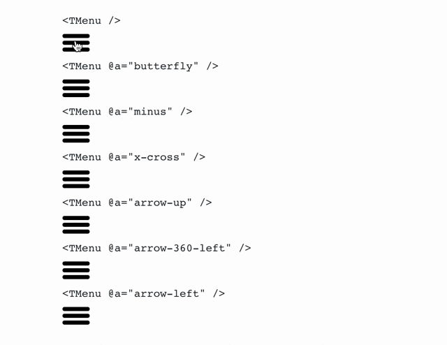
{{t-menu}}{{t-menu animation="butterfly"}}{{t-menu a="minus"}}{{t-menu a="x-cross"}}{{t-menu a="arrow-up"}}{{t-menu a="arrow-360-left"}}{{t-menu a="arrow-left"}}is-open
{{t-menu is-open=true}}{{t-menu is-open=someBoundProperty}}action
{{t-menu onclick=(action "updateMenuAction")}}Grid
Grid optional parameters:
is-openboolean - Set initial open grid state.onclickclosure action - The name of your consuming application's component/controller/route action to handle the transformicon click. Returned with 1 parameterisOpen, which is a boolean type indicating if the current state is open or closed.
animation
{{t-grid}}{{t-grid animation="rearrange"}}{{t-grid a="collapse"}}is-open
{{t-grid is-open=true}}{{t-grid is-open=someBoundProperty}}action
{{t-grid onclick=(action "updateGridAction")}}Add
Add optional parameters:
is-addedboolean - Set initial open add state.onclickclosure action - The name of your consuming application's component/controller/route action to handle the transformicon click. Returned with 1 parameterisAdded, which is a boolean type indicating if the current state is pending add.
animation
{{t-add}}{{t-add animation="minus"}}{{t-add a="check"}}is-added
{{t-add is-added=true}}{{t-add is-added=someBoundProperty}}action
{{t-add onclick=(action "updateAddAction")}}Remove
Remove optional parameters:
is-removedboolean - Set initial open removed state.onclickclosure action - The name of your consuming application's component/controller/route action to handle the transformicon click. Returned with 1 parameterisRemoved, which is a boolean type indicating if the current state is pending remove.
animation
{{t-remove}}{{t-remove animation="check"}}{{t-remove a="chevron-left"}}{{t-remove a="chevron-right"}}{{t-remove a="chevron-down"}}{{t-remove a="chevron-up"}}is-removed
{{t-remove is-removed=true}}{{t-remove is-removed=someBoundProperty}}action
{{t-remove onclick=(action "updateRemoveAction")}}Scroll
{{t-scroll}}Mail optional parameters:
is-openboolean - Set initial open mail state.onclickclosure action - The name of your consuming application's component/controller/route action to handle the transformicon click. Returned with 1 parameterisOpen, which is a boolean type indicating if the current state is open or closed.
{{t-mail}}is-open
{{t-mail is-open=false}}{{t-mail is-open=someBoundProperty}}action
{{t-mail onclick=(action "updateMailAction")}}Form
Form optional parameters:
is-searchingboolean - Set initial searching state.onclickclosure action - The name of your consuming application's component/controller/route action to handle the transformicon click. Returned with 1 parameterisSearching, which is a boolean type indicating if the current state is searching or not searching.
{{t-form}}is-searching
{{t-form is-searching=false}}{{t-form is-searching=someBoundProperty}}action
{{t-form onclick=(action "updateFormAction")}}Video
Video optional parameters:
is-playingboolean - Set initial playing state.onclickclosure action - The name of your consuming application's component/controller/route action to handle the transformicon click. Returned with 1 parameterisPlaying, which is a boolean type indicating if the current state is playing or stopped.
{{t-video}}is-playing
{{t-video is-playing=true}}{{t-video is-playing=someBoundProperty}}action
{{t-video onclick=(action "updateVideoAction")}}Loader
{{t-loader}}Contributing
Please contribute! You can help code, design, update documentation, fix typos, raise issues and so much more.
Any help is welcome and appreciated!
Development
Setup
git clone git@github.com:alexdiliberto/ember-cli-transformicons.gitcd ember-cli-transformiconsyarnServer
ember sTest Suite
yarn test # ember try:each yarn mocha # cross-env DEBUG=ember-cli-addon-tests mocha yarn test:all # ember try:each && mocha test/*-test.js Update Demo App
git checkout gh-pagesrm -rf assets/git commit git checkout masterember github-pages:commit --message "Release v<release_num>"git push origin gh-pages:gh-pagesFor more information on using ember-cli, visit https://ember-cli.com/.