ember-pagination-links

Simple pagination links for ember applications.
This Ember addon creates a simple set of pagination-style links, based on a given count of page numbers to display at once and the number of the final page. It includes navigation arrows for moving to the next and previous pages, and optionally to the first and last pages as well. When the user clicks on a page number, that value will be passed to an action you supply.
The pagination-links component does not manage the data to be displayed on
each page. It is independent of any data store or fetching strategies. You
tell the component how many pages you would like the user to be able to access,
and the component in turn tells you each time the user clicks on a new page
number. It is up to you then how to present the new page, and what models or
other information should be displayed.
Examples
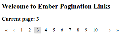
Default appearance
Styled

Installation
Install the addon within your Ember project:
ember install ember-pagination-linksUsage
Define an action to be called when the user changes pages:
Controller;Add a set of pagination links to your template:
{{pagination-links lastPage=42 goToPage=(action 'setPage')}}Options
The following options can be passed to the pagination-links component
to configure it:
Required
lastPage(integer): Highest page number to include.goToPage(callback): Function to call when the user changes pages.
Optional
width(integer, default10): Maximum number of page numbers to display.currentPage(integer, default1): Page number to display initially.firstPageIcon(string, default"«"): Text of the link to the first page.prevPageIcon(string, default"‹"): Text of the link to the previous page.nextPageIcon(string, default"›"): Text of the link to the next page.lastPageIcon(string, default"»"): Text of the link to the final page.ellipsisIcon(string, default"⋯"): Text to display when an ellipsis is required.showFirstAndLast(boolean, defaulttrue): Whether to include links to the first and last pages.showEllipses(boolean, defaultfalse): Whether to show an ellipsis icon between the ends of the page list and the naviation icons, when the first or last page is not included on the list.overflow(string, defaultundefined): Behaviour ofcurrentPagewhen it becomes greater thanlastPage. See Overflow behaviour below.
Overflow behaviour
There are circumstance under which the current page value in the pagination links can become greater than the last page value. Two common examples would be when the user deletes enough entries from the end of the list that the last page decreases, or when the list is filtered so that there are now fewer pages of content than there used to be.
The two most likely responses to such an overflow are to jump to the first or
to the last page in the list. If you want one of these two occur automatically,
you can specify overflow="first" or overflow="last" when creating the
{{pagination-links}} component.
Alternatively, you can omit the overflow parameter and handle this case
yourself by binding the currentPage parameter to a controller property.
Then when you change the last page value, you can update the current page
in whatever manner you please at the same time:
{{! /app/templates/my-page.hbs}}{{pagination-links currentPage=currentPage lastPage=lastPage goToPage=(action 'setPage')}}// /app/controllers/my-page.js// ...inside controller definition { // Perform filtering logic. // Get new last page. const lastPage = Ember; // Set the current page to half-way through the list. Ember; }// ...Styling
Each pagination-links component is wrapped in a div with a class of
.pagination-links. Within this div live anchor tags with classes that
denote their purpose:
a.pagination-links-first, link to the first page (if displayed).a.pagination-links-last, link to the last page (if displayed).a.pagination-links-prev, link to the previous page.a.pagination-links-next, link to the next page.a.pagination-links-page, link to a specific page number.a.pagination-links-current, the current page.span.pagination-links-ellipsis, gap between either end of the list and the corresponding navigation arrows.
Additionally, the first, last, prev and next links may have the class
.disabled in the case that they are not clickable (for instance, you cannot
go to the previous page when already on the first page).
Example
The highlight of the current page in the styled example above can be achieved with the following CSS:
Issues
Please use the issue tracker to report any problems you encounter using this addon.
Development
git clone https://github.com/mikeu/ember-pagination-links.gitcd ember-pagination-linksnpm install
Running
ember serve- Visit the dummy test app at http://localhost:4200.
Running Tests
npm test(Runsember try:eachto test your addon against multiple Ember versions)ember testember test --server
Building
ember build
For more information on using ember-cli, visit https://ember-cli.com/.