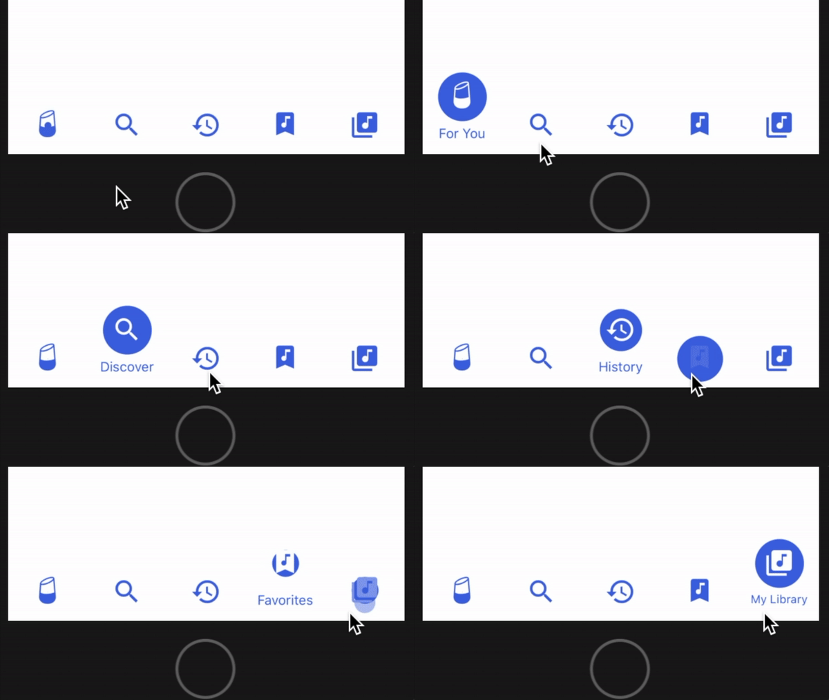
Enhanced Fluid Bottom Navigation Bar
This project improves the customization of 10clouds' fluid tab bar for React Native.
What's New in 0.2.2/0.2.3:
- Fixed and issue where
Zocialicons were not being rendered properly. - Formatting and linting.
- Optimized dependencies.
Changelog:
- Added Expo compatibility by removing
react-native-view-overflowand the need to link it. - Added integrated vector icons via @expo/vector-icons so you don't have to supply your own icons.
- Tab bar now auto-selects first tab index on mount (this behavior is customizable).
- Tab bar background color is now fully customizable.
- Icon highlight color on select is now fully customizable.
- Icon font size and font family is now fully customizable.
- Deprecated the ability to provide image sources for icon images.
- Removed example project in favor of expanded usage documentation.
- Fixed an issue where the default font family causes an
expo-fonterror in newer versions of Expo. - Fixed an issue where font scales poorly for long tab names when font size is not specified.

Installation
yarn (recommended)
yarn add enhanced-fluid-bottom-navigation-bar
npm
npm i enhanced-fluid-bottom-navigation-bar
Usage
Rendering Component
This component requires just 2 props:
onPress: a function that should handle rendering tabs.values: an array of objects that contains the title and icon properties for each tab.
<TabBar onPress={tabIndex => { this._handlePress(tabIndex) }} values={[ { title: 'News', // required icon: 'news', // required iconSet: 'Entypo', // required size: 32 // required (icon will be size x size) } ]}/>Look up valid icon names and their corresponding icon set at the @expo/vector-icons directory.
Integration with react-navigation
- Define a custom component that renders
TabBarwith thevaluesyou want. React's tab navigator will passnavigationandonTabPressprops to your component when hooked up; use these to implement theonPresscallback to navigate to the appropriate route:
import TabBar from 'enhanced-fluid-bottom-navigation-bar';class FluidTabBar extends Component {render() {return (<TabBaronPress={tabIndex => {const route = this.props.navigation.state.routes[tabIndex];this.props.onTabPress({route});}}values={[{title: 'Tab 1',icon: 'star',iconSet: 'MaterialIcons',size: 32}, {title: 'Tab 2',icon: 'check',iconSet: 'AntDesign',size: 32}]}/>);}}
In this case, pressing a tab in FluidTabBar navigates to the route that shares the same array index.
- Create a tab navigator and supply our custom component to
tabBarComponent.
;const myTabNavigator =;
- Create an app container from your tab navigator and use it as your top-level component.
;const myAppContainer =
Customization
| Prop | Type | Default | Description |
|---|---|---|---|
| tintColor | String | rgb(76, 83, 221) | Icon bubble background color and text color. |
| selectColor | String | rgb(255, 255, 255) | Icon tint or highlight color when selected. |
| backgroundColor | String | rgb(255, 255, 255) | Tab bar background color. |
| autoSelect | Number | 0 | Auto-selects the tab at this index on mount. |
| fontSize | Number | undefined | Font size for tab captions. |
| fontFamily | String | undefined | Font family for tab captions. |
NOTE: fontSize and fontFamily default to React Native's standard font size and font face.
Author
Original Author: Patryk Mierzejewski
Modifications By: Victor Li
License
Available under the MIT license. See the LICENSE file for more info.


