React Component Generator
Component Development Kit for React
This is a fork of react-cdk with some modifications.
- Add editorconfig
- Remove .npmignore file and modify package.json to only add lib folder to npm package if you wants add more files to package of npm files option in package.json
- Add karma for test with browser
- Add coverage for test with istanbul with isparta
- Add babel-stage-0, yes I'm early adopter
The feature of React CDK:
- Create a project with a single command.
- Write your component in ES2015+ syntax.
- Develop in a live environment with React Storybook.
- Write tests with Mocha and Enzyme.
- Use ESLint with the Airbnb style guide.
- Publish correctly transpiled code into NPM.
- Deploy your storybook to GitHub Pages.
- Get updates to core building tools.
TOC
- Getting Started
- Developing Your Component
- Testing
- Lint Rules
- Publishing
- Deploying Storybook
- CSS and Styles
- Updating Your Component with React CDK
- Customizing the Component
Getting Started
Install React Comp with the following command:
npm install -g yo generator-react-comp
React Comp comes as a yeoman generator, which allows you to scaffold your component quickly.
Then, create your first component library with the following command:
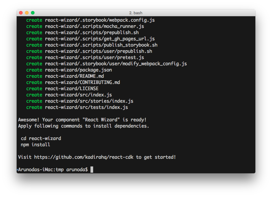
yo react-comp react-wizard

React CDK will create a directory called react-wizard with all the files you need to get started.
Visit that directory and install the NPM dependencies:
cd react-wizard
npm install
By default, this project contains a simple button created with React. It also includes tests and React Storybook stories so you can get ideas for writing your own stories.
Developing Your Component
Now we need to work with the component. Your component lives under the src directory. Open src/index.js in your favorite editor and start developing.
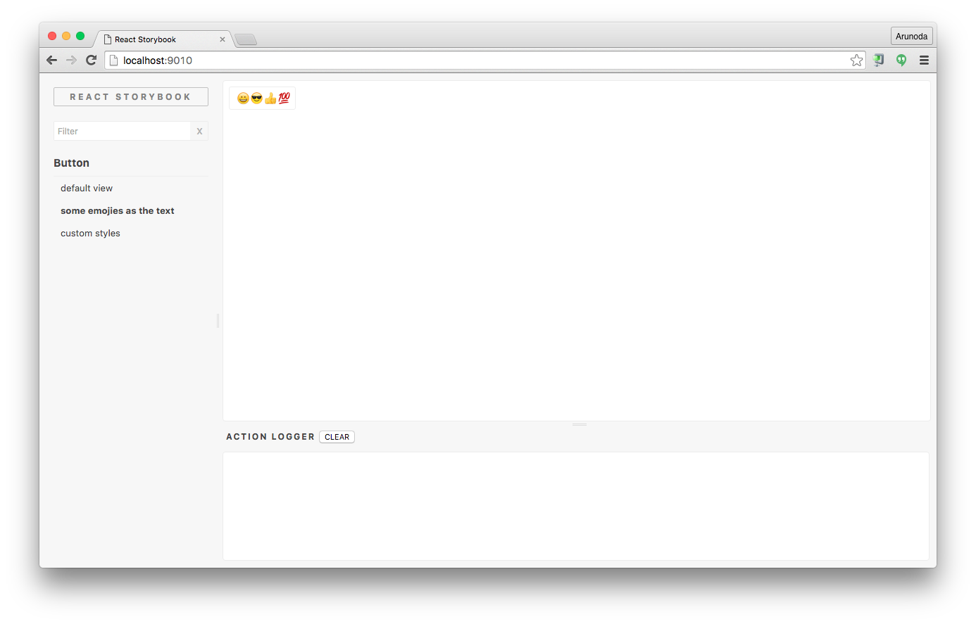
Now, it’s time to start the Storybook so we can see what we are building:
npm run storybook
The above command starts the Storybook console on http://localhost:9010.

You can see changes you make while you are editing your component. Visit React Storybook repo to learn more.
You can write your component in ES2015+ syntax. It supports react and babel-stage2 presets.
Testing
You can write your tests inside the src/tests directory. By default, the project comes with two test cases demonstrating how to write tests. React CDK configures your component with Mocha, Enzyme, jsdom, and other essential JS testing tools.
This is the ideal way to write React tests.
You can run tests with the following commands:
npm run test(run tests once)npm run test:watch(run tests and watch for changes)npm run test:karma(run test with karma and phantom and return coverage of test)
Lint Rules
Your project is configured with ESLint based on the Airbnb JavaScript style guide with some minor changes.
You can apply lint rules with the following commands:
npm run lint(apply lint rules)npm run lint:fix(apply lint rules and fix some common issues)
Publishing
Now it’s time to publish your component to NPM. Before you publish, make sure you’ve customized the following files as necessary:
- package.json
- README.md
- CONTRIBUTE.md
- LICENSE
If everything is okay, simply publish your component to NPM with the following command:
npm version [patch || minor || mayor] -m "Comment version, %s"
npm publish
This command will transpile your component for ES5 before publishing it to NPM. Your component will work on any JavaScript environment.
Deploying Storybook
You will usually write your stories while you are developing your component. That allows you to use your storybook as a living document. You could show what your component looks like and different ways to use it.
Then you can simply deploy it to GitHub Pages with the following command:
npm run storybook:publish
You can link your Storybook URL inside the README file.
Here’s a sample component listing a Storybook URL.
You can also publish your storybook automatically when you publish your component to NPM. To do that, simply add the following NPM script to your package.json file:
"scripts": ... "postpublish": "npm run storybook:publish" ... CSS and Styles
It’s common to include CSS and Styles with your component. There are many ways to do this. Some prefer to write CSS in JS, while some provide a CSS file that lives inside the repo.
CSS in JS
With this approach, you don’t need to configure anything. You can just use it. However, you should make sure you accept some external styles, which allows the end user to change the look and feel of your component as needed.
Plain old CSS files
If you are following this approach, make sure to place your CSS files inside the root of your component and not inside the src directory. Then, your end users can import it like this:
You may also need to load this style sheet inside your stories. Simply import the above style sheet into src/stories/index.js with the following command:
import '../../style.css'
Updating Your Component with React CDK
This is a plain NPM module without any magic. However, it’s written in a way that allows us to push updates to your repo.
You never need to worry about updating dependencies and build tools. React CDK will take care of that.
First, update React CDK with the following command:
npm install -g generator-react-comp
Then, visit your project and apply the following command:
yo react-comp:update
This will update the core build tools and the package.json file for dependencies.
It won’t update dependencies you’ve added; it will only update the dependencies and NPM script React CDK has added.
Customizing the Component
Since your component is a plain NPM module, you can customize it any way you want. Here are some ways to do so:
Add dependencies
You can add dependencies to the package.json file as needed.
Change the JavaScript environment
Sometimes you may want to use cutting-edge JavaScript features. You can simply add the necessary Babel preset and change the .babelrc file.
Change other dotfiles
You can change any of the dotfiles, including .gitignore. The React CDK update process won’t update these files.
Customize Storybook
Sometimes you may need to customize your React Storybook. If you do, you’ll usually customize the .storybook/webpack.config.js file. We don’t allow changes to that file directly in React CDK.
Instead, you can edit the .storybook/user/modify_webpack_config.js file.
Add some pre-publish code
React CDK already uses the NPM pre-publish hook, so you won’t be able to use it directly. Instead, you can use .scripts/user/prepublish.sh to add your own code.
Configure test utilities
We have included JSDOM(to support enzyme's full DOM rendering) and Babel configurations before running Mocha tests. If you want to add more stuff, simply use the .scripts/user/pretest.js file.
Configure something else
You can configure this project in many ways. Give it a try, and I bet you can do it without our help. If you need help from the core React CDK tools, just create an issue.