getmdl-select
Material Design Lite selectfield component material-design-lite
Live Example
Check out the example
Install
There are three ways to install getmdl-select:
-
Using npm: Use this command in your command line:
npm install getmdl-select -
Using Bower: Use this command in your command line:
bower install getmdl-select -
Clone the repo using Git:
git clone https://github.com/CreativeIT/getmdl-select.git(Alternatively you can download this repository.) And then:
cd getmdl-selectnpm install
Basic use
To use any MDL component, you must include the minified CSS and JavaScript files using standard relative-path references in the <head> section of the page, as described in the MDL Introduction.
<!-- getmdl --> <!--getmdl-select--> Example
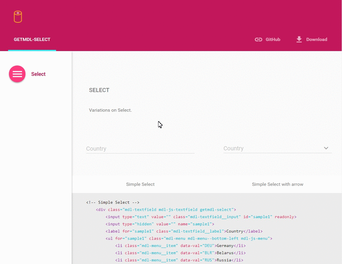
Simple select field. To see other examples visit this page.
Сountry Belarus Brazil France Germany Russia Important
If you want to use more than one getmdl-select item use different ids for inputs and don't forget to change ul and label's for attributes. It works wrong without this.
Configuration options
Dynamically usage
For dynamically usage, you must add getmdlSelect.init(cssSelector) in javascript code, (where cssSelector, for example, is ".getmdl-select" or "#mySelect"), after new item is created or any new element added to existing list.
data-val
Every li should have its own data-val attribute. Choosing any element of select you change value of hidden input as data-val property of corresponding
li. Also you change value of readonly input to li.textContent. Then after form submit, next pair hiddenInputName=hiddenInputValue will send to server side.
Pre-selected item
To set pre-selected value add data-selected="true" attribute to corresponding li in your list.
Width
Initial Select takes the default width (300px). You can change it by overriding the CSS property width.
Height
Options list automatically adapt to the maximum height by content. If you want to use small height (300px) and see scroll bar, add class getmdl-select__fix-height.
LICENSE
See the LICENSE file for license rights and limitations (MIT).
Support the project
- Star the repo
- Create issue report or feature request
- Tweet about it
- Follow us on Twitter