<gradient-button>
This is a gradient button with the attractive colours and hover effects and is created by using vanilla web component.

ButtonButtonInstall the Polymer-CLI
First, make sure you have the Polymer CLI installed. Then run polymer serve to serve your element locally.
Viewing Your Element
$ polymer serve
Avaliable in various colours
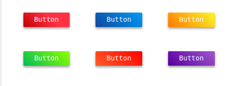
ButtonButtonButtonButtonButtonButtonIn round borders
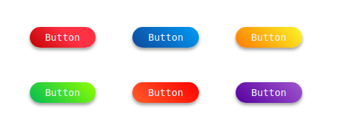
ButtonButtonButtonButtonButtonButtonContributing
- Fork it!
- Create your feature branch:
git checkout -b my-new-feature - Commit your changes:
git commit -am 'Add some feature' - Push to the branch:
git push origin my-new-feature - Submit a pull request :D
Browser Support
Using the webcomponents.js:
 |
 |
 |
 |
 |
 |
|---|---|---|---|---|---|
| Latest ✔ | Latest ✔ | Latest ✔ | Latest ✔ | 11+ | Latest ✔ |