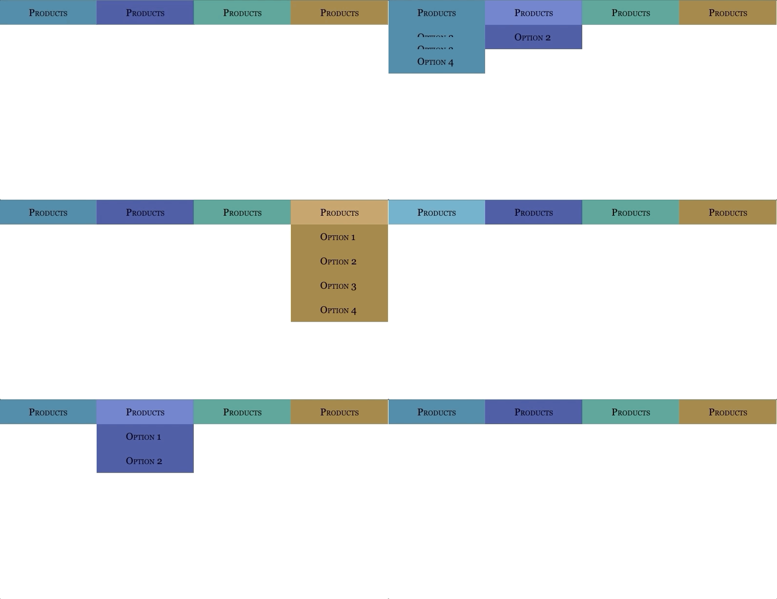
Izidropdown
This is an open source project based on a module to easly implement customizable drop-down menus.

Installation
First you will need to install this module.
npm install izidropdown --save-dev
In order to import and use this module from within JavaScript, you need to install and add the style-loader and css-loader to your module configuration.
npm install --save-dev style-loader css-loader
Also you need to install and add the sass-loader.
npm install sass-loader sass webpack --save-dev
Add the SASS module into your module configuration.
module.exports = {
  module: {
    rules: [
      {
        test: /\.s[ac]ss$/i,
        use: [
          // Creates `style` nodes from JS strings
          'style-loader',
          // Translates CSS into CommonJS
          'css-loader',
          // Compiles Sass to CSS
          'sass-loader',
        ],
      },
    ],
  },
};
Getting Started 🎯
Import the scss file that comes within the module into your index.js file, this file add animations requiered for the dropdown menus also add some pre-defined styles. Depending on where you index.js file is located, you have to specify the path of the scss module file. In this case we assume that the index.js file is inside the src folder.
import '../node_modules/izidropdown/scss/style.scss';
Next you have to import the Menu object from the module.
'import Menu from 'izidropdown';'
Usage
JS
You will have to define an instance of the object.
const menuObj = Menu;
This module was created with simplicity in mind, so you only need one line of code to get this working.
menuObj.scanForMenu();
By default, the multiselection is enabled when the instance is defined. To change this you could type this.
menuObj.allowMultiSelect(false);
It's done, that is all the JavaScript we have to implement to get this menu working.
HTML
This module works making use of classes like popular frameworks like bootstrap, also makes use of z-index property. In order to implement the desplegable menu you have to define a container for the menu and inside this container you need to implement another containers for each option. The menu has a maximum of 10 options.
<div class="drop-box-cont">
  <div class="opt default">
    <h3>Products</h3>
  </div>
  <div class="opt  opt-1">
    <h3>Option 1</h3>
  </div>
  <div class="opt  opt-2">
    <h3>Option 2</h3>
  </div>
  <div class="opt  opt-3">
    <h3>Option 3</h3>
  </div>
  <div class="opt  opt-x">
    <h3>Option 4</h3>
  </div>
</div>
Style
You can add the pre-defined styling that comes with the module, to do that you just have to add the class 't-x' to the menu container, there 4 themes that you can use.
<div class="drop-box-cont t-1">
  ...options
</div>
<div class="drop-box-cont t-2">
  ...options
</div>
<div class="drop-box-cont t-x">
  ...options
</div>
Future Implementations ⏩
- Add multiple animation options.
- Implement more predefined themes.
- Add the classes that define the animations directly from the JS without the need to import a scss or css file.
Built With
- Webpack
- ES6
- SASS
Live Demo
Live Demo Link 🚀 also there's an example inside the example/dist folder, just drop the index.html into your web browser, you can also check the implementation in the example/src/index.js diretory.
Automated Tests 👾
There are no automated tests for this project, they will eventually be added.
Authors
👤 David Elí
- Github: @davitomix
- Twitter: @davitomix007
- Linkedin: David Garcia
🤝 Contributing
Contributions, issues and feature requests are welcome!
Feel free to check the issues page.
Show your support
Give a ⭐️ if you like this project!
📝 License
ISC.