mantine-tag-input
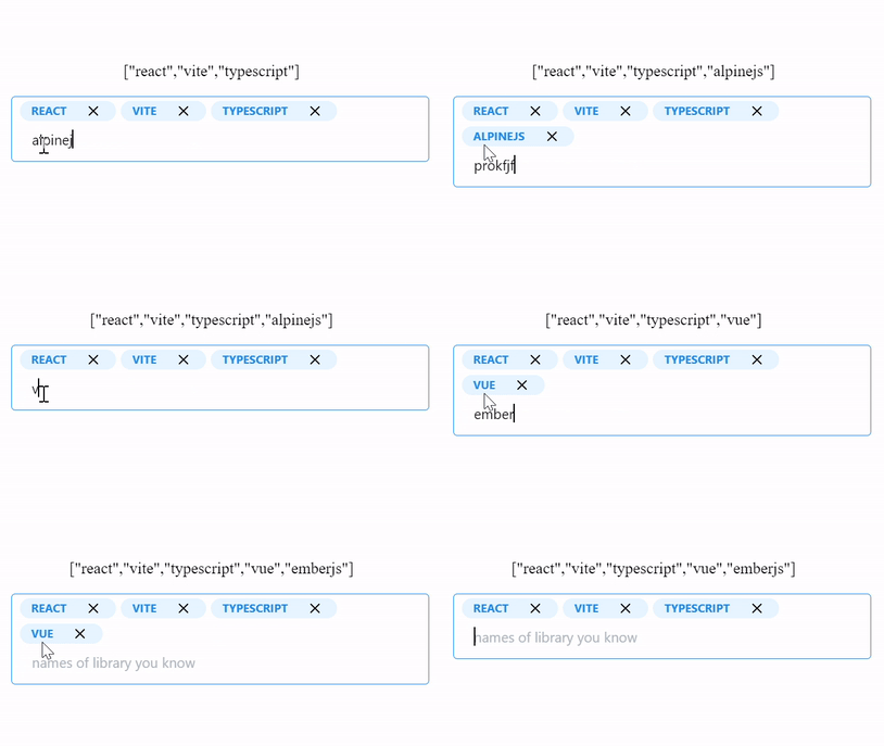
A react tag input built on mantine component library and it adapts well with the theme of the library.
Installation
To start using mantine Tag Input in your React project, follow these simple steps:
- Install the package via npm or yarn:
bash
npm install mantine-tag-inputor
bash
yarn add mantine-tag-inputor
bash
pnpm add mantine-tag-input- Import the component in your desired file:
javascript
import { TagsInput } from 'mantine-tag-input';Props
name (optional)
- Type:
string - Default:
undefined
The name prop allows you to specify the name attribute for the input field. This can be useful for form submission or accessing the input value via JavaScript.
placeHolder (optional)
- Type:
string - Default:
undefined
The placeHolder prop defines the placeholder text that appears in the input field when no tags are present.
value (optional)
- Type:
string[] - Default:
[]
The value prop accepts an array of strings representing the initial tags to be displayed in the input field.
onChange (optional)
- Type:
(tags: string[]) => void - Default:
undefined
The onChange prop is a callback function that is triggered whenever there is a change in the tags. It receives an array of strings representing the updated tags as a parameter.
onBlur (optional)
- Type:
any - Default:
undefined
The onBlur prop allows you to define a function that is called when the input field loses focus.
separators (optional)
- Type:
string[] - Default:
undefined
The separators prop allows you to specify an array of strings that will act as separators for creating multiple tags. By default, the tags are separated by commas.
disableBackspaceRemove (optional)
- Type:
boolean - Default:
false
The disableBackspaceRemove prop, when set to true, prevents the removal of tags by pressing the Backspace key.
onExisting (optional)
- Type:
(tag: string) => void - Default:
undefined
The onExisting prop is a callback function that is triggered when an existing tag is added. It receives the added tag as a parameter.
onRemoved (optional)
- Type:
(tag: string) => void - Default:
undefined
The onRemoved prop is a callback function that is triggered when a tag is removed. It receives the removed tag as a parameter.
disabled (optional)
- Type:
boolean - Default:
false
The disabled prop, when set to true, disables the input field and prevents any further interaction with the component.
isEditOnRemove (optional)
- Type:
boolean - Default:
false
The isEditOnRemove prop, when set to true, allows users to edit tags after they have been added.
beforeAddValidate (optional)
- Type:
(tag: string, existingTags: string[]) => boolean - Default:
undefined
The beforeAddValidate prop allows you to define a validation function that is called before a tag is added. The function receives the tag to be added and the existing tags as parameters, and should return a boolean value (true to allow the addition and false to prevent it).
onKeyUp (optional)
- Type:
(e: React.KeyboardEvent<HTMLInputElement>) => void - Default:
undefined
The onKeyUp prop is a callback function that is triggered when a key is released within the input field.
size (optional)
- Type:
'xs' | 'sm' | 'md' | 'lg' | 'xl' - Default:
undefined
The size prop allows you to specify the size of the input field. It accepts one of the following values: 'xs', 'sm', 'md', 'lg', or 'xl'.
error (optional)
- Type:
React.ReactNode - Default:
undefined
The error prop allows you to display an error message below the input field. It accepts a React node as a value.
badgeProps (optional)
- Type:
BadgeProps - Default:
undefined
The badgeProps prop allows you to pass mantine badge props to the badge component.
closeButtonProps (optional)
- Type:
CloseButtonProps - Default:
undefined
The closeButtonProps prop allows you to pass mantine close button props to the close button component.
Example Usage
import { MantineTagsInput } from 'mantine-tag-input';

const MyComponent = () => {
  const handleTagChange = (tags) => {
    // Handle tag change logic here
  };

  const handleTagRemove = (tag) => {
    // Handle tag removal logic here
  };

  return (
    <MantineTagsInput
      name="tags"
      placeHolder="Enter tags..."
      value={['tag1', 'tag2', 'tag3']}
      onChange={handleTagChange}
      onRemoved={handleTagRemove}
      separators={[' ', ',']}
      disableBackspaceRemove={true}
      isEditOnRemove={true}
    />
  );
};
