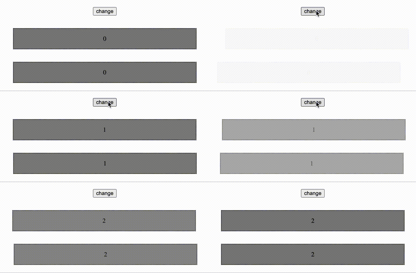
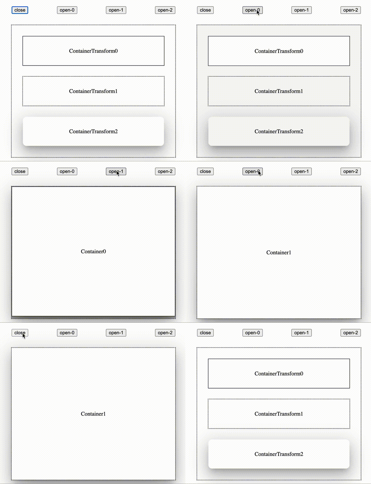
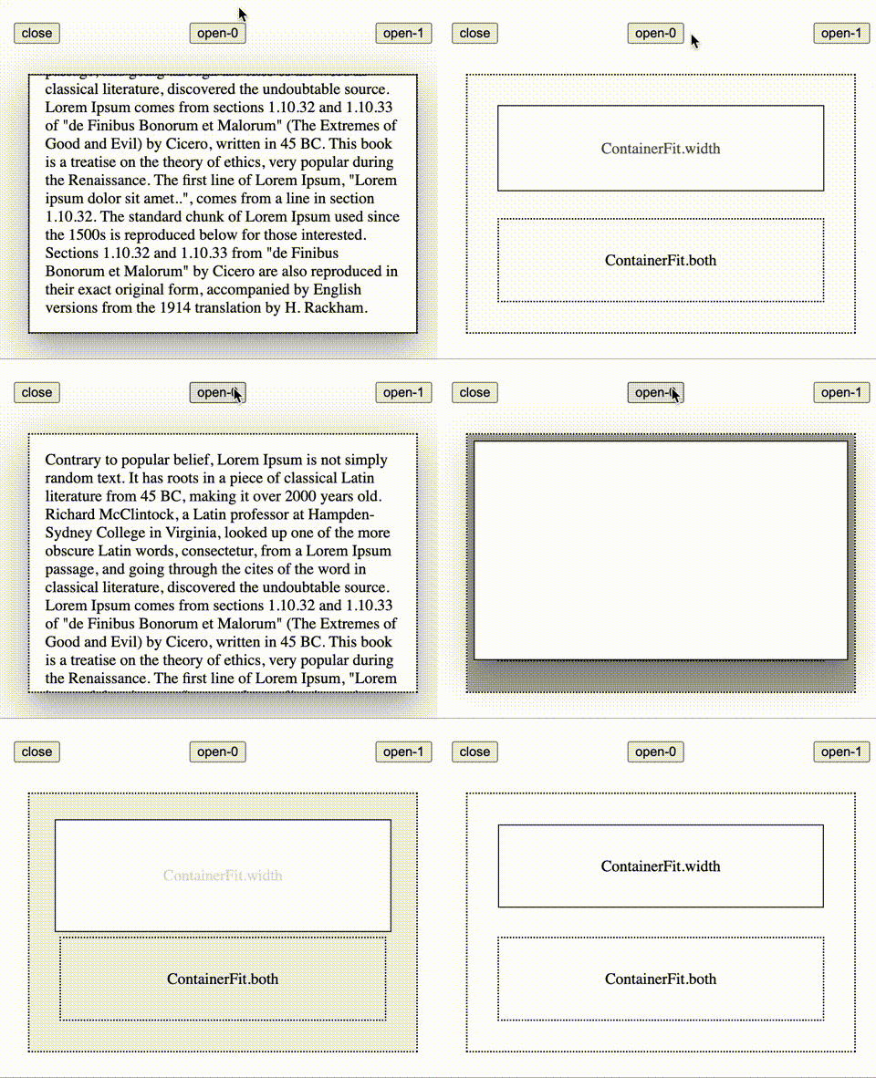
This component provide material design(v2) transform for html element under react-dom framework.
- Tip: you can continue to toggle animation even animation is running.
npm i material-design-transformimport { SharedAxis, SharedAxisTransform } from "material-design-transform";
import { FadeThrough } from "material-design-transform";
import {
ContainerTransform,
ContainerTransformLayout,
} from "material-design-transform";const [id, setId] = React.useState(0);
<SharedAxis transform={SharedAxisTransform.fromTopToBottom} keyId={id}>
{children}
</SharedAxis>;
<FadeThrough keyId={id}>{children}</FadeThrough>;- New component only render after the old component exit animation completed.
- Switch animation (SharedAxis / FadeThrough) state is toggled by properties changing and
transitionendevent ofopacity. If opacity animate to 0 and toggle transitionend event that mean exit animation end. And if opacity animate to 1 and toggle transitionend event that mean enter animation end. Break transitionend event of opacity may break the component function.
const [id, setId] = React.useState(undefined);

<ContainerTransformLayout keyId={id}>
  ...
  <ContainerTransform
    keyId={0 /* when [id] equal 0 */}
    container={<ElementShowOnExpanded />}
  >
    <ElementShowOnClosed />
  </ContainerTransform>
  ...
  <ContainerTransform
    keyId={1 /* when [id] equal 1 */}
    container={<ElementShowOnExpanded />}
  >
    <ElementShowOnClosed />
  </ContainerTransform>
  ...
</ContainerTransformLayout>;- If ContainerTransformLayout's keyId
matchesone ContainerTransform's keyId, the ContainerTransform's container will be expanded with animation. - ContainerTransform's keyId should be
uniqueunder same ContainerTransformLayout. - ContainerTransform's children should be available to render two same element on single document at the same time. Or use ContainerTransform-
mockto create a mock element for animation. - ContainerTransform's
relative position/size/children/propsshould not change when animation is running. - ContainerTransformLayout itself should not have any border (but outline is ok).
- ContainerTransform itself should not have any padding or any border (but outline is ok).
- ContainerTransform's animation
motion track(only linear track) is different from origin material design because it only use css transition for animation that animation is limited by css. - ContainerTransform's
box-shadowandborder-radiuscan be animated during animation. - By default ContainerTransform will animate to match ContainerTransformLayout size and position, but you can edit overlayPosition of ContainerTransformLayout to custom animation target.
Change keyId to toggle switch animation. Only keyId change will toggle animation.
-
fit- how the ContainerTransform'schildren/mockfit in ContainerTransform when animating -
containerFit- how the ContainerTransform'scontainerfit in ContainerTransform when animating
import { ContainerTransformLayout } from "material-design-transform";import { ContainerTransformLayout } from "material-design-transform/legacy-container-transform";The different between new ContainerTransform and LegacyContainerTransform is that:
- LegacyContainerTransformLayout - the container will change its
sizeduring animation - ContainerTransformLayout - the container do not change its size during animation (but just transform)
Size changing may cause re-layout of ContainerTransform-container's content, user by own should keep the layout consistent in different size during animation that is not easy.
So new ContainerTransformLayout only use transform. If ContainerTransformLayout's size don't change, the container's size would not change. So that user no longer need to care about layout problem during animation under new ContainerTransformLayout. Take advantage of ContainerTransform-containerFit to unlock more animation styles (check out demo).
Waiting google release precise motion guide.
git clone https://github.com/JohnGu9/MaterialDesignTransform.git
cd MaterialDesignTransform
npm i
npm run storybookResizeObserver support
| Browser | Version (or newer) |
|---|---|
| Chrome | 64 |
| Edge | 79 |
| Firefox | 69 |
| Safari | 13.1 |
| Safari on iOS | 13.4 |
- react-dom
- react-ref-composer


