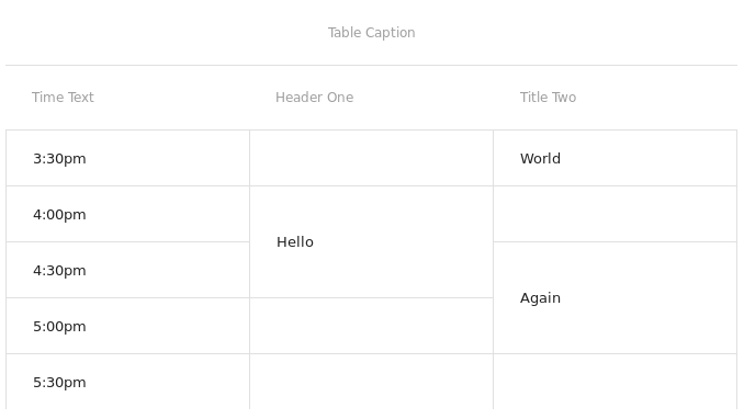
Material-UI Day Time Table
A flexible Material-UI component that displays information in the style of a day-planner. It prevents the pain of manually specifying colspan values.

1.0
This component is considered feature-complete, and stable. It is being used in production, and is actively supported, but no new features are under development.
Table of Contents
Install
npm i material-ui-day-time-table
Usage
This component is pretty flexible. It allows you to style your tables how you wish, while also trying to remain flexible with the format of your data. To accomplish this, there are a number of trivial functions which you must supply for how to access the data.
<DayTimeTable
  caption="This is the table caption"
  cellKey={key}
  calcCellHeight={calcHeight}
  showHeader={displayHeader}
  showCell={displayCell}
  showTime={showTime}
  isActive={isActive}
  toolTip="Table has tooltip"
  max={max}
  min={min}
  data={basic}
  rowNum={(max-min)/interval}
  valueKey="values"
/>
See storybook for demos, and storybook source for reference. It's quite simple. There are examples using Moment.js for nice times.
The source is the definitive reference.
Contribute
PRs accepted. 🍺