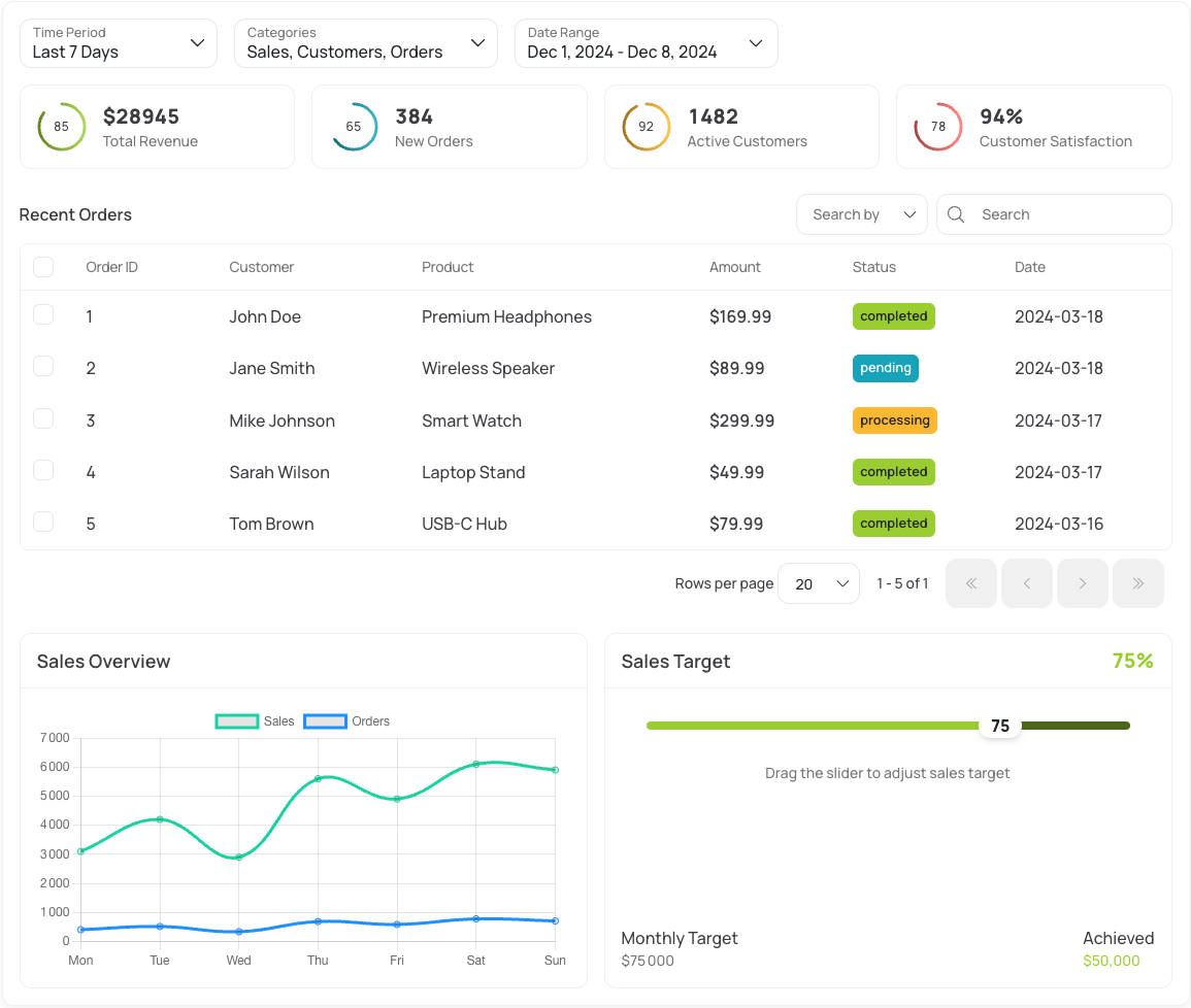
Example of a dashboard built with Maz UI components
- 🎯 Cherry-pick components - Use only what you need
- 🌙 Dark mode - Built-in dark mode support
- 🎨 Themeable - Easy to customize with CSS variables
- 📱 Responsive - Mobile-first design approach
- 🔧 TypeScript - Full type support included
- ⚡️ Lightweight - Tree-shakeable, no bloat
- 🔍 SSR - Server-side rendering ready
npm install maz-ui// main.ts
import 'maz-ui/styles'Then, import and use only the components, composables, and more you need:
<template>
  <MazBtn>Click me!</MazBtn>
</template>

<script setup lang="ts">
  import MazBtn from 'maz-ui/components/MazBtn'
</script>
Use provided resolvers to enjoy auto-imports and TypeScript support: Resolvers documentation
The Nuxt module automatically:
- Imports all components, plugins, composables and directives on-demand (auto-imports)
- Includes required styles
- Provides TypeScript support out of the box
See options and more in the documentation
// nuxt.config.ts
export default defineNuxtConfig({
  modules: ['maz-ui/nuxt'],
})No need to import components, plugins, composables or directives, they are all auto-imported.
<template>
  <MazBtn @click="toast.success('Hello Maz UI!')"> Click me! </MazBtn>
</template>

<script setup lang="ts">
  const toast = useToast()
</script>Customize Maz UI to match your brand with our dedicated CLI tool:
# Install the CLI
npm install -g @mazui/cli

# Generate your theme
maz generate-css-vars
The CLI will automatically:
- Generate all color variations
- Create dark mode variables
- Output a ready-to-use CSS file
To know how configure the CLI, check theming options in our documentation.
- 🧩 Components - Beautiful, accessible UI components
- 🔌 Plugins - Powerful plugins for common use cases
- 🎣 Composables - Reusable composition functions
- 📏 Directives - Useful Vue directives
- 🛠️ Helpers - Useful utilities for common tasks
We're always looking for contributors! Check out our contribution guide to get started.
Built with ❤️ by Louis Mazel


