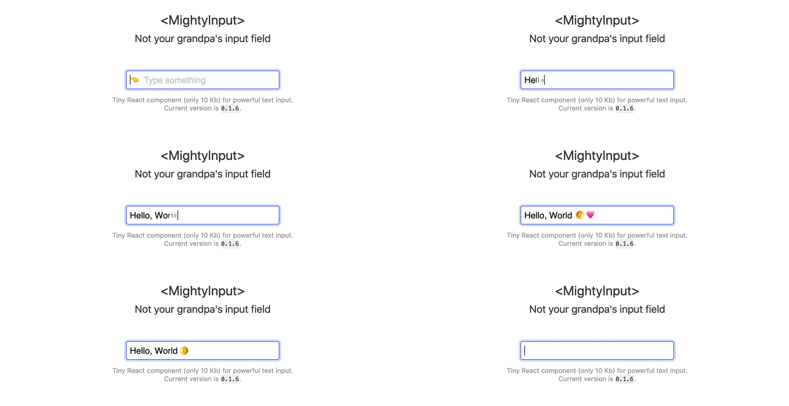
Mighty Input
Tiny React text input component for the modern web. Use HTML to decorate
<input /> value for your goals.

👇 Source of the preview 👆
{ const render = Array ; return <MightyInput value=value render=render ...props/> ;} { }CSS could be found in examples folder.
Installation
npm i mighty-inputLive examples
Usage
Use render property to specify custom render method and receive changed via onUpdate property callback.
<MightyInput render= <span style=borderBottom: '2px solid green'> value </span> } onUpdate= { // Value changed }/>Filter value
Use filter prop to specify input filter function.
Filtrate any non-digit values:
<MightyInput filter= { if /^\d$/ return next; else return prev; }/>API
render()
(next:string, previous:string) -> string|React.Element
Render property is a function to transform value to HTML or another string. This function receives next and previous values of input field.
<MightyInput render= <span style=color: 'red'>next</span> />filter()
(next:string, previous:string) -> string
Filter property is a function to filtrate input and return new output value. This function receives next and previous values of input field.
<MightyInput filter= nextlength < 10 ? next : prev />onUpdate()
(next:string, previous:string) -> void
Update event handler. It emits each time value (passed through filter) changes.
modifiers{}
{
  focus:string = '--focus',
}
Modifers property is an object with CSS classes for different states. It's using to simulate native CSS behavior for input wrapper. Currently it only has one option: focus.
References
MightyInput is inspired by Colin Kuebler's LDT.
License
MIT © Rumkin