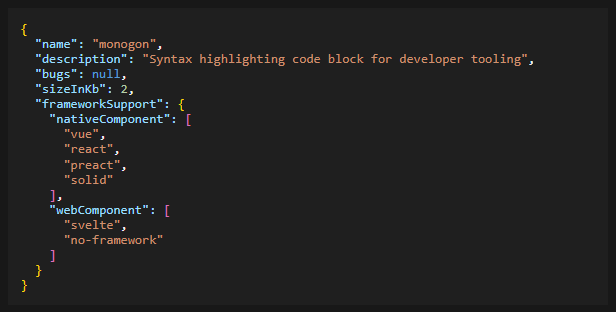
2kb <code> block with syntax highlighting meant for the dev environment.
Zero dependencies, support for most frameworks, mildly themable.
Using the CSS Highlight, meaning low browser support.
[!IMPORTANT] Monogon is meant for developer tooling and supports very few languages. Think config files.
If you don't need editable code snippets, look at Shiki, it's amazing.
If you need editable snippets, Codemirror might be worth a look.
No SSR support for now.
| Language | property | syntax | formatting |
|---|---|---|---|
| JSON | json | ✅ | ✅ |
| YAML | yaml | ✅ | ❌ |
| CSS | css | ❓ | ❌ |
| plaintext | plaintext | - | - |
Import it
import 'monogon';Use in your HTML as a web component.
<monogon-code lang="json" content='{ "names": ["ian", "ana"], size: "2kb", status: null  }'>Click me</monogon-code>

<script>
  document.querySelector('monogon-code').addEventListener('input', (event) => {
    console.log(event.target.value);
  });
</script>import MonogonCode from 'monogon/vue';
const content = ref('{ "json": ["this", "is", "json"], "how": 42 }')
const handleInput = (e) => { content.value = e.target.value }
<MonogonCode :content="content" @input="handleInput">Click me</MonogonCode>import MonogonCode from 'monogon/react';
const content = '{ "json": ["this", "is", "json"], "how": 42 }';
const handleInput = (e) => { console.log(e.target.value) }
<MonogonCode content={content} lang="json" onInput={handleInput} />import MonogonCode from 'monogon/preact';
const content = '{ "json": ["this", "is", "json"], "how": 42 }';
const handleInput = (e) => { console.log(e.target.value) }
<MonogonCode content={content} lang="json" onInput={handleInput} />There is no native support yet for Svelte, so the web component needs to be used.
import 'monogon';

<monogon-code {content} lang="json" oninput={handleInput}></monogon-code>import MonogonCode from 'monogon/solid';
const handleInput = (e) => { console.log(e.target.value) }
<MonogonCode content={content} lang="json" onInput={handleInput} />For a read-only code block just add the readonly prop/attribute.
Monogon comes with a VSCode-like dark and light theme. This theme can be changed by changing the css properties on monogon-code.
The simplest way to do so is:
monogon-el.custom-theme-name {
  --mng-background: #0f0;
  /* ...other changes, see lit below */
}
@media (prefers-color-scheme: dark) {
  monogon-el.custom-theme-name {
    --mng-background: #040;
    /* ...other changes, see lit below */
  }
}
Full list of css properties used:
.default-theme {
  /* Generic */
  --mng-text: #213547;
  --mng-background: #f1f1f1;
  /* Proper highlighting */
  --mng-string: #8b251e;
  --mng-key: #c32b1d;
  --mng-number: #4a845b;
  --mng-boolean: #3716f5;
  --mng-null: #3716f5;
  --mng-comment: #4e862d;
  --mng-curly-brackets: #59913e;
  --mng-square-brackets: #59913e;
  --mng-keyword: #666;
  --mng-dashes: #444;
}SSR is not yet supported, you need to load it in the browser during page load.
Made with 🍕 in Amsterdam.

