
multi-range-slider-react
a react component that can easy to use and interact with parent component with props and events.
Click on image to view demo-code.
No Dependency only single component file and css file
MultiRangeSlider.jsx , MultiRangeSlider.css
You can customize css to change UI/UX.
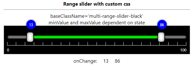
Download CSS file and modify it and reference it with baseClassName attribute
view Demo
GitHub-page
Following is the list of props that control the component
| props | type | default | description |
|---|---|---|---|
| id | String | '' | Set id to multi-range-slider control root div |
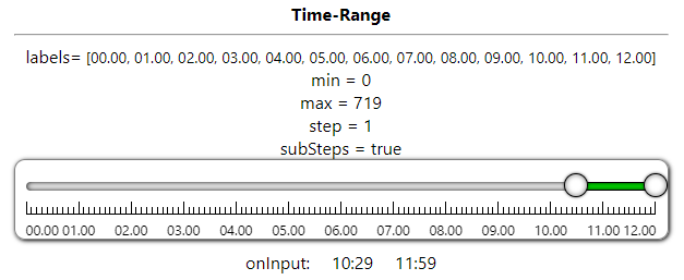
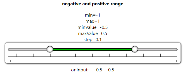
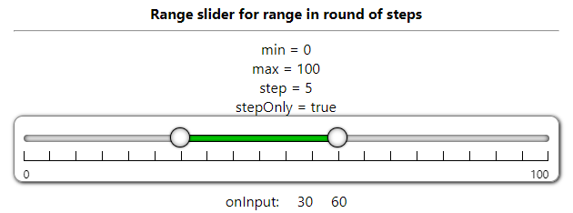
| min | Number | 0 | Slider Minimum Value that user can set |
| max | Number | 100 | Slider Maximum Value that user can Set |
| minValue | Number | 25 | Slider range selected minimum value that will show default selected |
| maxValue | Number | 75 | Slider range selected maximum value that will show default selected |
| step | Number | 5 | Slider change value that will change when bar clicked or keyboard arrow key pressed |
| stepOnly | Boolean | false | specify user to select only values in round of step only |
| canMinMaxValueSame | Boolean | false | If true then user can select both min and max same value otherwise have difference of step value |
| preventWheel | Boolean | false | true then it not accept mouse wheel to change its value. false then (shift + wheel) change minValue (ctrl+wheel) change maxValue, (ctrl+shift+wheel) change both values |
| disabled | Boolean | false | true then user can not change its value by mouse/keyboard. Only can change by update props/state value |
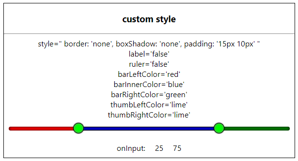
| ruler | Boolean | true | is ruler visible or not |
| label | Boolean | true | is label visible or not |
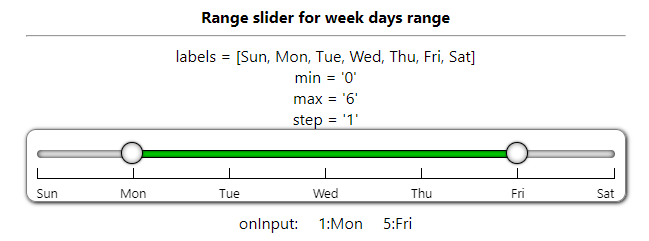
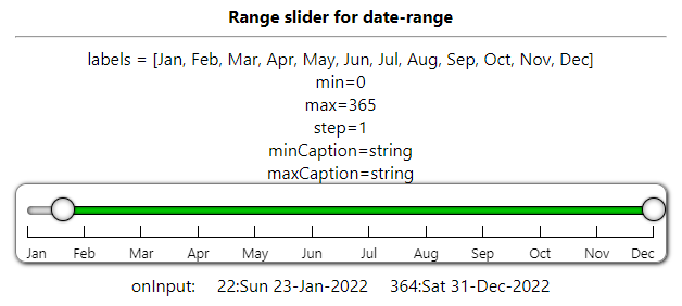
| labels | String Array | specify steps label string value | |
| minCaption | String | caption on min thumb when sliding - can set on onChange/onInput event | |
| maxCaption | String | caption on max thumb when sliding - can set on onChange/onInput event | |
| subSteps | Boolean | false | is small steps line visible or not |
| baseClassName | String | multi-range-slider | Change CSS style of your own |
| className | String | '' | Add additional class with baseClassName to div.multi-range-slider |
| style | React.CSSProperties | specify/override additional style on div.multi-range-slider | |
| barLeftColor | String-Color | specify slider left part background color | |
| barRightColor | String-Color | specify slider right part background color | |
| barInnerColor | String-Color | specify slider inner part background color | |
| thumbLeftColor | String-Color | specify slider left thumb background color | |
| thumbRightColor | String-Color | specify slider right thumb background color | |
| ref | React.useRef | reference to div.multi-range-slider |
Event List
| Event | Description |
|---|---|
| onChange | trigger when thumb mouse up OR slider value change done |
| onInput | trigger on thumb mouse move OR slider value changing |
typescript props definition
Props = {
	min?: number | string;
	max?: number | string;
	step?: number | string;
	minValue?: number | string;
	maxValue?: number | string;
	baseClassName?: string;
	className?: string;
	style?: React.CSSProperties;
	ruler?: boolean | string;
	label?: boolean | string;
	subSteps?: boolean | string;
	stepOnly?: boolean | string;
	preventWheel?: boolean | string;
	labels?: string[];
	minCaption?: string;
	maxCaption?: string;
	barLeftColor?: string;
	barRightColor?: string;
	barInnerColor?: string;
	thumbLeftColor?: string;
	thumbRightColor?: string;
	onInput?: (e: ChangeResult) => void;
	onChange?: (e: ChangeResult) => void;
};
onInput/onChange event parameter type - typescript
type ChangeResult = {
	min: number;
	max: number;
	minValue: number;
	maxValue: number;
};
How to Install
copy following code and run on CLI
npm install multi-range-slider-react
How to use
Example Code
App.jsx
import React, { useState } from "react";
import MultiRangeSlider from "multi-range-slider-react";
function App() {
const [minValue, set_minValue] = useState(25);
const [maxValue, set_maxValue] = useState(75);
const handleInput = (e) => {
	set_minValue(e.minValue);
	set_maxValue(e.maxValue);
};

return (
	<div className="App">
		<MultiRangeSlider
			min={0}
			max={100}
			step={5}
			minValue={minValue}
			maxValue={maxValue}
			onInput={(e) => {
				handleInput(e);
			}}
		/>
	</div>
	);
}

export default App;
App.tsx
import React, { useState } from "react";
import MultiRangeSlider, { ChangeResult } from "multi-range-slider-react";
const App = () => {
const [minValue, setMinValue] = useState(25);
const [maxValue, setMaxValue] = useState(75);
return (
<div className='App'>
<div className='multi-range-slider-container'>
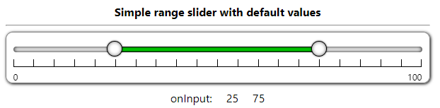
<b>Simple range slider with default values</b>
<hr />
<MultiRangeSlider
min={0}
max={100}
step={5}
minValue={minValue}
maxValue={maxValue}
onInput={(e: ChangeResult) => {
setMinValue(e.minValue);
setMaxValue(e.maxValue);
}}
></MultiRangeSlider>
<div style={{ display: 'flex', justifyContent: 'center' }}>
<div style={{ margin: '10px' }}>onInput:</div>
<div style={{ margin: '10px' }}>{minValue}</div>
<div style={{ margin: '10px' }}>{maxValue}</div>
</div>
</div>
</div>
)
}
export default App;