NativeScript Checkbox
A NativeScript plugin to provide a checkbox widget, radio buttons are also possible.
Do you need assistance on your project or plugin? Contact the nStudio team anytime at team@nstudio.io to get up to speed with the best practices in mobile and web app development.
Installation
From your command prompt/terminal go to your app's root folder and execute:
tns plugin add @nstudio/nativescript-checkbox
Platform controls used:
| Android | iOS |
|---|---|
| Android CheckBox | BEMCheckBox |
Sample Usage
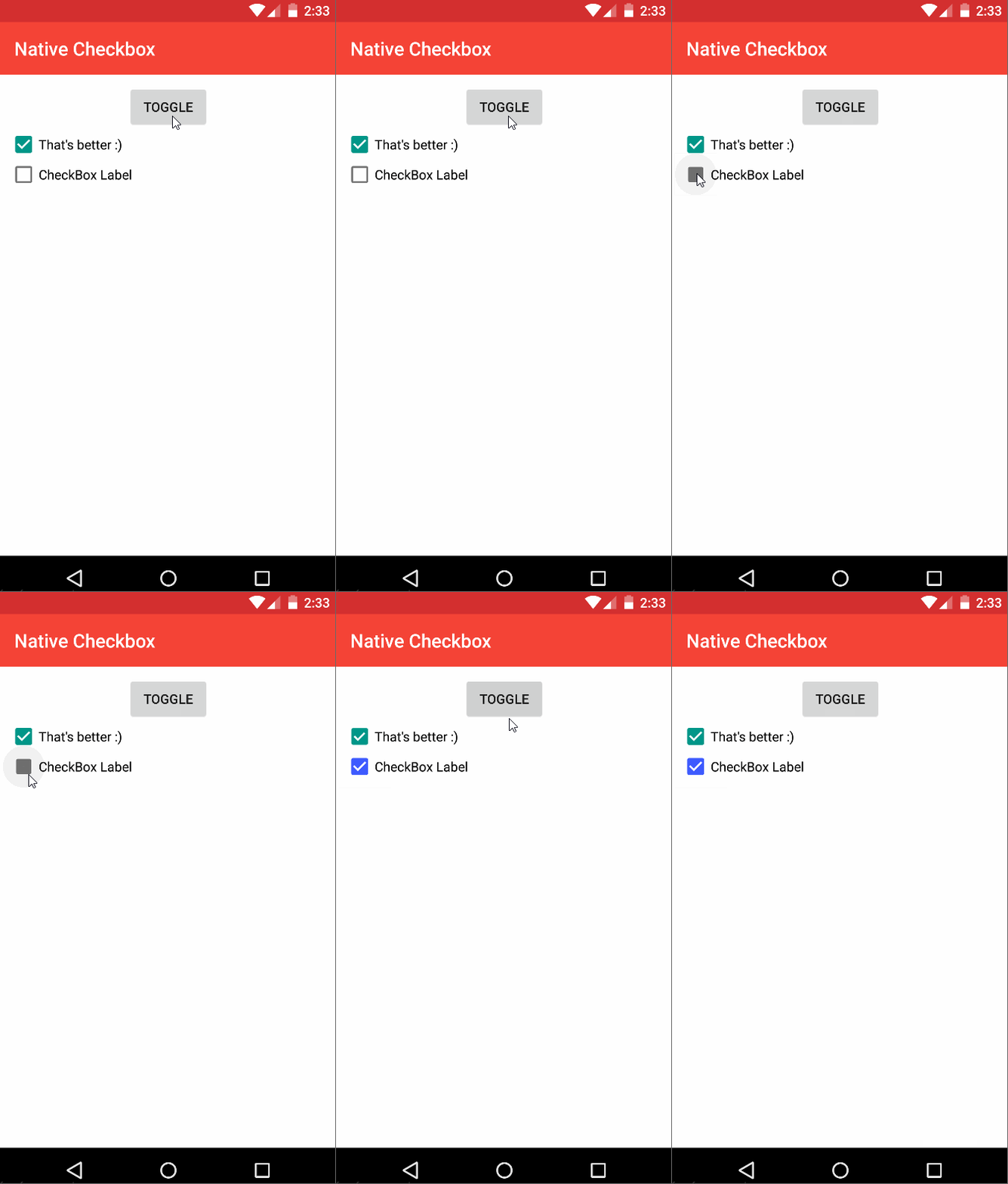
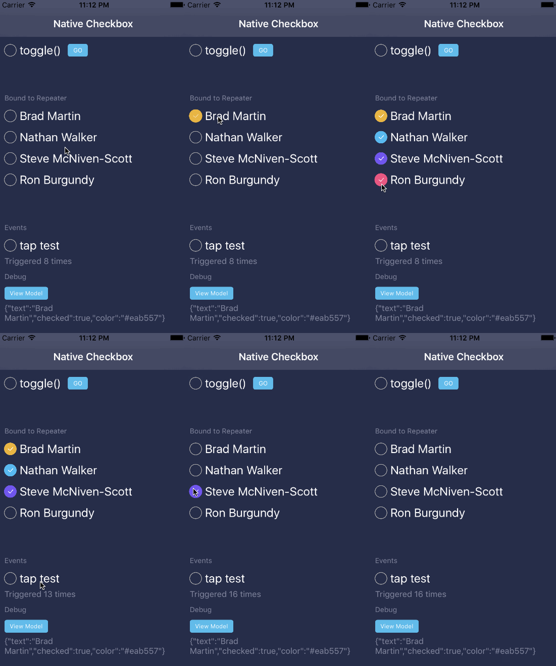
| Android Sample | iOS Sample |
|---|---|
 |
 |
Usage
<Page xmlns="http://schemas.nativescript.org/tns.xsd" xmlns:CheckBox="@nstudio/nativescript-checkbox" loaded="pageLoaded"> <ActionBar title="Native Checkbox" /> <StackLayout> <CheckBox:CheckBox checked="{{ checkProp }}" text="{{ myCheckText }}" fillColor="{{ myCheckColor }}" id="myCheckbox" /> <CheckBox:CheckBox text="CheckBox Label" checked="false" /> </StackLayout></Page> ;; public toggleCheck public getCheckProp Angular Usage Sample:
; // component: NativeScript-Vue Usage Sample
In your main.js (The file where the root Vue instance is created) register the element
Vue;And in your template, use it as:
Use checked instead of v-model. See #99.
Properties
- checked - boolean
- text - text to use with the checkbox
- fillColor - Color of the checkbox element
- boxType - Either 'square' (default) or 'circle'. It's recommended to use 'circle' for radiobuttons. Note that plugin version 3.0.0 switched the default for iOS to 'square' for alignment with Android. Still want
circleon iOS andsquareon Android? Just make theboxTypevalue conditional.
Events
- checkedChange - Use a reference to the CheckBox component to grab it's
checkedproperty when this event fires to see the new value.
API
- toggle() - Change the checked state of the view to the inverse of its current state.
Css Styling
- color - set the text label color
- font-size - checkbox is sized to text from here : default 15
- border-width - set the line width of the checkbox element: iOS only
Styling [Android]
- checkStyle - set to the name of your drawable
- checkPadding - set the padding of the checkbox
Add the following to app/App_Resources/Android/drawable/checkbox_grey.xml
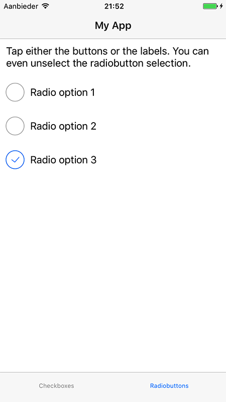
Radiobuttons, anyone?
Want to use radiobutton behavior for your checkboxes (only one option possible within a group)?
Set boxType="circle" and check out the second tab in the Angular demo, here's a screenshot:

Contributing & Running Demo Apps
- Execute from root:
- For android:
npm run demo.android - For iOS:
npm run demo.ios npm run demo.ng.android(for angular android)npm run demo.ng.ios(for angular ios)
- For android:


