
Ng2-float-btn
Button group for angular 2 and angular material 2.
Installation
Dependecies:
Install package
npm install ng2-float-btn --saveUsage
Setup
;;; ; ; @ Example
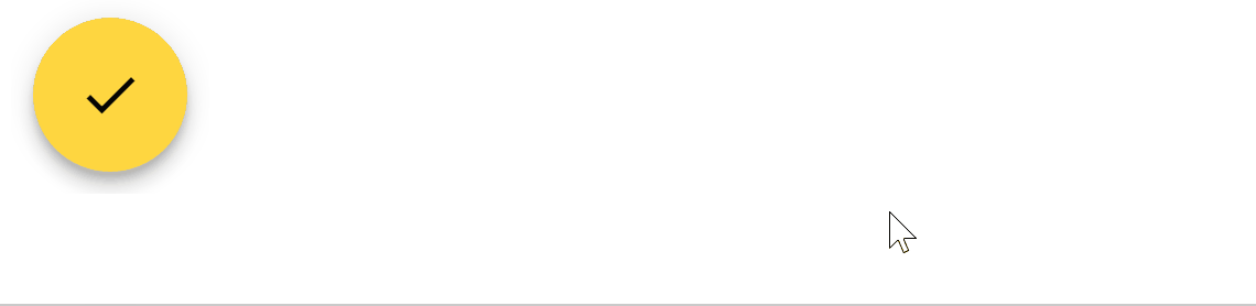
;; @ mainButton: Ng2FloatBtn; buttons: Array<Ng2FloatBtn>; public { thismainButton = color: "primary" iconName: "check" thisbuttons = color: "primary" iconName: "add" { ; } label : "button 1" color: "primary" iconName: "remove" { ; } label : "button 2" }Type Definition
Ng2FloatBtn
| Property | Type | Description |
|---|---|---|
| color | string | The color of the button. Can be primary, accent, or warn(Reference) |
| iconName | string | The name of the material icon. Refer to here |
| onClick(optional) | any | The callback function when the button clicked |
| label(optional) | string | The label of the button |
Element Atributes
| Attribute | Type | Description |
|---|---|---|
| mainButton | Ng2FloatBtn | The main button of the button group. label and onClick will be ignored. |
| buttons | Array | The array of button of the collapsed button. |
| direction | string | The direction that the collapsed fab should expand to when the main button get clicked. Can be right, left, up and down |