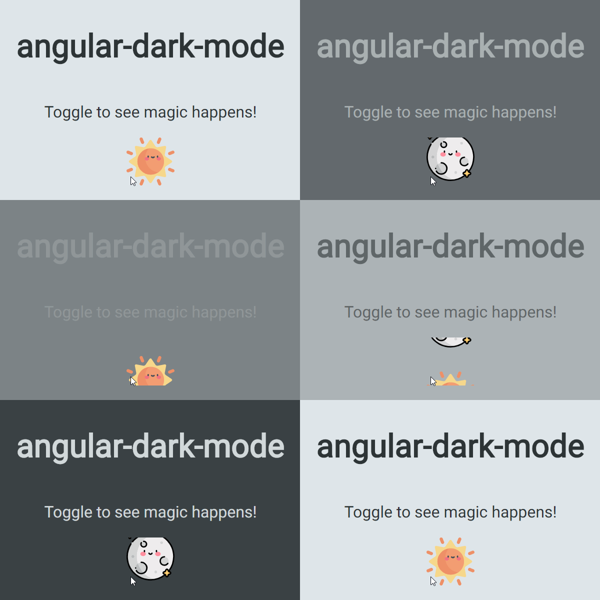
ngx-color-scheme is a zero-dependency library that helps you integrate dark mode into you Angular applications with ease!
Inspired by the awesome use-dark-mode library
Forked from the not more maintained angular-dark-mode library
To use ngx-color-scheme in your project install it via npm:
// npm npm i ngx-color-scheme
and provide it inside your min.ts file:
import { ColorSchemeService } from 'ngx-color-scheme'

bootstrapApplication(AppComponent, {
  providers: [
    ColorSchemeService,

    provideAppInitializer(() => {
      const colorSchemeService = inject(ColorSchemeService)

      colorSchemeService.init()
    }),
  ],
}).catch((err) => console.error(err))
or inside the app.module.ts file
import { ColorSchemeService } from 'ngx-color-scheme'

export function initColorScheme(colorSchemeService: ColorSchemeService) {
  return () => colorSchemeService
}

@NgModule({
// ...
providers: [
    {
      provide: APP_INITIALIZER, // If you wish to instantiate it before the App renders
      useFactory: initColorScheme,
      deps: [ColorSchemeService],
      multi: true,
    },
]
})In case you'd like to use it with Angular SSR.
As the library is using document.body, you need to instantiate it inside the app.component.ts file.
Note: The app will have initially no state when it first load, but this cannot be avoided.
// app.component.ts
import { afterRender } from '@angular/core'
import { ColorSchemeService } from 'ngx-color-scheme'

export class AppComponent {
  constructor(
    private _colorSchemeService: ColorSchemeService,
  ) {
    const singleRender = afterRender(() => {
      this._colorSchemeService.init()
      singleRender.destroy()
    })
  }
}In order to use ngx-color-scheme you need to inject the service somewhere in your applications - presumably where you hold the dark mode toggle, and get the dark mode value from the exported colorScheme$ Observable:
// color-scheme-toggle.component.ts

@Component({
  selector: 'app-color-scheme-toggle',
  template: `<input
    type="checkbox"
    [checked]="$isDarkMode"
    (change)="ontoggleColorScheme()"
  />`,
})
export class ColorSchemeToggle {
  readonly #colorSchemeService = inject(ColorSchemeService);

  $isDarkMode = this.#colorSchemeService.$isDarkMode.asReadonly();

  ontoggleColorScheme(): void {
    this.#colorSchemeService.toggleColorScheme();
  }
}
Next, include global styles and some text to reflect the mode:
/* styles.css */

body.dark-mode {
  background-color: #2d3436;
  color: #dfe6e9;
}

body.light-mode {
  background-color: #dfe6e9;
  color: #2d3436;
}
You're all set!
Save and run your application, play with the toggle button to change between modes.
ngx-color-scheme ships with the following options:
| Option | Description | Default Value |
|---|---|---|
| colorSchemeClass | dark mode css class name | 'dark-mode' |
| lightModeClass | light mode css class name | 'light-mode' |
| preloadingClass | css class name to flag that element is in preloading state |
'color-scheme-preloading' |
| storageKey | localStorage key to persist dark mode | 'dark-mode' |
| element | target HTMLElement to set given css classes | document.body |
All options are set to default and can be configured via the COLOR_SCHEME_OPTIONS InjectionToken:
import { COLOR_SCHEME_OPTIONS } from 'ngx-color-scheme';

@NgModule({
    ...
    providers: [
        {
            provide: COLOR_SCHEME_OPTIONS,
            useValue: {
                colorSchemeClass: 'my-dark-mode',
                lightModeClass: 'my-light-mode'
            }
        }
    ]
    ...
})
export class AppModule {}It is often useful to transition the changes between dark and light modes, and most of the time we would want to skip the initial transition, in order to achieve this use the preloadingClass option like so:
/* styles.css */
...

body:not(.color-scheme-preloading) {
  transition: all 0.3s linear;
}

...Thanks goes to these wonderful people:
|
Tal Ohana 💻 📖 🚧 |
Guy Shemesh 🎨 |
Raphaël Balet 💻 📖 🚧 |


