


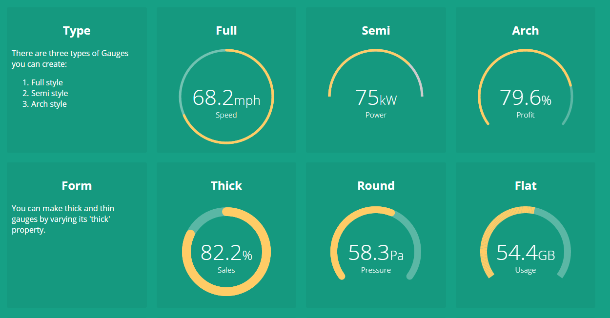
A highly customizable Gauge component for Angular apps and dashboards. It provides many configurationable options to customize according to your needs. Checkout the live demo here. (For older versions of Angular, check out the compatibility matrix below).
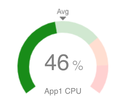
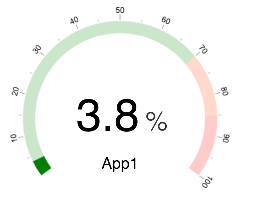
In version v5.0.0, we introduced markers, ticks and background opacity for gauge as shown below. Checkout the documentation below.
| Angular Version | ngx-gauge Version |
|---|---|
| 6.0 | - |
| 7.0 | - |
| 8.0 | 1.0.0-beta.12 |
| 9.0 | 1.1.0 |
| 10.x.x | 2.0.0 |
| 11.x.x | 3.0.0 |
| 12.x.x | 4.0.0 |
| 13.x.x | 5.0.0 |
| 14.x.x | 6.0.0 |
| 15.x.x | 7.0.0 |
| 16.x.x | 8.0.0 |
| 17.x.x | 9.0.0 |
| 18.x.x | 10.0.0 |
| 19.x.x | 11.0.0 |
For latest version use the command:
npm install ngx-gaugeFor a specific version for an older Angular version as per Compatibility table above, use command:
npm install --save ngx-gauge@<version>import { NgxGaugeModule } from 'ngx-gauge';
@NgModule({
...
imports: [NgxGaugeModule],
...
})
export class AppModule { }Be sure to import NgxGaugeModule after Angular's BrowserModule, as the import order matters for NgModules.
NgxGaugeModule provides a <ngx-gauge> component which can be used in any angular template to render a gauge.
It's configuration properties can be bind to a typescript variable as shown below:
import { Component } from '@angular/core';

@Component({
    selector: 'app-component',
    templateUrl: 'app.html'
})
export class AppComponent {

    gaugeType = "semi";
    gaugeValue = 28.3;
    gaugeLabel = "Speed";
    gaugeAppendText = "km/hr";
}<ngx-gauge [type]="gaugeType"
[value]="gaugeValue"
[label]="gaugeLabel"
[append]="gaugeAppendText">
</ngx-gauge>Checkout the extensive list of configuration properites given below and try them to acheive your desired customization. In case you face any problem, then raise an issue here.
There are plenty of configurable properties available to tune the gauge as per your needs.
| Name | Description | Required | Default value | Possible values |
|---|---|---|---|---|
size |
Specifies the size of the canvas in which Gauge will be drawn. It is used as width and height both. |
No | 200 |
Positive Integer |
type |
Specifies the gauge's type. | No | "full" |
"full", "semi", "arch"
|
min |
Specifies the minimum numeric value for gauge's scale. | No | 0 |
Any numeric value |
max |
Specified the maximum numeric value for gauge's scale. | No | 100 |
Any numeric value |
value |
Specifies the current value of the Gauge in the range specified by min and max. It is a required attribute. |
Yes | undefined |
Any numeric value |
cap |
The style of line ending at the gauge's end. | No | "butt" |
"round", "butt"
|
thick |
Specified the thickness of the gauge's bar. | No | 6 |
Any Positive Integer |
label |
Specifies the text to display below the Gauge's reading. | No | undefined |
Any String |
foregroundColor |
Specifies the foreground color of the Gauge's scale. | No | rgba(0, 150, 136, 1) |
Any color value string |
backgroundColor |
Specifies the background color of the Gauge's scale. | No | rgba(0, 0, 0, 0.1) |
Any color value string |
append |
Specifies a string appended to the Gauge's reading. For example "%" most commonly used. |
No | undefined |
Any string |
prepend |
Specifies a string prepended to the Gauge's reading. For example "$" in case of financial data displayed in Gauge. |
No | undefined |
Any String |
duration |
Specifies the duration (in milliseconds) of the Gauge's animation | No | 1500 |
Positive Integer |
thresholds |
Specifies an object of threshold values at which the gauge's color changes. Checkout an example here. | No | none |
{} |
markers |
Specifies an object of marker values at which value to place a marker. Can be a line or triangle and optionally may specify color, size and label. Note if you use labels you should add to margin value to the gauge using the margin option | No | A special object of the format shown. Currently type supports "line" or "triangle" marker. { "50": { color: "#555", type: "triangle", size: 8, label: "Goal", font: "12px arial" } , ... }
|
{} |
margin |
Specifies an optional margin for the gauge. | No | 0 | Positive Integer |
animate |
toggles the gauge animation. | No | true |
boolean |
aria-label |
Specifies the label used by screen readers | No | undefined |
Any String |
aria-labelledby |
Specifies the ID of any external element to be used as label by screen readers | No | null |
Any ID String |
You can customize the colors of the gauge based on the current value being shown. In order to show different colors when gauge crosses certain value, use property thresholds. It takes an object with the threshold value as key and an object with color property as value. For example:
@Component({ ... })
export class AppComponent {
    ...

    thresholdConfig = {
        '0': {color: 'green'},
        '40': {color: 'orange'},
        '75.5': {color: 'red'}
    };

    ...
}<ngx-gauge ... [thresholds]="thresholdConfig"></ngx-gauge>The keys in the threshold object signifies the minimum value at which the color will be applied. For instance, if the gauge's current value is 53.2, then orange color will be applied because after point 40 every value will be displayed as orange, until next threshold is encountered. In this example 75.5 is the next threshold.
Sometimes setting a property value on <ngx-gauge> does not solve your purpose. You may want to add custom HTML for displaying value,append, prepend and label texts. In order to provide custom templates for these properties display following directives can be used.
<ngx-gauge [value]="currentValue">
    <ngx-gauge-append>
        <!-- custom append text or HTML goes here -->
    </ngx-gauge-append>
    <ngx-gauge-label>
        <!-- custom label text or HTML goes here -->
    </ngx-gauge-label>
    <ngx-gauge-prepend>
        <!-- custom prepend text or HTML goes here -->
    </ngx-gauge-prepend>
    <ngx-gauge-value>
        {{ currentValue * Math.PI | number }}
    </ngx-gauge-value>
</ngx-gauge>
Note that value attribute is still required on <ngx-gauge> even when you are providing custom template using <ngx-gauge-value>. Because value attribute is responsible for calculating the gauge's drawing on a scale.
The project is continously evolving with every new release. Give it a star, if you like it. For contribution, setup the development environment as follows:
- clone and setup the project dependencies
$> git clone https://github.com/ashish-chopra/ngx-gauge.git
$> npm install- Use following commands based on what you'd like to do:
$> npm start             # builds the project and watch for changes.
$> npm test              # runs test suite once and exit.
$> npm run test:watch    # starts the test framework and watch for changes in code.
$> npm run build # triggers a manual build for library, outputs at `/dist` directory.- To add a new feature or fix a bug, make sure to create a new branch from
master.
First thing first, explore the issue tracker to find something to contribute. There are tons of other project setup related issues and activities in which you can help. Your feedback could also be a great contribution.
If you face any problem, then raise an issue here.