React DatePicker Component
A flexible and customizable React DatePicker component with a built-in calendar for easy date selection.
Example of DatePicker Component Usage
Initial Input:
Location: ./screenshots/input/Input_initial.png Description: Screenshot showcasing the initial appearance of the DatePicker input.
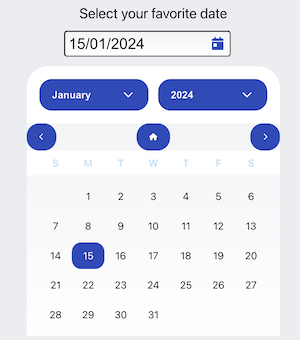
Opened Calendar:
Location: ./screenshots/calendar/calendar_opened.png Description: Screenshot illustrating the opened calendar for date selection.
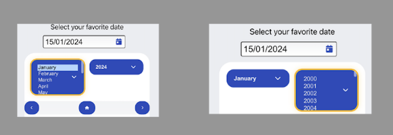
Month and Year Selection:
Location: ./screenshots/calendar/month_year_selected.png Description: Screenshot displaying the selection of the month and year in the calendar.
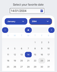
Day Selection:
Location: ./screenshots/calendar/day_selected.png Description: Screenshot illustrating the selection of a specific day in the calendar.
Rendered Input with Selected Date:
Location: ./screenshots/input/input_rendered.png Description: Screenshot showing the final appearance of the input after date selection.
Installation
Prerequisites
Node.js v18 or higher Please make sure you have the right versions and download both packages. You can verify this by using the following commands in your terminal:
Check Node.js version
node --versionCheck npm version
npm --versionTo install the DatePicker component, use npm :
npm install plugin-datepicker --save Usage
Import the DatePicker component in your React application and use it as follows:
import React from 'react';
import DatePicker from 'plugin-datepicker';

function App() {
  return (
    <div>
     <DatePicker
          type="text"
          minYear={1950}
          maxYear={2050}
          dateFormat={"dd/MM/yyyy"}
          language={"en-EN"}
          font="Roboto, sans-serif"
          fontSize="16px"
          customInputClass={{ className: "custom-input-class" }}
          id="inputDate"
          placeholder="dd/mm/yyyy"
        />
    </div>
  );
}

export default App;
Props
- minYear (number, optional): The minimum allowed year for date selection.
- maxYear (number, optional): The maximum allowed year for date selection.
- customInputClass (string, optional): Additional custom class for styling.
- dateFormat (string, optional): The format in which the date should be displayed. Defaults to "yyyy/MM/dd".
- language (string, optional): The language for the date picker. Defaults to "en".
- errorClass (string, optional): Additional custom class for styling error messages.
- showCurrentDateOnMount (boolean, optional) = Use false for not see the current Date in input field
- showError (boolean, optional) = Use false for not see errors from DatePicker Default
- customStyles (object, optional): Custom styles for various elements.
- calendarStyle (object): Styles for the calendar container.
- monthSelectClass (object): Styles for the month select dropdown.
- yearSelectClass (object): Styles for the year select dropdown.
- buttonStyle (object): Styles for navigation buttons.
- dateStyle (object): Styles for individual dates.
Features
- Easy date selection with a built-in calendar.
- Customizable appearance with various styling options.
- Supports different date formats and languages.
- Validates and handles user input for accurate date selection.
- Accessible with keyboard navigation.
Development
If you want to contribute or modify the DatePicker component, follow these steps:
- Clone the repository
https://github.com/VangitParis/plugin-datepicker.git- Install dependencies:
cd plugin-datepicker
npm install- Start the server
npm startTesting with Cypress
To run Cypress tests, use the following command:
npm run cypress:openThis will open the Cypress Test Runner, allowing you to run and interact with the tests.
EsLint
This project uses ESLint for code linting. To run ESLint, use the following command:
npm run lint


