postcss-style-guide 
PostCSS plugin to generate a style guide automatically.
CSS comments will be parsed through Markdown and displayed in a generated HTML document.
Install
$ npm install postcss-style-guideExample
Node.js:
var fs = ;var postcss = ;var styleguide = ;var input = fs; var output = ;in Gulp:
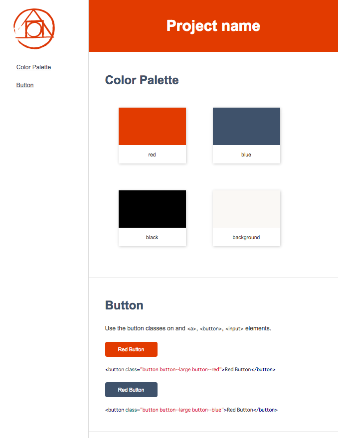
var gulp = gulpWe can generate color palette from CSS Custom Properties with @start color and @end color annotations.
app.css:
;;color.css:
;/* @start color *//* @end color */postcss-style-guide generate style guide from CSS comments that have special annotation(@styleguide).
@title: set component name
button.css:
/*@styleguide @title Button Use the button classes on and `<a>`, `<button>`, `<input>` elements. <button class="button button--large button--red">Red Button</button> <button class="button button--large button--red">Red Button</button> <button class="button button--large button--blue">Red Button</button> <button class="button button--large button--blue">Red Button</button>*/ You will get styleguide/index.html for the style guide.
Options
options.src: The path to the source CSS file.options.dest: The path to style guide file. (default:styleguide/index.html)options.project: Project name. (default:Style Guide)options.showCode: The flag to show CSS code (default:true)options.theme: Theme name. (default:psg-theme-default)options.themePath: The path to theme file. (default:node_modules/psg-theme-default)
Themes
You can select a theme of style guide with options.theme.
And you can also create original themes.
When you create themes, please read theme guideline
All of postcss-style-guide themes that can be used are here.
Themes list
How to develop postcss-style-guide theme
License
The MIT License (MIT)
Copyright (c) 2015 Masaaki Morishita