
Progress Animated
Progress indicator using reanimated and react native svg
Table of Contents
Installation
yarn add progress-react-native# or npm install progress-react-nativeAlso, you need to install react-native-reanimated, & react-native-svg, and follow theirs installation instructions.
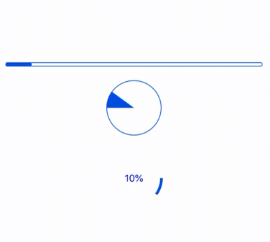
Usage
;;; ; Props
| name | required | default | description |
|---|---|---|---|
| preset | NO | "bar" | Preset for progress. |
| progress | NO | 0 | Current progress. |
| animated | NO | true | Flag to use animated when progress change or not. |
| duration | NO | 1000 | Duration of animated. |
| indeterminate | NO | false | If set to true, the indicator will spin. |
| name | required | default | description |
|---|---|---|---|
| height | NO | 6 | Height of the progress bar. |
| color | NO | #0057e7 | Color of indicator. |
| borderRadius | NO | 4 | Rounding of corners, set to 0 to disable. |
| borderColor | NO | #0057e7 | Color of outer border. |
| borderWith | NO | 1 | Width of outer border, set to 0 to remove. |
| name | required | default | description |
|---|---|---|---|
| radius | NO | 40 | Radius of circle. |
| strokeWidth | NO | 4 | Width of stroke. |
| strokeColor | NO | #0057e7 | Stroke color . |
| bgStrokeColor | NO | transparent | Background stroke color . |
| isRadius | NO | false | Using radius for progress line. |
| showText | NO | false | Show current progress or not. |
| textConcat | NO | '' | Text assigned after the progress. |
| textStyle | NO | '' | Text style for progress. |
| name | required | default | description |
|---|---|---|---|
| radius | NO | 40 | Radius of Pie. |
| strokeWidth | NO | 1 | Width of stroke. |
| strokeColor | NO | #0057e7 | Stroke color. |
| fillColor | NO | #0057e7 | Color of progress. |
| bgColor | NO | transparent | Background color stroke. |
Built With
License
MIT