
Qwik-Theme-Toggle Library ⚡️
The Qwik-Theme-Toggle Library is a lightweight, user-friendly JavaScript library developed as a Qwik component. It provides an efficient theme toggle button for web applications, enabling users to switch between light, dark, and auto modes, enhancing their browsing experience.
Works with Tailwind CSS and DaisyUI.
Leveraging the power and flexibility of Tailwind CSS and its DaisyUI plugin, the library allows for a utility-first framework approach and usage of a robust UI toolkit to create aesthetically pleasing and responsive designs.
Installation
npm install qwik-theme-toggleor if you use bun:
bun install qwik-theme-toggleProject Structure
Inside Qwik-Theme-Toggle project, you'll find the following directories and files:
└── src/
    ├── components/theme-toggle
    │              └── ...
    └── index.ts
-
src/components/theme-toggle: This directory is a location for Qwik-Theme-Toggle components. -
index.ts: The entry point of your Qwik-Theme-Toggle library. -
example/: Contains an example showcasing the usage of Qwik-Theme-Toggle.
Development
During development, Qwik-Theme-Toggle uses Vite's development server with server-side rendering (SSR) capabilities provided by Qwik and Bun. Bun is an all-in-one JavaScript runtime & toolkit designed for speed, complete with a bundler, test runner, and Node.js-compatible package manager.
Start development:
bun installbun startProduction
For production, the Qwik-Theme-Toggle library should generate the production build in the ./lib directory, along with TypeScript type definitions in ./lib-types.
bun run buildExample
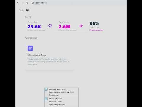
Qwik-Theme-Toggle in action.
Add daisyUI to your tailwind.config.js files, add darkMode: "class" for pure Tailwind CSS:
module.exports = {
  content: [
    //...
    "./node_modules/qwik-theme-toggle/**/*.{cjs,mjs}"
  ],
  //..
  darkMode: "class", // for Tailwind
  //...
  plugins: [require("daisyui")], // for DaisyUI
}
Add <ThemeScript /> into head
 <head>
    //...
     <ThemeScript
        themeStorageKey="theme" // name of the local storage theme key
        themeQuery="theme"      // (Optional) name of the query param to reflect theme
      />
 </head>
Use toggle button in your code: Set icon size and/or add your own class.
<ThemeToggle
  themeStorageKey="theme"           // name of the local storage theme key
  themeQuery="theme"                // (Optional) name of the query param to reflect theme
  textSize="text-2xl"               // Size of the toggle button
  myClass={"hover:text-secondary"}  // Apply a custom class
/>
Install dependencies:
bun install
Run:
bun start