React-ADA-Keyboard-Accessible-Datepicker
React-ADA-Keyboard-Accessible-Datepicker is an easy to implement date picker compliant with the standards set out by the Americans with Disabilities Act, including features such as full keyboard accessibility and aria labeling. The package builds upon the date picker developed by w3.org ( https://www.w3.org/TR/wai-aria-practices/examples/dialog-modal/datepicker-dialog.html ) and and adds several options for customization and easy React integrations.
Accessibility Features
React-ADA-Keyboard-Accessible-Datepicker includes several features to help make its use more accessible to all.
- When a date is chosen, the accessible name of the “Choose Date” button is updated to include the selected date. So, when the dialog closes and focus returns to the “Choose Date” button, screen reader users hear confirmation of the selected date in the button name.
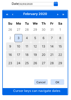
- When the month or year of the calendar grid changes as users navigate the calendar or activate the buttons for next or previous month or year, a live region enables screen readers to announce the new month and year.
- The calendar grid provides hotkeys for changing the year and month as well as support for normal grid navigation keys.
- When the dialog opens and a date in the calendar grid receives focus, a live region enables screen readers to announce keyboard instructions for navigating the calendar grid. The instructions are also visible at the bottom of the dialog box.
- A numbr of customization options including auto complete dates, date ranges, and more.
Installation
Use npm to install React-ADA-Keyboard-Accessible-Datepicker
npm install react-ada-keyboard-accessible-datepickerUsage
import React from 'react';import Datepicker from 'react-ada-keyboard-accessible-datepicker' const DatePickerContainer = () =>Keyboard Controls
Choose Date Button
| Key | Function |
|---|---|
| Space, Enter |
* Open the date picker dialog. * Move focus to selected date, i.e., the date displayed in the date input text field. If no date has been selected, places focus on the current date. |
Date Picker Dialog
| Key | Function |
|---|---|
| ESC | Closes the dialog and returns focus to the Choose Date button. |
| Tab | * Moves focus to next element in the dialog Tab sequence. * Note that, as specified in the grid design pattern, only one button in the calendar grid is in the Tab sequence. * If focus is on the last button (i.e., OK), moves focus to the first button(i.e. Previous Year). |
Date Picker Dialog: Month/Year Buttons
| Key | Function |
|---|---|
| Space, Enter |
Change the month and/or year displayed in the calendar grid. |
Date Picker Dialog: Date Grid
| Key | Function |
|---|---|
| Space, Enter |
* Select the date, close the dialog, and move focus to the Choose Date button. * Update the value of the Date input with the selected date. * Update the accessible name of the Choose Date button to include the selected date. |
| Up Arrow | Moves focus to the same day of the previous week. |
| Down Arrow | Moves focus to the same day of the next week. |
| Right Arrow | Moves focus to the next day. |
| Left Arrow | Moves focus to the previous day. |
| Home | Moves focus to the first day (e.g Sunday) of the current week. |
| End | Moves focus to the last day (e.g. Saturday) of the current week. |
| Page Up | *Changes the grid of dates to the previous month. *Sets focus on the same day of the same week. If that day does not exist, then moves focus to the same day of the previous or next week. |
| Shift + Page Up | *Changes the grid of dates to the previous Year. *Sets focus on the same day of the same week. If that day does not exist, then moves focus to the same day of the previous or next week. |
| Page Down | *Changes the grid of dates to the next month. *Sets focus on the same day of the same week. If that day does not exist, then moves focus to the same day of the previous or next week. |
| Shift + Page Down | *Changes the grid of dates to the next Year. *Sets focus on the same day of the same week. If that day does not exist, then moves focus to the same day of the previous or next week. |
Date Picker Dialog: OK and Cancel Buttons
| Key | Function |
|---|---|
| Space, Enter |
Activates the button: *"Cancel": Closes the dialog, moves focus to Choose Date button, does not update date in date input. *OK: Closes the dialog, moves focus to Choose Date button, updates date in date input. |
Role, Property, State, and Tabindex Attributes
Chose Date Button
| Role | Attribute | Element | Usage |
|---|---|---|---|
| aria-label="String" | button | The initial value of accessible name is "Choose Date". When users select a date, the accessible name is updated to also include the selected date. |
Date Picker Dialog
| Role | Attribute | Element | Usage |
|---|---|---|---|
| dialog | div | Identifies the element as a dialog . | |
| aria-modal="true" | div | Indicates the dialog is modal. | |
| aria-labelledby="IDREF" | div | Refers to the heading containing the currently displayed month and year, which defines the accessible name for the dialog. |
|
| aria-live="polite" | div | *Indicates the element that displays information about keyboard commands for navigating the grid should be automatically announced by screen readers. *The script slightly delays display of the information so screen readers are more likely to read it after information related to change of focus. |
Date Picker Dialog: Calendar Navigation Buttons
| Role | Attribute | Element | Usage |
|---|---|---|---|
| aria-label="String" | button | Defines the accessible name of the button (e.g. Next Year). |
|
| aria-live="polite" | h2 | *When the month and/or year changes the content of the h2 element is updated. *Indicates the h2 should be automatically announced by screen readers. |
Date Picker Dialog: Date Grid
| Role | Attribute | Element | Usage |
|---|---|---|---|
| grid | table | *Identifies the table element as a grid widget. *Since the grid role is applied to a table element, the row, colheader, and gridcell roles to be specified because they are implied by th, and tdtags. |
|
| aria-labelledby=IDREF | table | Defines the accessible name for the grid using the h2 that shows the month and year of the dates displayed in the grid. |
|
| tabindex="0" | button | *Makes the button focusable and includes it in the dialog Tab sequence. *Set dynamically by the JavaScript when the element is to be included in the dialog Tab sequence. *At any given time, only one button within the grid is in the dialog Tab sequence. *This approach to managing focus is described in the section on roving tabindex. |
|
| tabindex="-1" | button | Makes the button focusable and excludes it from the dialog Tab sequence. *Changed dynamically to 0 by the JavaScript when the button is to be included in the dialog Tab sequence. *At any given time, only one button within the grid is in the dialog Tab sequence. *This approach to managing focus is described in the section on roving tabindex. |
|
| aria-selected="true" | button | *Identifies the button for the currently selected date, i.e., the date value present in the date input. *Only set on the button representing the currently selected date, no other buttons have aria-selectedspecified. |
Customization and Formatting
The date picker allows several levels of customization to acccomodate developers needs. Customizations are generally passed into the component as props. Additional levels of customization will be available in future releases.
themeColor
Applies a selected color to the calendar button and calendar borders
const DatePickerContainer = () =>dateFormat
Dates will be formatted to mm/dd/yyyy by default, but custom formats may be passed in as a string. The month field must be repressed by mm, the date by dd, and the year by yyyy. Fields may be separated by forward slashes, commas or spaces[/ , ]. User input will be automatically formatted unless autoFormatting={false} is passed in as a prop.
const DatePickerContainer = () =>minDate
-Sets the earliest day that the user may choose by using the datepicker. All date cells before the minDate will be disabled. Combing the minDate prop with maxDate will create a date range. Users will not be able to naviagate to the dates outside of the range. minDate must be passed in with the “yyyy-mm-dd” format. To set the min date to the current date pass in minDate={“today”}
const DatePickerContainer = () =>maxDate
Sets the latest date that the user may choose by using the date picker. All date cells after the maxDate will be disabled. Combining the maxDate with mandate will create a date range. Users will not be able to naviagate to the dates outside of the range. maxDate must be passed in with the “yyyy-mm-dd” format. To set the min date to the current date pass in maxDate={“today”}
const DatePickerContainer = () =>specifiedFocusDate
You can specifiy which date that the datepicker will open to by passing in specifiedFocusDate={"yyyy-mm-dd"}
const DatePickerContainer = () =>buttonInlineStyle
Customized styling can be passed to the calendar button as a style object. Object keys follow JSX conventions. Alternatively, class names from your own stylesheet can be passed to the calendar button with the buttonClassNames prop.
const buttonInlineStyle = const DatePickerContainer = () =>buttonClassNames
One of more classes can be passed to the calendar button through the buttonClassNames prop as a string. Seperate the classes by a space Be sure to pass in names without a prepending period.
const DatePickerContainer = () =>customInputBox
Save a custom input box as a variable and pass it in as a prob. Note, you will have ot provide your own ARIA labels.
const DatePickerContainer = () =>inputBoxLabel
Pass in a string for a custom input box label, or pass in false to remove the default label.
const DatePickerContainer = () =>inputBoxClassNames
One of more classes can be passed as strings to the input box through the inputBoxClassNames prop. Be sure to pass in names without a prepending period.
const DatePickerContainer = () =>Error Handling
The datepicker comes with default internal error handling, but it is possible to passs in custom error messages through props. all of the following must be passed in as strings
invalidFormatError - This message will be displated when a user enters the date in an invaliud format
invalidMonthErrorMessage - This message will be displayed when a user enters a mm(month) value greater than 12
invalidDateErrorMessage - This message will be displayed when a user enters a dd(day) value greater than 31
pastMaxDateErrorMessage - This message will be displayted when there is a Maximum date prop passed into the datepicker and the user enters a date past that
minDateErrorMessage - This message will be displayted when there is a minimum date prop passed into the datepicker and the user enters a date before that
const DatePickerContainer = () =>If you would prefer to handle error on your application level rather than internally through the datepicker, and alternative can be to pass in the errorHandlingCallback. and wrapping the datepicker in its own component with its own state. Set a field on the state called errorType. Write a function that will invoke this.setState and pass it into the errorHandlingCallback. An example can be seen below. Passing in errorHandlingCallback will disable the internally generated error messages.
For Class Based Components :
import React, from 'react';import Datepicker from 'react-ada-keyboard-accessible-datepicker';import './testStyle.css' }}For Functional Components:
const CalendarContainer = () =>You can use the errorType const to write the logic for determining your errorType messages and errorHandling behavior.
inputBoxOnChange
Callback that will be executed on input box change (under development)
inputBoxOnBlur
Callback that will be executed on input box blur (under development)
autoFormat
Auto formatting of user input can be turned off by passing in autoFormatting={false}. (under development)
History
v1.2.13
- Improvements to error handling logic
- Selecting date from calander now triggers an input event in the inputbox
v1.2.12
- Improvements to autopcomplete functionality
- Formatting error message only appears entire datepicker's blur
- Errors in console for incorrect datadate format when passing in min and max date props
v1.2.9
- Improved documentation readibility.
v1.2.3
- Removed default "Cursor keys can navigate dates" message"
- Calander height now changes to fit dates
v1.2.2
- Added leading zeros into dateBoxInput string in roder to facilitate error handling and follow project formatting
v1.2.1
- Fixes bug that causes DOM propagation on go to next year and go to previous year buttons.
v1.2.0
- input box now calculates latest day of each month and throws error if entered date is beyond that
- simplified autoformating that allows for easier revisions to input date
- updated documentation with screenshots and keyboard controls
v1.1.4
- custom iput boxs without ids are automatically assigned id of "id-textbox-1"
- error messages nor use the htmlFor attribute and point ot inputBox
- inputBox ariaDescribedby pointsx to the error message
- updates to documentation