React-Awesome-Combobox · 


React-Combobox is a React library for building autocomplete searchbox in an easy and fully customizable way.
Installation
npm install --save react-awesome-combobox
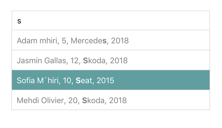
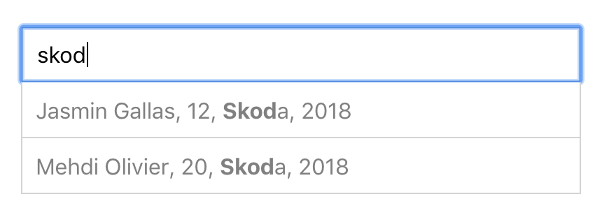
Preview


Usage
import Combobox from 'react-awesome-combobox';const data=name: 'Marouen Mhiri' age: 40 car: carMake: 'VW' year: '2018'name: 'Tanja Bernhardt' age: 35 car: carMake: 'Audi' year: '2017'name: 'Adam Mhiri' age: 5 car: carMake: 'Mercedes' year: '2018'name: 'Hanna Miriam Mhiri' age: 3 car: carMake: 'VW' year: '2016'name: 'Jasmin Gallas' age: 12 car: carMake: 'Skoda' year: '2018'name: 'Sofia M`hiri' age: 10 car: carMake: 'Seat' year: '2015'name: 'Sofiene Attia' age: 20 car: carMake: 'Skoda' year: '2018';return<Combobox='Placeholder'='cadetBlue'=='car/carMake'====/>;
or (with a simple array of strings)
import Combobox from 'react-awesome-combobox';const names = 'John' 'Marouen' 'Tanja' 'Hanna' 'Sofia' 'Adam' 'Rafif';return<Combobox='Search for name...'='green'====/></div>;
Props
| Prop | Type | Required | Description |
|---|---|---|---|
data |
Array | ✓ | These are the suggestions that will be displayed. Items can take an arbitrary shape. |
plaeholder |
String | will display the placeholder of the input field. | |
bgColor |
String | When set it will style the background color of the suggestions when moved using keyboard arrows. Default is "#6B9FCE". |
|
filterProperty |
String | ✓* | When Implement it to teach Autosuggest what should be the input value when suggestion is clicked. |
display |
Object | Gives the possibility to customize the suggestions. If your data is an array of objects and you filter for a specific property but want to display others. With this property it is possible (See Example here) |
|
highlight |
Boolean | highlights the occurences in the suggestions using the mark tag. | |
itemHeight |
Number | specifies the items height of the suggestions dropdown. | |
visibleItems |
Number | sets the limit of the suggestions to see and make the dropdown scrollable. | |
onSelectItem |
Function | A Callback function that will be triggered after selecting a suggestion. This function has as parameter the selected object. |
data
[REQUIRED] the list of the suggestions to filter. This can be a simple array of i.e. strings, numbers, booleans... or an array of objects.
This property is REQUIRED.
placeholder
[OPTIONAL] the placeholder to show in the input field.
bgColor
[OPTIONAL] the Background color of the suggestions when visited with keyboard up/down-arrows.
filterProperty
[OPTIONAL] the Property to search for in the list of the suggestions. This property works with the property data when it's an array of objects.
filterProperty can contain '/'-sign to specify the property levels to search for.
display
[OPTIONAL] Object specifying which property of the searched object should appear in the search result and how they should be seperated.
display property when used should have this shape:
display = // or any other sign '|', ':', ' '... seperator: ',' // Array of existing object properties fields: 'name' 'car/year' highlight
[OPTIONAL] when true the found search string will be highlighted using the <mark />-html Tag
itemHeight
[OPTIONAL] a number specifies the height of the suggestions boxes (this number will be used as pixel height) - default = 40
visibleItems
[OPTIONAL] a maximum number of suggestions to see. The rest will be reached when scrolled or by tapping UP/Down Keys. Default = 4
onSelectItem
[OPTIONAL] a callback function which will be called after a selection of a suggestion took place. this function recieves a suggestion item as parameter. I.e. use onSelectItem={(sugg) => console.log(sugg)} to see the result.
License
React-awesome-combobox is MIT licensed.