
A lightweight, customizable modal component for web applications. Easy to integrate, responsive, and supports user interactions with customizable responses. Ideal for overlays, alerts, and dialogs without complex setup
- Simple setup and usage.
- Fully responsive design for all screen sizes.
- Customizable styles and behavior.
- Built-in support for user interactions and responses.
- Lightweight with minimal dependencies.
- Easily customizable via props.
- Typescript support
- Small bundle size
npm install react-beautiful-modals
yarn add react-beautiful-modals
pnpm add react-beautiful-modals
import React, { useState } from "react";
import { Modal } from "react-beautiful-modals";

const App = () => {
  const [open, setOpen] = useState(false);

  return (
    <Modal open={open} onClose={() => setOpen(false)}>
      <h1>You content here</h1>
    </Modal>
  );
};

export default App;import React, { useState } from "react";
import {
Modal,
ModalCancelButton,
ModalDescription,
ModalFooter,
ModalHeader,
ModalSuccessButton,
ModalTitle,
} from "react-beautiful-modals";
const App = () => {
const [open, setOpen] = useState(false);
return (
<Modal open={open} onClose={() => setOpen(false)}>
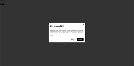
<ModalHeader>
<ModalTitle>This is modal title</ModalTitle>
</ModalHeader>
<ModalDescription>This is modal Description</ModalDescription>
<ModalFooter>
<ModalCancelButton onClose={() => setOpen(false)}>
Cancel
</ModalCancelButton>
<ModalSuccessButton>Continue</ModalSuccessButton>
</ModalFooter>
</Modal>
);
};
export default App;| Prop | Type | Default | Description |
|---|---|---|---|
open |
boolean |
Controls the visibility of the modal or modal content. | |
onClose |
() => void |
Callback function to handle closing of the modal. | |
children |
React.ReactNode |
Content to be displayed inside the component. | |
size |
"sm","md","lg" |
"sm" |
Size of the modal. |
animationType |
"slide-up","slide-down","fade","zoom" |
"zoom" | Type of animation used for the modal. |
width |
number |
"25vw" | Custom width for the modal. |
disableBackdropClick |
boolean |
false |
Disables closing the modal when clicking on the backdrop. |
customModalOverly |
string |
Custom class name to apply additional styles or override existing styles. | |
customModalContent |
string |
Custom class name to apply additional styles or override existing styles. |
| Prop | Type | Default | Description |
|---|---|---|---|
children |
React.ReactNode |
Text content of the title. | |
fontSize |
string |
Custom font size for the title. | |
color |
string |
Color for the title. | |
textAlign |
"left","center" |
"left" |
Text alignment for the title. |
fontWidth |
"300","400","500","600","700","800","900" |
"700" |
Font weight for the title. |
customModalTitle |
string |
Custom class name to apply additional styles or override existing styles. | |
customModalDescription |
string |
Custom class name to apply additional styles or override existing styles. |
| Prop | Type | Default | Description |
|---|---|---|---|
children |
React.ReactNode |
Content displayed inside the button. | |
color |
"primary","secondary", "success","error","warning","info","primary"
|
"secondary" | Color theme for the button. |
size |
"sm","md","lg" |
"sm" |
Size of the button. |
animationOnHover |
"slide-up","slide-down", "fade","zoom" |
"slide-up" | Animation applied when hovering over the button. |
disabled |
boolean |
false |
Disables the button when set to true. |
onClose |
() => void |
Callback for closing the button (useful if the button is part of a modal or similar component). | |
startIcon |
React.ReactNode |
Icon displayed at the start of the button. | |
endIcon |
React.ReactNode |
Icon displayed at the end of the button. | |
loading |
boolean |
false |
Shows a loading spinner when true. |
variant |
"contained","outline", "text","contained"
|
"contained" | Variant style of the button. |
customModalCancelButton |
string |
"" |
Custom class name to apply additional styles or override existing styles. |
customModalSuccessButton |
string |
Custom class name to apply additional styles or override existing styles. | |
primary,secondary,error,success,warning,info |
string |
Custom class name to apply additional styles or override existing styles. | |
btn-sm,btn-md,btn-lg |
string |
Custom class name to apply additional styles or override existing styles. |
| Prop | Type | Default | Description |
|---|---|---|---|
color |
string |
Color of the divider line. | |
height |
string |
Height of the divider line. | |
customModalDivider |
string |
Custom class name to apply additional styles or override existing styles. |
This documentation helps developers understand the props they can use, along with their types and defaults, including how to apply custom styles through customClass.