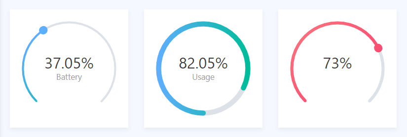
react-circle-progress-bar
A circular progress bar with gradient colors for React
installation
npm install react-circle-progress-bar
usage
import Progress from 'react-circle-progress-bar'

<Progress progress={75} />
properties
| Property | default | information |
|---|---|---|
| progress | 0 | Value of the progress bar. This can range from 0 - 100 |
| strokeWidth | 4 | Width of the bar |
| ballStrokeWidth | 16 | Width of the ball |
| reduction | 0.25 | Percentage of the circle that is removed. Set to 0 o have a closed circle. Default uses 3/4 of the circle (75%) so .25 reduction |
| transitionDuration | 0.5 | Duration of transition between old and new progress value in seconds |
| transitionTimingFunction | ease | Function for the transition between the old and new progress value. Any css transition function can be used |
| background | #dde2e9 (light grey) | Color of the empty part of the progress bar |
| hideBall | false | Indicates whether the ball at the furthest point of the progress bar is hidden |
| hideValue | false | Indicates wheter the text value of the progress bar should be hidden |
| subtitle | "" | Text displayed below the percentage text value of the progress bar |
| style | undefined | Sets the style on the wrapper component |
| className | undefined | Sets the className on the wrapper component |
| gradient | [{stop: 0.0, color: '#00bc9b'}, {stop: 1, color: '#5eaefd'}] |
An array of objects, declaring the gradient color of the progress bar. Use 'stop' as percentage, and 'color' as color to declare a gradient. |