Introduction
A simple react component to select time or display time in 12 hour or 24 hours format
Click here for demo

|
|
|

|
Installation:
npm install react-clock-selectFeatures:
-
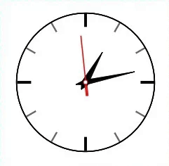
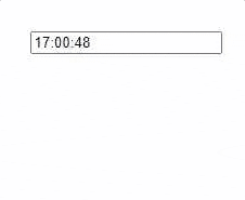
Analog & Digital:
Two types of time components available
AnalogTime&DigitalTime. - Picker: Input field for time selection which pops open the Analog/Digital picker.
- Time Display: For showing only Analog/Digital time display.
- Time Format: Returns time in 12hours or 24hours format.
- Live Clock: Real Time Clock with optional initial value.
- Fully Customizable: Seperate props for changing color & size of time component. For advanced customization, CSS classes can be overridden.
Example (AnalogTime):
    import React from 'react';
    import { AnalogTime } from "react-clock-select";

    function TimePicker(props){
      return(
        <AnalogTime
           type={"picker"}
           // "picker" or "display", default is picker
           value={new Date()}
           // Date() object or
           // a valid time string for Date() constructor
           placeholder={"Select Time.."}
           // when 'value' is empty string
           hoursFormat={12}
           // 12 or 24
           size={1}
           // greater than 0, Default is 1.
           selectorPosition={"top"}
           // "top", "bottom" or "modal" (Picker only).
           // Default is bottom.
           liveUpdater={true}
           // true or false (Display only).
           // Default is false.
           baseColor={"rgb(255,255,255)"}
           // Color value for clock base
           hourHandColor={"white"}
           // Color value for clock base
           minuteHandColor={"#FFFFFF"}
           // Color value for clock base
           secondHandColor={"#4d944e"}
           // Color value for clock base
           onConfirm={(e,value)=>{
           // "e" is the event object
           // "value" is a JSON
           // {
           //   time_string: "12:00:00 AM",
           //   hours: "12",
           //   minutes: "00",
           //   seconds: "00",
           //   am_pm: "AM",
           // }
           }}
        />
      )
  }
Example (DigitalTime):
    import React from 'react';
    import { DigitalTime } from "react-clock-select";

    function TimePicker(props){
      return(
        <DigitalTime
           type={"picker"}
           // "picker" or "display", default is picker
           value={new Date()}
           // Date() object or
           // a valid time string for Date() constructor
           placeholder={"Select Time.."}
           // when 'value' is empty string
           hoursFormat={12}
           // 12 or 24
           size={1}
           // greater than 0, Default is 1.
           selectorPosition={"top"}
           // "top", "bottom" or "modal" (Picker only).
           // Default is bottom.
           liveUpdater={true}
           // true or false (Display only).
           // Default is false.
           color={"rgba(24, 24, 24, 0.671)"}
           // Color value for clock digits
           onConfirm={(e,value)=>{
            // "e" is the event object
            // "value" is a JSON
            // {
            //   time_string: "12:00:00 AM",
            //   hours: "12",
            //   minutes: "00",
            //   seconds: "00",
            //   am_pm: "AM",
            // }
           }}
        />
      )
  }
Props (AnalogTime):
| Prop | Type | Description |
|---|---|---|
| type | String | "picker" for time picker display or "display" for non editable display |
| value | String/Date() | Sets default time value |
| placeholder | String | Set placeholder, visible when 'value' is empty string |
| hoursFormat | Number | Hour format can be either 12 or 24 |
| size | Number | Size of the clock, should be greater than 0, Default is 1 |
| selectorPosition | String | Position of the picker, "top", "bottom" or "modal" (Picker only). Default is bottom. |
| liveUpdater | Boolean | Live Clock, if "value" prop is provided live time will be initiated from the "value". |
| baseColor | String | Color value for clock base |
| hourHandColor | String | Color value for hour hand |
| minuteHandColor | String | Color value for minute hand |
| secondHandColor | String | Color value for second hand |
| onConfirm | Callback | Callback function for date confirm on OK button. value is a JSON {
|
Props (DigitalTime):
| Prop | Type | Description |
|---|---|---|
| type | String | "picker" for time picker display or "display" for non editable display |
| value | String/Date() | Sets default time value |
| placeholder | String | Set placeholder, visible when 'value' is empty string |
| hoursFormat | Number | Hour format can be either 12 or 24 |
| size | Number | Size of the digital font, should be greater than 0, Default is 1 |
| selectorPosition | String | Position of the picker, "top", "bottom" or "modal" (Picker only). Default is bottom. |
| liveUpdater | Boolean | Live Clock, if "value" prop is provided live time will be initiated from the "value". |
| color | String | Color value for clock digits |
| onConfirm | Callback | Callback function for date confirm on OK button . value is a JSON {
|
CSS Classes (AnalogTime):
Default CSS classes for easy css customization.
| ClassName | Description |
|---|---|
| rcs-analog-picker-custom | For analog picker container. |
| rcs-analog-clock-base-custom | For the base svg of analog clock. |
| rcs-analog-hour-hand-custom | For the hour-hand svg of analog clock. |
| rcs-analog-minute-hand-custom | For the minute-hand svg of analog clock. |
| rcs-analog-seconds-hand-custom | For the seconds-hand svg of analog clock. |
| rcs-analog-time-picker-form-container-custom | For analog picker container for inputs and button. |
| rcs-analog-time-input-field-parent-custom | For analog picker input fields container. |
| rcs-analog-time-input-field-custom | For analog picker input field. |
| rcs-analog-picker-input-custom | For the main analog picker input field. |
| rcs-analog-am-pm-toggle-custom | For analog picker am-pm toggle. |
| rcs-analog-time-picker-btn-custom | For analog picker confirm button. |
CSS Classes (DigitalTime):
Default CSS classes for easy css customization.
| ClassName | Description |
|---|---|
| rcs-digital-parent-custom | For main container. |
| rcs-digital-picker-custom | For digital picker and display container. |
| rcs-digital-picker-input-custom | For picker input fields. |
| rcs-digital-time-picker-btn-custom | For picker confirm button. |
Support:
For support contact: adnanali17official@gmail.com, daniyal_09.2005@hotmail.com