react-controls
A set of components like checkboxes, switches and radio buttons used at Housing.com
| Normal | Tag |
|---|---|
 |
 |
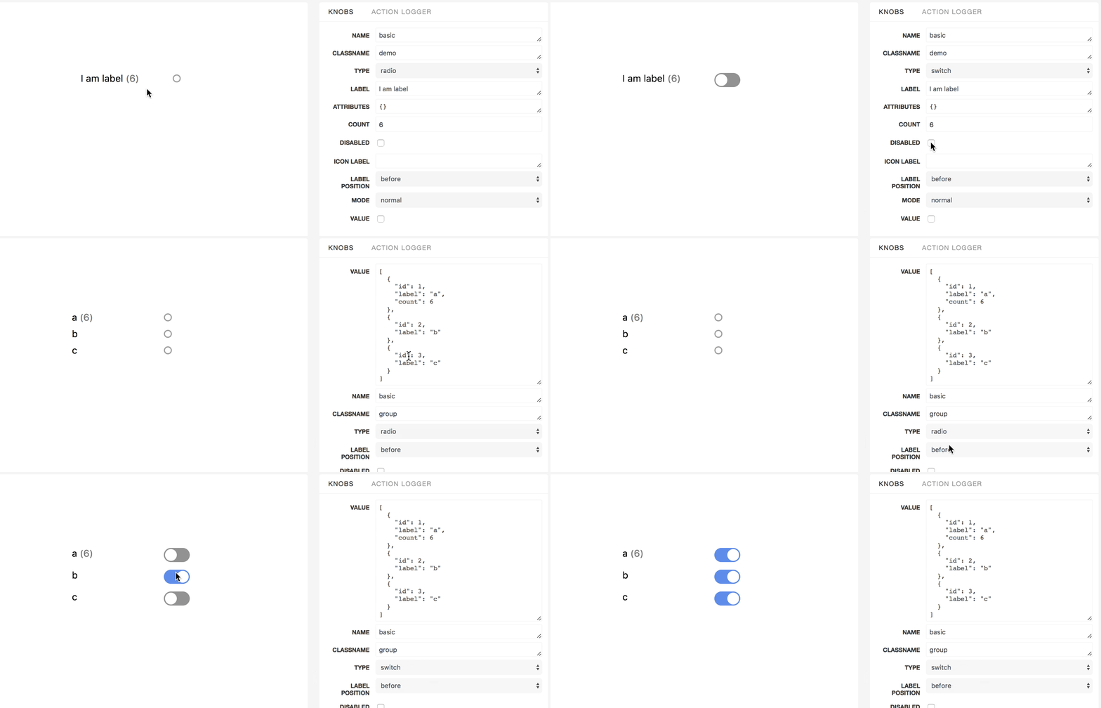
<Toggle/>
Basic Usage
; Component { <Toggle name='story1' label='hello' disabled count=6 type='radio' value=true /> }Props
| prop name | defaultValue | type |
|---|---|---|
| attributes | {} | Sometimes you may need to add some custom attributes to the root tag of the component. attributes will accept an object where the key and values will be those attributes and their value respectively. Eg : If you pass attributes = {'data-attr1' : 'val1','data-attr2' : 'val2'}the root tag will have the attributes data-attr1 and data-attr2 with the corresponding values as val1 and val2 respectively |
| className | '' | Optional className to be added to the root tag of the component |
| count | null | In case you want to show aggregation/count in front of label then pass the number in this option. This is generally useful for showing the items present corresponding to that filter option. |
| countElem | function | Return the element that you want to be rendered in place of count. |
| disabled | false | To disable or not to disable |
| iconElement | func |
|
| iconLabel | ['on', 'off'] | the text to be shown in the switch button in on and off states. |
| label | '' | The text label for that component |
| mode | 'normal' | There are two modes here, 'normal' and 'tag'. 'tag' mode can be use for mobile devices where you need experience like this. |
| name | '' | name of the component |
| onChange | ({name, value}) | function triggered when the component is clicked |
| type | 'switch' | The component can be change to have the behaviour of 'switch', 'radio' or 'checkbox'. |
| value | false ️ | [Required] true or false |
countElem
type: union(func|element)
defaultValue:
{ return <span className='toggle-count'>propscount</span>;}iconElement
type: func
defaultValue:
{ return <i></i>}<Group/>
Basic Usage
; const value = id: 1 label: 'a' count: 6 id: 2 label: 'b' id: 3 label: 'c' Component { return <Group name='group' type='switch' value=value /> }Props
| prop name | defaultValue | type |
|---|---|---|
| attributes | {} | Sometimes you may need to add some custom attributes to the root tag of the component. attributes will accept an object where the key and values will be those attributes and their value respectively. Eg : If you pass attributes = {'data-attr1' : 'val1','data-attr2' : 'val2'}the root tag will have the attributes data-attr1 and data-attr2 with the corresponding values as val1 and val2 respectively |
| className | '' | Optional className to be added to the root tag of the component |
| mode | 'normal' | There are two modes here, 'normal' and 'tag'. 'tag' mode can be use for mobile devices where you need experience like this. |
| onChange | ({name, value}) | function triggered when the component is clicked. |
| type | 'switch' | The component can be change to have the behaviour of 'switch', 'radio' or 'checkbox'. |
| value | {} ️ | [Required] An array of the form [{id: 1,label: 'x', value: true, count: 4}, {id:2, label: 'y', value: true, count:7}] . |
| selectedIds | [] or null |
An array of selected ids for checkbox or switch and a single id for 'radio' type. |
| id | 'id' | The key name of the primary key. |
| disabled | false |
Set to true to disable the whole group. |
Development
- Clone the repo
- Create a new branch.
- Run
npm install && npm run storybook - You can find the server running at localhost:9002
- Add feature or fix bug. Add tests if required.
- if commit fails make sure that there's no linting error or failed test by running
npm run test && npm run lint
License
MIT @ Ritesh Kumar


