react-customizable-modal
Customizable Modal component for React
Features
- Fancy styled modal
- Mobile Support
Usage
- Install via NPM
$ npm install --save-dev react-customizable-modal- Load to browser(need web bundler, such as Webpack or Browserify, also need to plugin to load CSS. Else, you have to load css from HTML)
// CommonJS;var Modal = ; // ES2015 Modular Syntax;;Example
Above examples can found here: https://github.com/rico345100/react-customizable-modal-example.
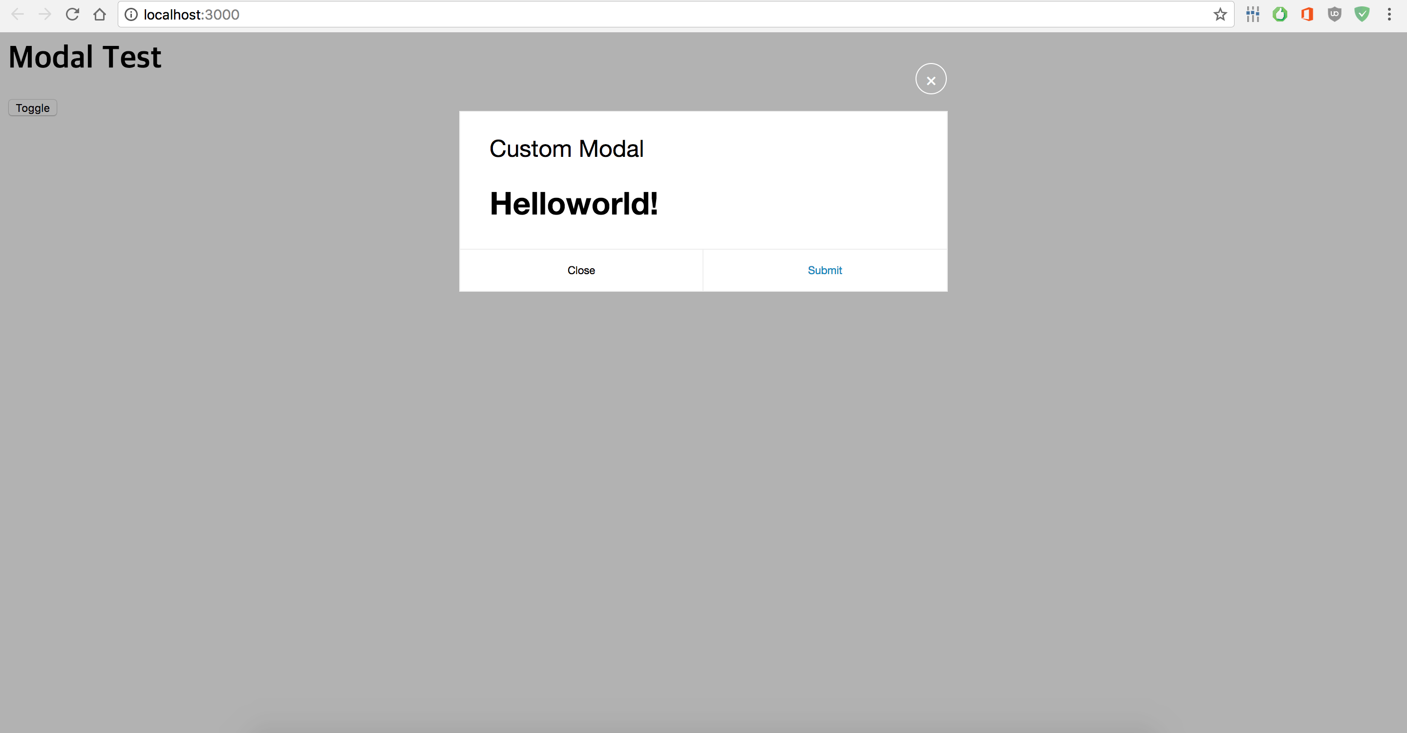
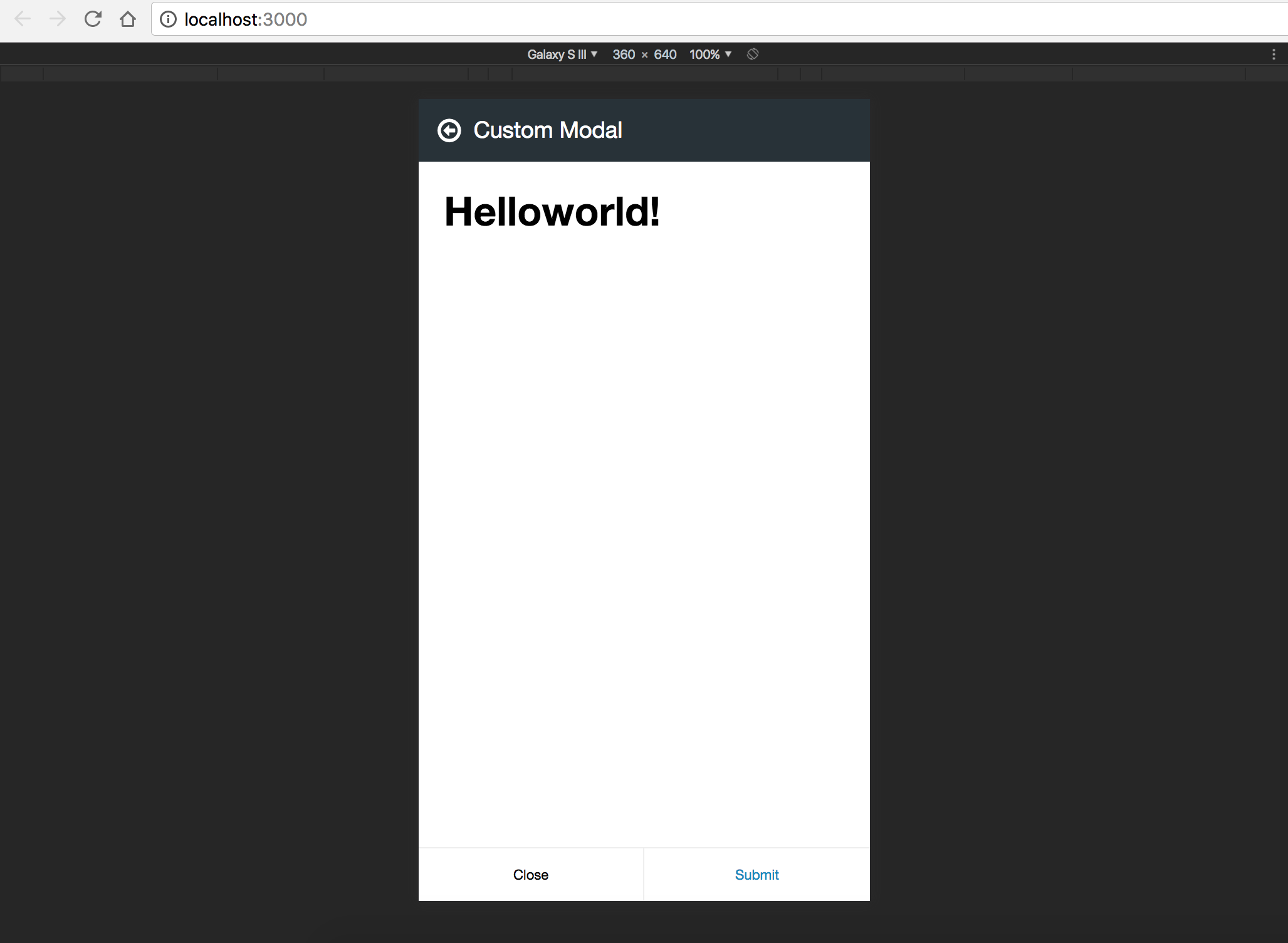
Simple Modal
Example for creating simple custom modal:
;; static propTypes = visible: PropTypesboolisRequired onClose: PropTypesfunc static defaultProps = {} { return <Modal name="Custom Modal" visible=thispropsvisible onSubmit=thispropsonClose onClose=thispropsonClose> <h1>Helloworld!</h1> </Modal> } state = showModal: false { this; } { this; } { return <div> <h1>Modal Test</h1> <button onClick=thistoggleModal>Toggle</button> /* Modal must be render always, and control visiblity via visible props */ <CustomModal visible=thisstateshowModal onClose=thiscloseModal /> </div> ; }Form Modal
Example for creating custom modal has form(using with react-bootstrap):
;;; static propTypes = onClose: PropTypesfunc visible: PropTypesboolisRequired state = name: '' age: '' { console; } { thisprops; } { this; } { const visible = thisprops; const name age = thisstate; return <Modal name="Add Account" onSubmit=thisonAdd onClose=thisonClose submitText="Add" closeText="Close" visible=visible> <div className="form-horizontal"> <FormGroup> <ControlLabel>Name</ControlLabel> <FormControl type="text" value=name onChange=thishandleChange /> </FormGroup> <FormGroup> <ControlLabel>Age</ControlLabel> <FormControl type="text" value=age onChange=thishandleChange /> </FormGroup> </div> </Modal> ; } ;API
props
- string name: Name of the modal. It displays both Desktop and Mobile device.
- boolean visible: Set visibility. This is using when animate modal on show/hide.
- optional number zIndex: Z-Index of modal component. This is useful when you want to make some kind of nested modals with right order.
- optional string className: Add class.
- optional function onSubmit: Invoked when submit the form.
- optional function onClose: Invoked when close the form.
- optional boolean noSubmit: On true, no submit button in the modal. Default is false.
- optional string submitText: Text on the submit button. Default is "Submit".
- optional string closeText: Text on the close button. Default is "Close".
License
MIT. Free to use.