React DataTable Responsive


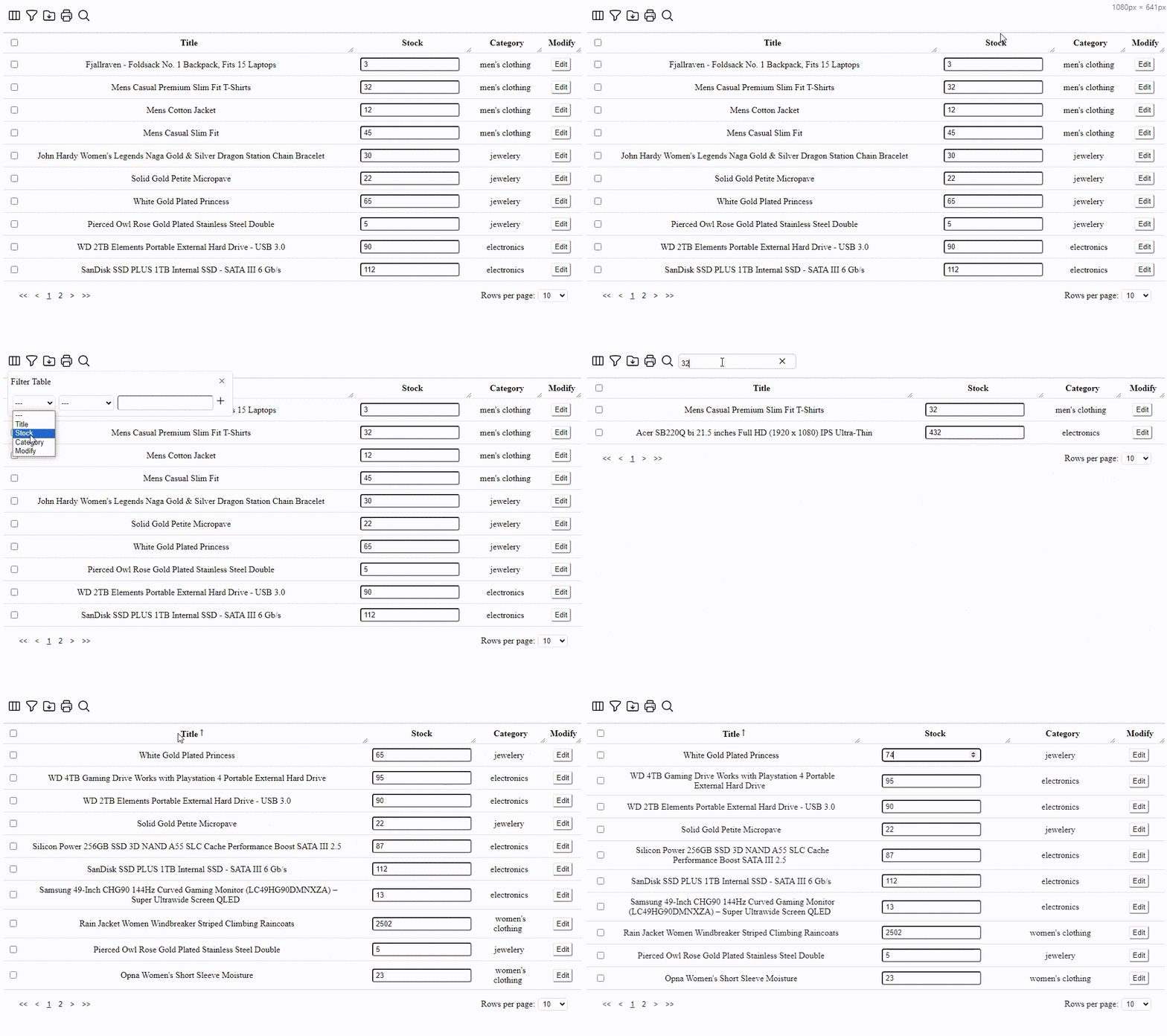
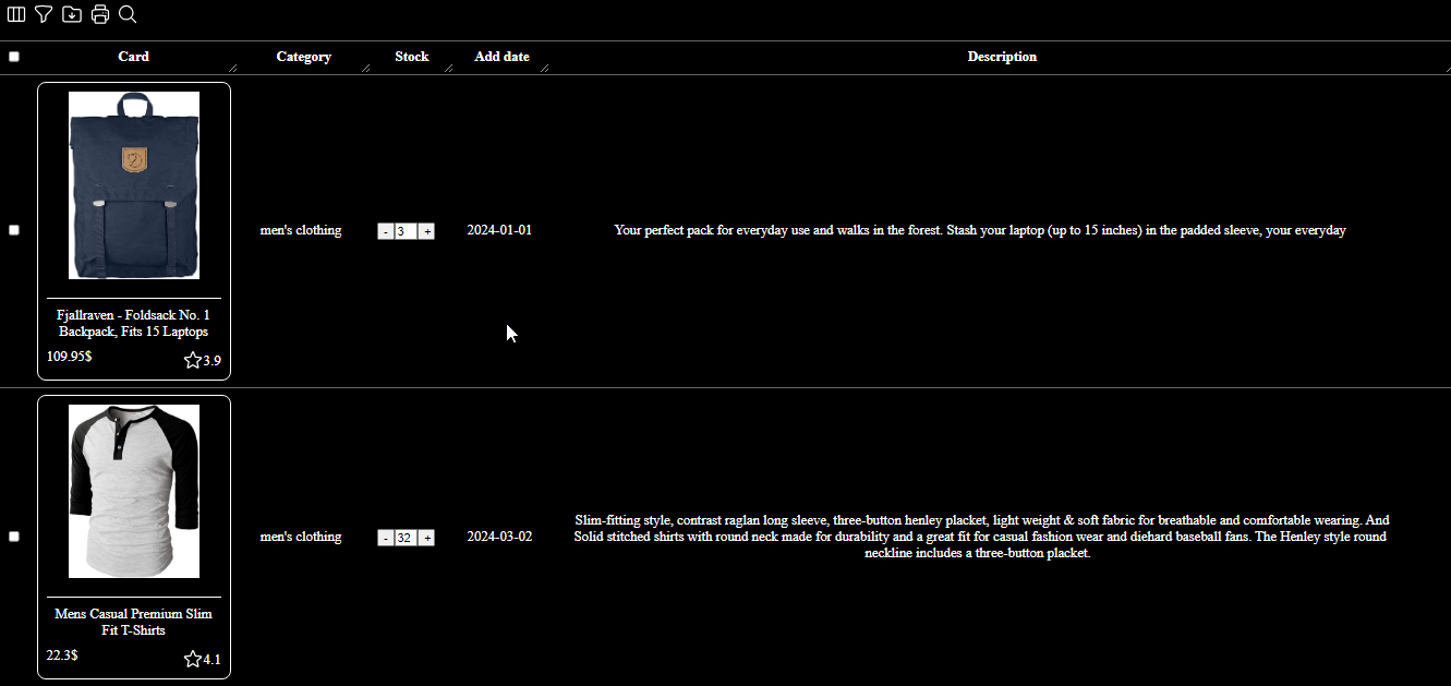
It's a datatable component on React. It comes with features like filtering, search, view/hide columns, export to excel file, printing, sorting, selectable rows, pagination, and responsible for mobile/tablet device. On top of the ability to put component, textbox, checkbox, button, img, ... in cells.
- filtering
- search
- view/hide columns
- export to excel file
- printing
- sorting
- selectable rows
- pagination
- responsible for mobile/tablet
- resizable columns
- component, textbox, checkbox, button, img, and ... in cells

npm i react-datatable-responsive
import ReactDataTable from 'react-datatable-responsive';
import { ColumnType } from 'react-datatable-responsive';

const columns: ColumnType[] = [
  { field: { title: 'title' }, label: 'Title' },
  { field: { title: 'price' }, label: 'Price' },
  { field: { title: 'category' }, label: 'Category' },
]

const data = [
  { title: "Fjallraven - Foldsack No. 1 Backpack, Fits 15 Laptops", price: 109.95, category: "men's clothing"},
  { title: "Mens Casual Premium Slim Fit T-Shirts ", price: 22.3, category: "men's clothing"},
  { title: "Mens Cotton Jacket", price: 55.99, category: "men's clothing"},
]

export default function Example() {
  return (
    <ReactDataTable rows={data} columns={columns} />
  )
}import ReactDataTable from 'react-datatable-responsive';
import { ColumnType } from 'react-datatable-responsive';
const columns: ColumnType[] = [
{ field: { title: 'id' }, label: 'ID', options: { display: false } },
{ field: { title: 'title' }, label: 'Title', options: { sort: true } },
{ field: { title: 'price' }, label: 'Price', options: { filter: false, sort: true } },
{ field: { title: 'category' }, label: 'Category', options: { search: false } },
]
const data = [
{ id:1, title: "Fjallraven - Foldsack No. 1 Backpack, Fits 15 Laptops", price: 109.95, category: "men's clothing"},
{ id:2, title: "Mens Casual Premium Slim Fit T-Shirts ", price: 22.3, category: "men's clothing"},
{ id:3, title: "Mens Cotton Jacket", price: 55.99, category: "men's clothing"},
]
export default function Example(): React.JSX.Element {
return (
<ReactDataTable rows={data} columns={columns} />
)
}import ReactDataTable from 'react-datatable-responsive';
import { ColumnType } from 'react-datatable-responsive';
const columns: ColumnType[] = [
{ field: { title: 'id' }, label: 'ID', options: { display: false } },
{ field: { title: 'firstName' }, label: 'First Name' },
{ field: { title: 'account.username' }, label: 'Username' },
{ field: { title: 'address.home.street' }, label: 'Home Street' },
]
const data = [
{ id:1, firstName:"Anna", account:{username:"annauser"}, address:{home:{street:"24"}}},
{ id:2, firstName:"Lena", account:{username:"lenauser"}, address:{home:{street:"24"}}},
]
export default function Example(): React.JSX.Element {
return (
<ReactDataTable rows={data} columns={columns} />
)
}The component accepts the following props:
| Name |
Type |
Description |
direction |
lrt | rtl | inherit |
Direction used to describe direction of table. |
columns |
array |
Columns used to describe table. Must be either an array of simple strings or objects describing a column. (This field is required) |
rows |
array |
Rows used to describe table. Must be either an array containing objects of key/value pairs. (This field is required) |
options |
object |
Options used to describe table. |
| Name |
Type |
Default |
Description |
cells |
object |
|
User provided items in cells. Example
|
color |
object |
|
User provided colors to customized table. Example
|
download |
boolean |
true |
Show/hide download icon from toolbar. Possible values:
- true: Button is visible and clickable.
- false: Button is not visible.
|
filter |
boolean |
true |
Show/hide filter icon from toolbar. Possible values:
- true: Button is visiable and clickable.
- false: Button is not visible.
|
onRowClick |
function |
|
Callback function that triggers when a row is clicked. function(rowData: any) => void
|
onRowsDelete |
function |
|
Callback function that triggers when row(s) are deleted. function(rowsDeleted: any[]) => void
|
pagination |
boolean |
true |
Show/hide pagination. |
print |
boolean |
true |
Show/hide print icon from toolbar. Possible values:
- true: Button is visiable and clickable.
- false: Button is not visible.
|
resizableColumns |
boolean |
true |
Enable/disable resizable columns. |
responsive |
boolean |
true |
Enable/disable responsive table. |
rowsPerPage |
number |
10 |
Number of rows allowed per page. |
rowsPerPageOptions |
array |
[5,10,20,50,100] |
Options to provide in pagination for number of rows a user can select. |
search |
boolean |
true |
Show/hide search icon from toolbar. Possible values:
- true: Button is visiable and clickable.
- false: Button is not visible.
|
searchPlaceholder |
string |
|
Search text placeholder. |
selectableRowsHideCheckboxes |
boolean |
false |
Hides the checkboxes that appear when selectableRows is set to "multiple" or "single". Can provide a more custom UX, especially when paired with selectableRowsOnClick. |
textLabels |
object |
|
User provided labels to localize text. |
viewColumns |
boolean |
true |
Show/hide viewColumns icon from toolbar. Possible values:
- true: Button is visiable and clickable.
- false: Button is not visible.
|
These class names are useful for styling with CSS. They are applied to the component.
| Name |
Description |
rdtdatatable |
Styles applied to the data table |
rdtmenu-main |
Styles applied to the menu box |
rdtmenu-select |
Styles applied to the select menu box |
rdtmenu-title |
Styles applied to the caption table |
rdtfilter |
Styles applied to the filter box |
rdtfilter__title |
Styles applied to the title of the filter box |
rdtfilter-item |
Styles applied to the filter items box |
rdtfilter-column |
Styles applied to the columns select tag |
rdtfilter-column__option |
Styles applied to options of the columns select tag |
rdtfilter-condition |
Styles applied to the conditions select tag |
rdtfilter-condition__option |
Styles applied to options of conditions select tag |
rdtfilter-item__text |
Styles applied to the input on the filter box |
rdtfilter__add |
Styles applied to the add button on the filter box |
rdtfilter-list |
Styles applied to the filter list box |
rdtfilter-list__li |
Styles applied to the filter list item |
rdtfilter-list__remove |
Styles applied to the remove button on filter list item |
rdtsearch |
Styles applied to the search box |
rdtsearch__input |
Styles applied to the input on search box |
rdtsearch__close |
Styles applied to the close button on search box |
rdtshowcolumn |
Styles applied to the show column box |
rdtshowcolumn__title |
Styles applied to the caption show column box |
rdtshowcolumn__li |
Styles applied to the list columns on show column box |
rdtshowcolumn__label |
Styles applied to the label list columns on show column box |
rdttable |
Styles applied to the table |
rdttable-nodata |
Styles applied to the no data alert |
rdttable-header__label |
Styles applied to the header label |
rdtcell-input |
Styles applied to the input in cells |
rdtcell-textarea |
Styles applied to the textarea in cells |
rdtcell-image |
Styles applied to the image in cells |
rdtcell-checkbox |
Styles applied to the checkbox in cells |
rdtcell-text |
Styles applied to the text in cells |
rdtcell-progress |
Styles applied to the progress in cells |
rdtcell-select |
Styles applied to the to select in cells |
rdtcell-select__option |
Styles applied to options in select |
rdtcell-button |
Styles applied to the button in cells |
rdtpagination |
Styles applied to the pagination box |
rdtpagination-pages |
Styles applied to the number pagination box |
rdtpagination-pages__no |
Styles applied to the number pagination |
rdtpagination-pages__no--select |
Styles applied to the current page no |
rdtpagination-per-page |
Styles applied to the per page select |
On each column object, you have the ability to customize columns to your liking with the 'options' property. Example:
const columns = [
 {
  name: "Name",
  options: {
   filter: true,
   sort: false,
   ...
  }
 },
 ...
];
| Name |
Type |
Description |
field |
object |
Title of column (This field is required) and function to handle cell event |
label |
string |
Column Header Name (This field is required) |
kind |
input/textbox | input/date | input/datetime-local | input/number | input/file | input/password | textarea | button | image | boolean | select | progress | component, |
kind of column |
options |
object |
Options for customizing column |
eventHandlerHeader |
function |
function to handle column event |
| Name |
Type |
Default |
Description |
component |
function |
|
Function that returns a React component. Used to display data within all table cells of a given column. Example
|
display |
boolean |
true |
Display column in table. Possible values:
- true: Column is visible and toggleable via the View Columns popover in the Toolbar.
- false: Column is not visible but can be made visible via the View Columns popover in the Toolbar.
Example
|
filter |
boolean |
true |
Display column in filter list.Example
|
search |
boolean |
true |
Exclude/include column from search results.Example
|
sort |
boolean |
false |
Enable/disable sorting on column.Example
|
const defaultOptions {
  color: {
    color: '#000',
    backgroundColor: '#fff',
    borderColor: '#ddd'
  },
  download: true,
  filter: true,
  print: true,
  search: true,
  viewColumns: true,
  pagination: true,
  resizableColumns: true,
  responsive: true,
  rowsPerPage: 10,
  rowsPerPageOptions: [5, 10, 20, 50, 100],
  searchPlaceholder: '',
  selectableRowsHideCheckboxes: false,
  cells: {
    imageWidth: 60,
  },
  textLabels: {
    body: {
      title: '',
      noMatch: "Sorry, no data found",
      toolTip: "Sort",
    },
    ...
  }
}The files included in this repository are licensed under the MIT license.


