
Click above to play with the live demo.
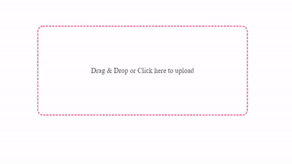
A lightweight and type-safe React component to upload files with Drag & Drop.
npm install react-drop-region
or
yarn add react-drop-region
Live demo: CodeSandbox
import DropRegion from "react-drop-region";

export default function DropRegionDemo() {
  const [isHovering, setIsHovering] = useState(false);

  return (
    <DropRegion
      setIsHovering={isHovering => {
        setIsHovering(isHovering);
      }}
      handleAcceptedFiles={files => {
        console.log("Accepted files: ", files);
      }}
    >
      <div
        className="drop-region"
        style={{ height: 150, width: 300, border: "2px dashed hotpink" }}
      >
        {isHovering ? "Drop here" : "Drag and drop to upload"}
      </div>
    </DropRegion>
  );
}* indicates that the prop is required.
| Props | Type | Default | Description |
|---|---|---|---|
| handleAcceptedFiles* | function | - | returns accepted files as an array. |
| handleRejectedFiles | function | - | returns rejected files as an array. |
| handleProgress | function | - | is fired periodically as the files are being uploaded. |
| setIsHovering | function | - | returns true, if user is dragging over DropRegion. |
| onDrop | function | - | is invoked when upon drop event. |
| onDragEnter | function | - | is invoked upon dragEnter event. |
| onDragLeave | function | - | is invoked upon dragLeave or dragExit events. |
| onError | function | - | is invoked, if an error occurs during uploading files. |
| readAs | string | readAsDataURL |
specifies reading method. |
| allowMultiple | boolean | true |
if true, user may upload more than one file. |
| disable | boolean | false |
if true, user cannot upload files. |
| allowKeyboard | boolean | true |
if true, user can open file dialog by pressing Enter or Space keys. |
| allowClick | boolean | true |
if true, user can open file dialog by clicking on DropRegion. |
| validTypes | string[] | [] | pass accepted file types. |
| showPlaceholder | boolean | true | Placeholder is shown while waiting for full image to load |
| customPlaceholder | DOM Element | null | Pass your custom placeholder component/element. |