
react-easy-auto-complete-input
Easy to create an input with suggest list. Can use on input text or textarea. Trigger showing suggest list by special character such as: @, [, ... anything you like

Features:
- Support typescript
- All style can be customed via
children,className,style - Show list by any key
- Support filter items
- Note: It's important to set lineHeight to style because of the position of suggest list base on this.
Install
Use npm:
npm install --save react-easy-auto-complete-inputUse yarn:
yarn add react-easy-auto-complete-inputTest
npm testUsage
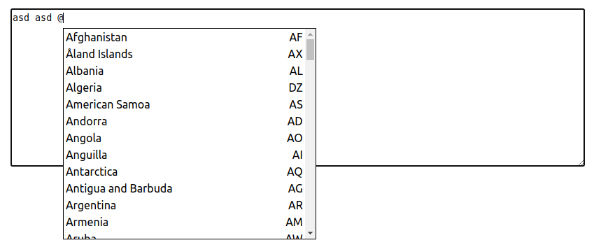
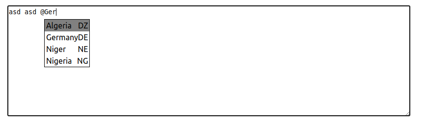
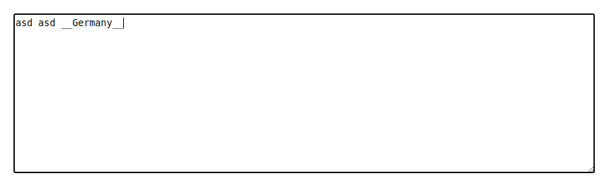
Result images:
Trigger showwing suggest list by '@':
Continue entering will filter items:
Press enter or click on item which you want:
Demo
Live demo
Local
cd example && npm install && npm start
Props
WIP
| # | Name | Type | Required | Default | Description |
|---|---|---|---|---|---|
| 1 | type | string | false | textarea |
Type of element textare or input |
| 2 | activeKey | string | true | null | When press this key, the suggest list will appear |
| 3 | filterBy | string or (item: StandardItem<AutoCompleteItem>) => boolean |
true | name |
Use to filter suggest list, cannot be a field of item or a custom fucntion |
| 4 | items | object | true | suggested items | |
| 5 | formatSelectedItem | (item: StandardItem<AutoCompleteItem>) => string |
true | Used to format selected item | |
| 6 | value | string | false | "" |
Init value of textarea or input |
| 7 | onChanged | (value: string) => void |
false | Invoked when value change by input from keyboard or select item | |
| 8 | onSelect | (item: AutoCompleteItem) => void |
false | Invoked when item is selected | |
| 9 | className | string | false | Custom classNames for textarea or input | |
| 10 | style | object | false | Custom style for textarea or input |
License
MIT © huytd